0

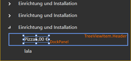
I want to have 2 Textblocks in my TreeViewItem.Header. So I though it works like this:

<TreeViewItem>
    <TreeViewItem.Header>
       <DockPanel LastChildFill="False" HorizontalAlignment="Stretch">
            <TextBlock Text="Pizza" DockPanel.Dock="Left"/>
            <TextBlock Text="5,00 €" DockPanel.Dock="Right"/>
       </DockPanel>
    </TreeViewItem.Header>
</TreeViewItem>

But the DockPanel don't fill all the Space which is available in TreeViewItem.Header. I tried to Use HorizontalAlignment="Stretch", but this hasn't any effect.

Is there an Attribute to make this Work?

I have a picture where can u see the problem better: Image

O Jean
  • 105
  • 9
  • In order to "Stretch" to work, the parent element must have a width (It can't have width="Auto"). Is this the case? – ltiveron Apr 21 '17 at 12:42
  • I guess yea. This TreeView is Auto Height/Width. If I set the Width of DockPanel manually to for example 260. Then it "works". But then i will get Visual Bugs when it will resize. Why does the DockPanel don't fill the available Space in the TreeViewItem automatically, like I create a StackPanel in a Grid. – O Jean Apr 21 '17 at 12:44
  • Maybe you could put your DockPanel inside a Grid with one ColumnDefinition Width = "*". Not sure if this would do, but I would try it. – ltiveron Apr 21 '17 at 12:47
  • No, because the Grid doesn't fill the available space too. – O Jean Apr 21 '17 at 12:50
  • What is the "available space" here, i.e. what is the width of the TreeViewItem? – mm8 Apr 21 '17 at 12:53

4 Answers4

1

If you want the header of a TreeView to stretch horizontally, you should override the ControlTemplate:

<TreeViewItem HorizontalContentAlignment="Stretch">
    <TreeViewItem.Template>
        <ControlTemplate TargetType="{x:Type TreeViewItem}">
            <Grid>
                <Grid.ColumnDefinitions>
                    <ColumnDefinition MinWidth="19" Width="Auto"/>
                    <ColumnDefinition Width="Auto"/>
                    <ColumnDefinition Width="*"/>
                </Grid.ColumnDefinitions>
                <Grid.RowDefinitions>
                    <RowDefinition Height="Auto"/>
                    <RowDefinition/>
                </Grid.RowDefinitions>
                <ToggleButton x:Name="Expander" ClickMode="Press" IsChecked="{Binding IsExpanded, RelativeSource={RelativeSource TemplatedParent}}" />
                <Border x:Name="Bd" BorderBrush="{TemplateBinding BorderBrush}" BorderThickness="{TemplateBinding BorderThickness}" Background="{TemplateBinding Background}" Grid.Column="2" Padding="{TemplateBinding Padding}" SnapsToDevicePixels="true">
                    <ContentPresenter x:Name="PART_Header" ContentSource="Header" HorizontalAlignment="{TemplateBinding HorizontalContentAlignment}" SnapsToDevicePixels="{TemplateBinding SnapsToDevicePixels}"/>
                </Border>
                <ItemsPresenter x:Name="ItemsHost" Grid.ColumnSpan="2" Grid.Column="1" Grid.Row="1"/>
            </Grid>
            <ControlTemplate.Triggers>
                <Trigger Property="IsExpanded" Value="false">
                    <Setter Property="Visibility" TargetName="ItemsHost" Value="Collapsed"/>
                </Trigger>
                <Trigger Property="HasItems" Value="false">
                    <Setter Property="Visibility" TargetName="Expander" Value="Hidden"/>
                </Trigger>
                <Trigger Property="IsSelected" Value="true">
                    <Setter Property="Background" TargetName="Bd" Value="{DynamicResource {x:Static SystemColors.HighlightBrushKey}}"/>
                    <Setter Property="Foreground" Value="{DynamicResource {x:Static SystemColors.HighlightTextBrushKey}}"/>
                </Trigger>
                <MultiTrigger>
                    <MultiTrigger.Conditions>
                        <Condition Property="IsSelected" Value="true"/>
                        <Condition Property="IsSelectionActive" Value="false"/>
                    </MultiTrigger.Conditions>
                    <Setter Property="Background" TargetName="Bd" Value="{DynamicResource {x:Static SystemColors.InactiveSelectionHighlightBrushKey}}"/>
                    <Setter Property="Foreground" Value="{DynamicResource {x:Static SystemColors.InactiveSelectionHighlightTextBrushKey}}"/>
                </MultiTrigger>
                <Trigger Property="IsEnabled" Value="false">
                    <Setter Property="Foreground" Value="{DynamicResource {x:Static SystemColors.GrayTextBrushKey}}"/>
                </Trigger>
            </ControlTemplate.Triggers>
        </ControlTemplate>
    </TreeViewItem.Template>
    <TreeViewItem.Header>
        <DockPanel LastChildFill="False">
            <TextBlock Text="Pizza" DockPanel.Dock="Left"/>
            <TextBlock Text="5,00 €" DockPanel.Dock="Right"/>
        </DockPanel>
    </TreeViewItem.Header>
</TreeViewItem>
mm8
  • 163,881
  • 10
  • 57
  • 88
  • 1
    Oh thanks. This looks a bit hard to understand for me but it works. It seems like u always now the answer of all questions of me. Nice that u are there. – O Jean Apr 21 '17 at 13:28
0

It seems the only way is to change the Control template of the TreeviewItem. See this question: TreeViewItem.Header with Grid inside

Community
  • 1
  • 1
ltiveron
  • 579
  • 7
  • 16
0

The @mm8 's answer is correct, but in my case, I didn't want to override the content template. Instead, I've implemented a behavior that stretches the DockPanel with a button in it.

public class TreeViewItemWithDockPanelStretchBehavior : Behavior<DockPanel>
{
    private TreeViewItem? _treeViewItem;
    private double? _offset;

    protected override void OnAttached()
    {
        AssociatedObject.LastChildFill = false;

        _treeViewItem = WpfHelpers.FindVisualParent<TreeViewItem>(AssociatedObject).NotNull();
        _treeViewItem.SizeChanged += OnSizeChanged;

        base.OnAttached();
    }

    protected override void OnDetaching()
    {
        if (_treeViewItem is not null)
            _treeViewItem.SizeChanged -= OnSizeChanged;
        base.OnDetaching();
    }

    private void OnSizeChanged(object sender, SizeChangedEventArgs e) => UpdateWidth();

    private void UpdateWidth()
    {
        if (_treeViewItem is null) return;

        _offset ??= _treeViewItem.DesiredSize.Width - AssociatedObject.DesiredSize.Width;
        AssociatedObject.Width = _treeViewItem.ActualWidth - _offset.Value;
    }
}

The usage:

xmlns:i="http://schemas.microsoft.com/xaml/behaviors"
xmlns:behaviors="clr-namespace:YourNameSpaceGoesHere"
...
<HierarchicalDataTemplate ItemsSource="...">
  <DockPanel>
    ...Text control with a button at the end with DockPanel.Dock="Right"
    <i:Interaction.Behaviors>
      <behaviors:TreeViewItemWithDockPanelStretchBehavior />
    </i:Interaction.Behaviors>
  </DockPanel>
</HierarchicalDataTemplate>

Result:

Screenshot

Genius
  • 1,784
  • 14
  • 12
-1

You have to set a style like this : (don't forget to change the docking of the second textblock)

        <TreeViewItem>
            <TreeViewItem.Style>
                <Style TargetType="TreeViewItem">
                    <Setter Property="HorizontalContentAlignment" Value="Stretch"></Setter>
                </Style>
            </TreeViewItem.Style>
            <TreeViewItem.Header>
                <DockPanel LastChildFill="False" HorizontalAlignment="Stretch">
                    <TextBlock Text="Pizza" DockPanel.Dock="Left"/>
                    <TextBlock Text="5,00 €" DockPanel.Dock="Left"/>
                </DockPanel>
            </TreeViewItem.Header>
        </TreeViewItem>
Tarboeuf
  • 90
  • 4