3

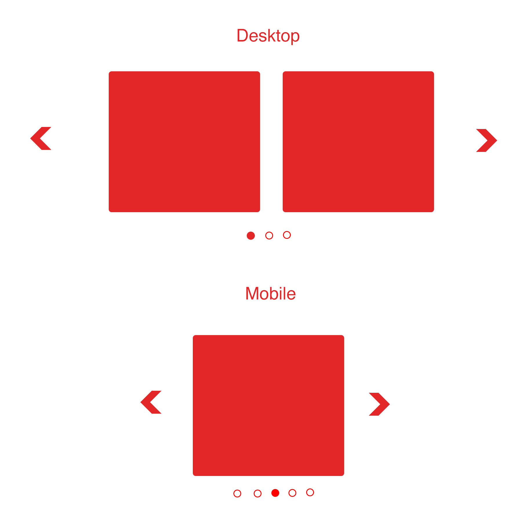
I have this Bootstrap Carousel which shows 2 item each in Desktop view. However, I want to show one item at a time in Mobile view. How can I achieve this?

https://jsfiddle.net/v9t2pz9b/

HTML

<div class="container">
  <div id="myCarousel" class="carousel slide" data-ride="carousel">
    <div class="carousel-inner" role="listbox">
      <div class="item active">
        <div class="col-sm-6">
          block1
        </div>
        <div class="col-sm-6">
          block2
        </div>
      </div>
      <div class="item">
        <div class="col-sm-6">
          block3
        </div>
        <div class="col-sm-6">
          block4
        </div>
      </div>

      <div class="item">
        <div class="col-sm-6">
          block5
        </div>
        <div class="col-sm-6">
          block6
        </div>
      </div>

    </div>

    <!-- Left and right controls -->
    <a class="left carousel-control" href="#myCarousel" role="button" data-slide="prev">
      <span class="glyphicon glyphicon-chevron-left" aria-hidden="true"></span>
      <span class="sr-only">Previous</span>
    </a>
    <a class="right carousel-control" href="#myCarousel" role="button" data-slide="next">
      <span class="glyphicon glyphicon-chevron-right" aria-hidden="true"></span>
      <span class="sr-only">Next</span>
    </a>
  </div>
</div>

JS:

$(document).ready(function(){
     $("#myCarousel").carousel();
});

Something like as this shown in the design. I want to show only one slide at a time in mobile: enter image description here

Elaine Byene
  • 3,868
  • 12
  • 50
  • 96
  • I would use a different slider. Most of them allow you to change the # of slides shown and you would just monitor the window load and resize event and at whatever width you want 1 slide to show, change the # of slides to 1 and reinit the slider. slick does it http://kenwheeler.github.io/slick/ – Michael Coker Apr 25 '17 at 00:32

1 Answers1

6
$(document).ready(function(){
  $("#myCarousel").carousel();
    if ( $(window).width() < 640 ) {
       $('.col-sm-6').unwrap().addClass('item');
       $('.col-sm-6:first').addClass('active');
    }
});

Where 640 is your mobile breakpoint. Check out unwrap() , it removes the element's parent while not affecting its content.

asarna
  • 61
  • 2
  • I'm sorry. This doesn't seem to work. At <640, it still shows both the columns. I would like to show only 1 column in mobile (say 640 or less) instead of 2 columns. Check the updated question with the design please. – Elaine Byene Apr 25 '17 at 06:27
  • its working fine for me thank you for your efforts! – Rohit Verma May 25 '20 at 09:10