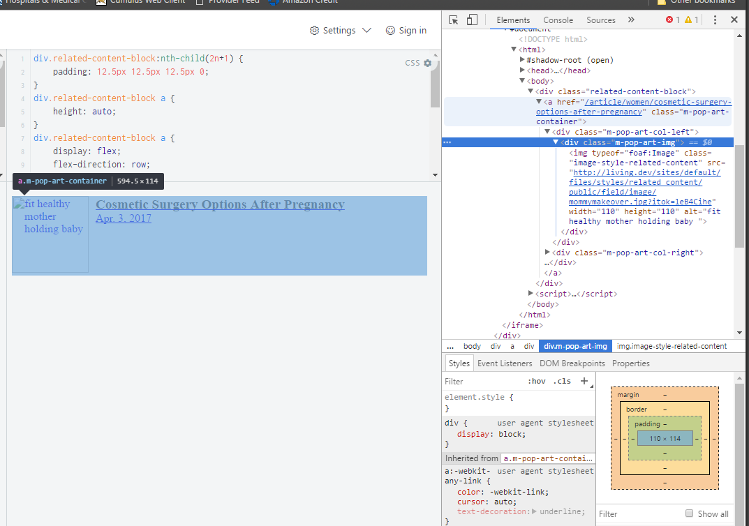
On my website, I'm creating a grid of articles. However, I'm having trouble getting the container element to respect the height of the child elements inside of it. You can see in this screenshot that the container is a few pixels taller than the content inside of it (click to enlarge):
Now, I can always set a fixed height, but I'd rather not. The image will always be the same height, but the title will vary, so I want to container to be flexible to accomidate the height of the title.
CSS:
div.related-content-block:nth-child(2n+1) {
    padding: 12.5px 12.5px 12.5px 0;
}
div.related-content-block a {
    height: auto;
}
div.related-content-block a {
    display: flex;
    flex-direction: row;
    width: 100%;
}
.m-pop-art-col-right {
    padding: 0 0 0 10px;
}
.m-pop-art-title {
    color: #464646;
    font-size: 1.2em;
    font-weight: 600;
    line-height: 1.2em;
}
.related-content-footer .m-pop-art-date {
    color: #898989;
}
HTML:
<div class="related-content-block">
  <a href="/article/women/cosmetic-surgery-options-after-pregnancy" class="m-pop-art-container">
  <div class="m-pop-art-col-left">
    <div class="m-pop-art-img"><img typeof="foaf:Image" class="image-style-related-content" src="http://living.dev/sites/default/files/styles/related_content/public/field/image/mommymakeover.jpg?itok=leB4Cihe" width="110" height="110" alt="fit healthy mother holding baby "></div>
  </div>
  <div class="m-pop-art-col-right">
    <div class="m-pop-art-title">Cosmetic Surgery Options After Pregnancy</div>
    <div class="m-pop-art-date">Apr. 3, 2017</div>
  </div>
</a>
</div>
Here's a JSFiddle of my code: https://jsfiddle.net/8m3upb0o/