I'm having a bit of trouble trying to create a layout section on a site which uses Twitter bootstrap grid.
I need a regular .container with a col-xs-3 column and then the next column should simply fill the rest of the browser viewport. The content of the large "full width" column should fill the div all the way to the right side of the browser.
While I do realise that this is violating the rules of the grid, it's important for me, that the first col (.col-xs-3) uses the exact same left position as all other columns to keep content aligned horizontally.
See drawing for clarification:
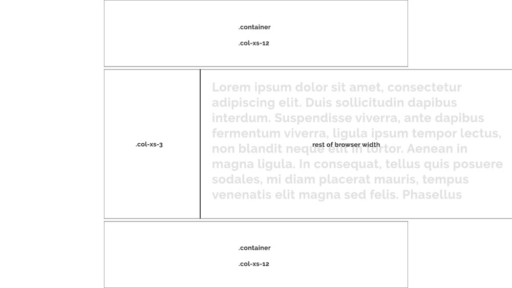
I'm absolutely open to suggestions of doing this without using the boostrap grid in the middle section, but still, it's important the left position from tablet and up.
Any suggestions? :-)
EDIT:
Here's my markup:
<div class="product-slideshow">
    <div class="container">
        <div class="row">
            <div class="col-xs-3 categories">
                <ul>
                    <li><a>Product 1</a></li>
                    <li><a>Product 2</a></li>
                    <li><a>Product 3</a></li>
                    <li><a>Product 4</a></li>
                </ul>
            </div>

            <!-- This column should span all the way to the right side of the browser -->
            <div class="col-xs-9 images">
                <div class="slider-wrapper">
                    <img class="slide" src="..." />
                    <img class="slide" src="..." />
                    <img class="slide" src="..." />
                    <img class="slide" src="..." />
                </div>
            </div>
        </div>
    </div>
</div>
EDIT 2:
Actually managed to fix this meanwhile. I'm using Slick.js slider for the slideshow/content in the large column, and appearantly, the following CSS (SASS) did the trick:
.products-slideshow {
    overflow-x: hidden;

    .images {
        position: relative;

        .slider-wrapper {
            max-width: calc(100vw - 25%); // 25% being the col-xs-3 width
            position: absolute;
            height: auto;
        }
    }
}