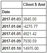
I have a dataframe
fig, ax = plt.subplots(figsize=(10, 8))
ax.bar(df_temp.index, df_temp['Client $ Amt'].cumsum()/100000)
ax.set_xticks(ax.get_xticks()[::2])
The problem is the graph is showing the empty dates in between the index of my graph. I want to not show those though.
I have already done
df_temp.plot(kind='bar')
But the dates in the x-axis are in long format and I am not able to add the line
ax.set_xticks(ax.get_xticks()[::2])
where I collapse the dates. I need to collapse the dates otherwise the x-axis ticks become unreadable when I add more dates to the dataframe.
I am looking for either one of two solutions. Not show in-between dates in the figure plot, or combine dates and show in a shorter format in the df.plot() example.
Edit
Here is the json dump of the dataframe. You can load it with df_temp_new = pd.read_json(json_dict)
'{"Client $ Amt":{"1483401600000":20,"1483488000000":-20.4,"1483574400000":20.76,"1483920000000":79.5684759707,"1484006400000":20.123,"1484179200000":20.654,"1484265600000":-20.876,"1484611200000":203.1234,"1484697600000":20.654,"1484784000000":20.432,"1484870400000":204.432,"1485129600000":-20.543,"1485216000000":20.654,"1485388800000":108.106,"1485475200000":2151.18,"1485734400000":1515.12,"1485820800000":102.327,"1485907200000":573.41,"1486080000000":449.65,"1486339200000":48.9152,"1486684800000":268.7302,"1486944000000":415.744,"1487030400000":22.335167,"1487116800000":20.6546,"1487203200000":865.45,"1487635200000":43.23,"1487721600000":543.234,"1488153600000":154.476,"1488240000000":20,"1488326400000":20,"1488412800000":20,"1488499200000":280.17256}}'


