6

I love the JMP variability plot. (link) It is a powerful tool.

The example the plot has 2 x-axis labels, one for part-number and one for operator. JMP variability plot 2-level

Here the JMP variability plot displays more than 2 levels of variables. The following splits by oil amount, batch size, and popcorn type. It can take some work to find the right sequence to show strongest separation, but this is an excellent tool for communication of information.
JMP variability plot 2-level

How does one do this, the multiple-level x-labels, with R using the ggplot2 library?

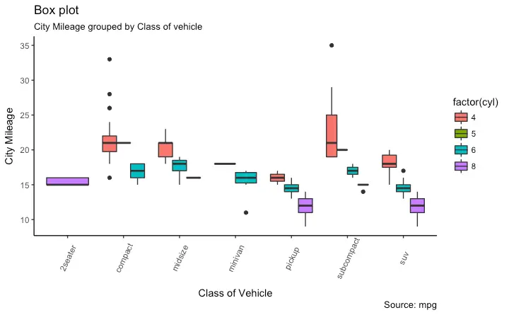
The best that I can find is this (link, link), which separates based on cylinder count, but does not make the x-axis labels.

My example code is this:

#reproducible
set.seed(2372064)

#data (I'm used to reading my own, not using built-in)
data(mtcars)
attach(mtcars)

#impose factors as factors
fact_idx <- c(2,8:11)
for(i in fact_idx){
     mtcars[,i] <- as.factor(mtcars[,i])
}

#boxplot
p <- ggplot(mtcars, aes(gear, mpg, fill=cyl)) + 
     geom_boxplot(notch = TRUE)  
p

The plot this gives is:

enter image description here

How do I make the x-axis lables indicate both gears and cylinders?

In jmp I get this:
enter image description here

1201ProgramAlarm
  • 32,384
  • 7
  • 42
  • 56
EngrStudent
  • 1,924
  • 31
  • 46
  • You would do this in ggplot using facets. It would be better if you provided a [reproducible example](http://stackoverflow.com/questions/5963269/how-to-make-a-great-r-reproducible-example) with sample input if you really want a more precise answer. Otherwise the question really is too broad. – MrFlick May 03 '17 at 15:46
  • Here's a start: `ggplot(mtcars, aes(x = factor(gear), y = mpg))+ geom_boxplot()+ facet_wrap(~cyl, strip.position = 'bottom')` – bouncyball May 03 '17 at 16:31
  • 1
    You'll also want to add `+ theme(strip.placement="outside")` to @bouncyball's code. – eipi10 May 03 '17 at 17:06
  • Unfortunately, there's not an easy way to get nested facets if you have two facetting variables. For example, `ggplot(mtcars, aes(x = factor(gear), y = mpg))+ geom_boxplot()+ facet_grid(.~cyl+vs, switch="x") + theme(strip.placement="outside")`. In this case, we'd like a spanning facet for `cyl` (as in your example using jmp), but the `cyl` value is instead repeated for each value of `vs`. In addition, the `cyl` facet is above the `vs` facet, rather than below it. – eipi10 May 03 '17 at 17:13
  • You can hack the underlying grobs as in [the answers to this SO question](http://stackoverflow.com/questions/40732543/seeking-workaround-for-gtable-add-grob-code-broken-by-ggplot-2-2-0) or [ths one](http://stackoverflow.com/questions/40316169/nested-facets-in-ggplot2-spanning-groups), but it's a bit of a pain if you want something that will work in more general situations. – eipi10 May 03 '17 at 17:15
  • @bouncyball - I get an error with this of "Error in facet_wrap(~day_of_week, strip.position = "bottom") : unused argument (strip.position = "bottom")" – EngrStudent May 03 '17 at 17:30
  • 2
    Are you using the latest version of `ggplot2`? I think `strip.position` was added in version 2.2. – eipi10 May 03 '17 at 17:36
  • 1
    an attempt here http://seshadri.me/rnotes/2017/06/18/Variability-Charts-in-R.html – Stéphane Laurent Oct 19 '17 at 10:10
  • @StéphaneLaurent - you could put that as an answer. – EngrStudent Jul 14 '19 at 19:18

1 Answers1

8

You could use R-package VCA which comes with function varPlot implementing variability charts similar to JMP. There are multiple examples provided in the help. Your example would look like this:

library(VCA)
dat <- mtcars[order(mtcars$cyl, mtcars$gear),]

# default
varPlot(mpg~cyl/gear, dat)    
# nicely formatted
varPlot(mpg~cyl/gear, dat, 
        BG=list(var="gear", col=paste0("gray", c(90,80,70)), 
                col.table=T),
        VLine=list(var="cyl"), Mean=NULL,
        MeanLine=list(var=c("cyl", "gear"), col=c("blue", "orange"),
                      lwd=c(2,2)),
        Points=list(pch=16, cex=1))
user82372
  • 81
  • 1
  • 2