0

I tried with lots of similar questions regarding pop-up resize, but what I need is that the pop-up should be resizable between min-width: 500px to max-width :900px (without using width in percentage) based of browser resize such that the pop-up comes at center of screen.

Code snippet:

 <html>
 <head>
 <style type="text/css">
 .pop-box {
     position: absolute; 
     top : 25%;
     left: 15%;
     min-width: 500px; 
     //width : 70%;
     width: 900px; 
     min-height : 200px;
     max-height: 500px;
     border: 5px solid black;
 }
 </style>
 </head>
     <div class='pop-box'></div>
 </html>

Note:
1. The changes should to be done only in CSS (@media query Or CSS change).
2. Thewidth: 900px; & position: absolute; in .pop-box{...} should not be changed.
3. Thewidth of .pop-box{..} should not be in percentage.


Expected Results:
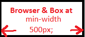
1) If Browser & Box have same width then, the box should look like as below:

Image 1


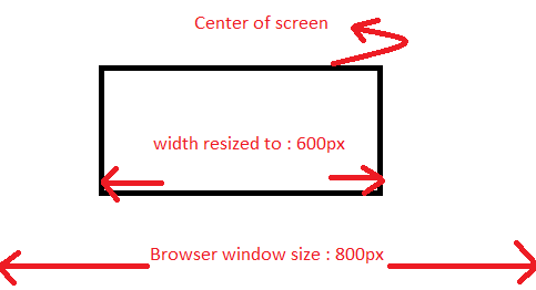
2) If Browser is resized(streched) to around 800px then Box(around 600px) should be at center of screen as below:

Image 2


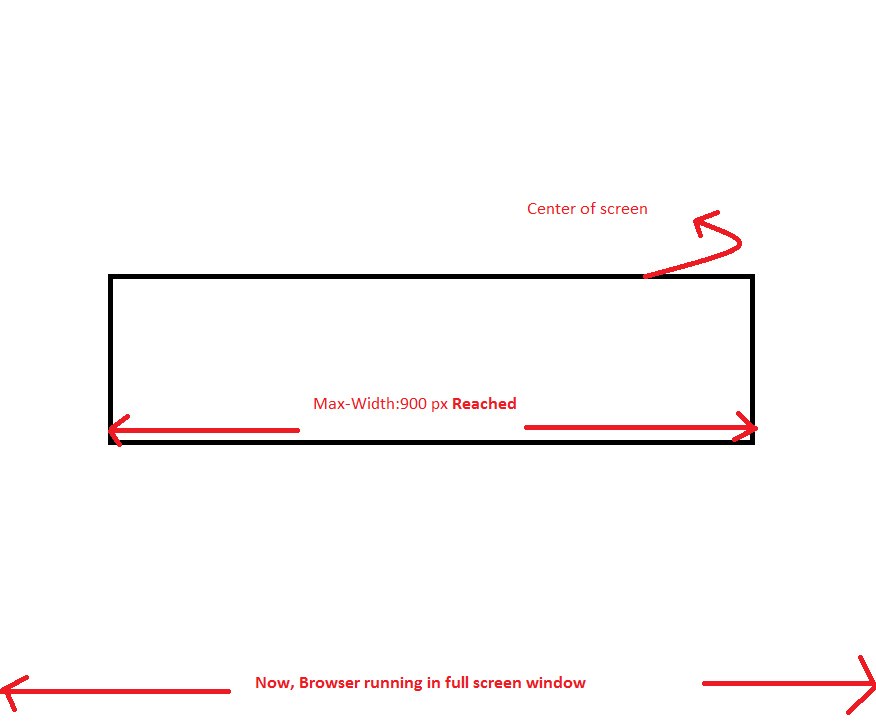
3) If Browser is resized(streched) to full screen then Box of Full size width:900px should be at center of screen as below: enter image description here


Thanks.

Rohit Gaikwad
  • 3,677
  • 3
  • 17
  • 40
  • Have you tried to use media queries? What were the results? This should be easily done with media queries if I'm understanding the issue correctly, but I can't tell without seeing what you've tried with them first. – Joseph Marikle May 17 '17 at 13:38
  • I could be wrong but css and resizing only works on page load. You would need javascript if you want the css to work on resize – Keith May 17 '17 at 13:39
  • Joseph Marikle+ I have not tried with media queries, but I think it should solve this problem. – Rohit Gaikwad May 17 '17 at 13:40
  • maybe the answers in here can help you http://stackoverflow.com/questions/10075524/sizing-div-based-on-window-width – Edwin May 17 '17 at 13:42
  • Keith+ Using width in percentage, it works almost fine! I guess media queries would make it responsive. – Rohit Gaikwad May 17 '17 at 13:42

1 Answers1

0

You have to subtract the edge

.pop-box {
   position: absolute;
   top: 0;left: 0;bottom: 0;right: 0;
   margin: auto;
   width: 890px;
   height: 490px;
   border: 5px solid black;
   background: orange;
 }
 @media (max-width:600px) and (min-width:0) {
   .pop-box {
     background: green;
     width: 490px;
     height: 190px;
   }
 }
 @media (max-width:800px) and (min-width:601px) {
   .pop-box {
     background: red;
     width: 590px;
     height: 90px;
   }
 }
<div class='pop-box'></div>
alessandrio
  • 4,282
  • 2
  • 29
  • 40