2

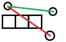
There's a table with three columns, the first and the last are fixed and the middle one should be fluid.

The problem - inside of the middle column there's text with nowrap and it prevents it from being fluid.

How that could be done?

How it looks on wide page (correct behaviour):

enter image description here

How it should look on narrow page:

enter image description here

How it actually looks on narrow page (incorrect behaviour, see scrollbar):

image

The code https://jsfiddle.net/8c9msa71/

td {
  border: 1px solid black;
}

.fluid {
  white-space: nowrap;
  overflow: hidden;
  text-overflow: ellipsis;
}
<table>
  <tr>
    <td>first</td>
    <td class="fluid">very-very-very-very-very-very-long-second-text</td>
    <td>third</td>
  </tr>
</table>
PEHLAJ
  • 9,980
  • 9
  • 41
  • 53
Alexey Petrushin
  • 1,311
  • 3
  • 10
  • 24

2 Answers2

4

you can do it by adding a div

td { border: 1px solid black; }
.fluid { position: relative; width: 70%;}
.fluid div {
  white-space: nowrap; 
  overflow: hidden;
  text-overflow: ellipsis;
  position: absolute;
  left: 5px;
  right: 5px;
  top: 0;
}
<table width="100%">
  <tr>
    <td>first</td>
    <td class="fluid">
    <div>very-very-very-very-very-very-long-second-text</div>
    </td>
    <td>third</td>
  </tr>
</table>
Milad Dehghan
  • 307
  • 3
  • 16
1

I noticed the solution to add a div.

If you don't want to or need to add a div, you could use max-width.

Explanation: Your first problem is that none of your elements has a width attribute set. To start with I would set a max-width of your "very-very-long-second-text". For example you can add max-width: 60vw; to your .fluid. If you're not familiar with the vw syntax, read more here: https://www.w3.org/TR/css3-values/#vw

By only adding this, you'll be almost there. You'll still have one problem left: On very small devices / resolutions, you notice that your third table-data, <td></td> will disappear out of visible area.

Instead of collapsing ALL the content, I recommend using display: inline-block; on your table data <td></td>. What this does is that it will display your table data inline as long as they have enough space to be inline. In addition a small part of the information will be visible, instead of the result of NO information visible at all. When the available area becomes smaller (i.e. resizing the window), they will start jumping down one by one.

Full CSS:

td { 
  border: 1px solid black; 
  display: inline-block;
}

.fluid { 
  max-width: 60vw; 
  white-space: nowrap; 
  overflow: hidden; 
  text-overflow: ellipsis; 
}
chrisv
  • 724
  • 6
  • 18