5

I have found the following links... but it still doesn't help me...

how to make nested flexboxes work
Height 100% on flexbox column child
How to make flexbox children 100% height of their parent?

I need a full page that is responsive, like the following image: full page 
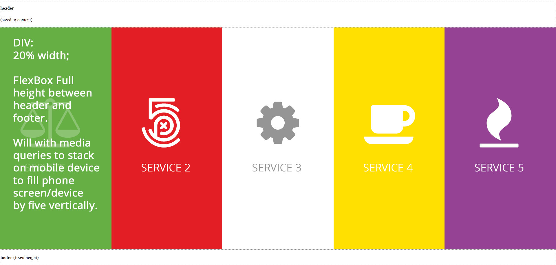
With header and footer and the middle 5 columns filling the height equally in the remaining space, and then when I do media queries, fill the screen of the mobile device like so:

mobile view

Here's the code I have so far...

<!DOCTYPE html PUBLIC "-//W3C//DTD XHTML 1.0 Transitional//EN" "http://www.w3.org/TR/xhtml1/DTD/xhtml1-transitional.dtd">
<html xmlns="http://www.w3.org/1999/xhtml">
<head>
<meta http-equiv="Content-Type" content="text/html; charset=utf-8" />
<title>Untitled Document</title>
<style type="text/css">
html,
body {
  height: 100%;
  margin: 0
}

.box {
  display: flex;
  flex-flow: column;
  height: 100%;
}

.box .row {
  border: 1px dotted grey;
}

.box .row.header {
  flex: 0 1 auto;
  /* The above is shorthand for:
  flex-grow: 0,
  flex-shrink: 1,
  flex-basis: auto
  */
}

.box .row.content {
  flex: 1 1 auto;
}

.box .row.footer {
  flex: 0 1 40px;
}

.yellow-back {
    background: #ffe001;
}

.red-back {
    background: #e31e25;
}

.green-back {
    background: #66af45;
}

.purple-back {
    background: #954294;
}

.containerFull                                  { position: relative; width: 100%; margin: 0 auto; padding: 0;}
.containerFull .column,
.containerFull .columns                         { float: left; display: inline; margin-left: 0px; margin-right: 0px; }
.containerFull .one-fifth.column                { width: 20%; }
</style>
</head>

<body>

<div class="box">

  <div class="row header">
    <p><b>header</b>
      <br />
      <br />(sized to content)</p>
  </div>

    <div class="row content">

        <div class="containerFull">    
            <div class="one-fifth column green-back">Here</div>
            <div class="one-fifth column red-back">Here</div>
            <div class="one-fifth column">Here</div>
            <div class="one-fifth column yellow-back">Here</div>
            <div class="one-fifth column purple-back">Here</div>
        </div><!-- ContainerFull -->

    </div>

  <div class="row footer">
    <p><b>footer</b> (fixed height)</p>
  </div>
</div>

</body>
</html>

html,
body {
  height: 100%;
  margin: 0
}

.box {
  display: flex;
  flex-flow: column;
  height: 100%;
}

.box .row {
  border: 1px dotted grey;
}

.box .row.header {
  flex: 0 1 auto;
  /* The above is shorthand for:
      flex-grow: 0,
      flex-shrink: 1,
      flex-basis: auto
      */
}

.box .row.content {
  flex: 1 1 auto;
}

.box .row.footer {
  flex: 0 1 40px;
}

.yellow-back {
  background: #ffe001;
}

.red-back {
  background: #e31e25;
}

.green-back {
  background: #66af45;
}

.purple-back {
  background: #954294;
}

.containerFull {
  position: relative;
  width: 100%;
  margin: 0 auto;
  padding: 0;
}

.containerFull .column,
.containerFull .columns {
  float: left;
  display: inline;
  margin-left: 0px;
  margin-right: 0px;
}

.containerFull .one-fifth.column {
  width: 20%;
}
<div class="box">

  <div class="row header">
    <p><b>header</b>
      <br />
      <br />(sized to content)</p>
  </div>

  <div class="row content">

    <div class="containerFull">
      <div class="one-fifth column green-back">Here</div>
      <div class="one-fifth column red-back">Here</div>
      <div class="one-fifth column">Here</div>
      <div class="one-fifth column yellow-back">Here</div>
      <div class="one-fifth column purple-back">Here</div>
    </div>
    <!-- ContainerFull -->

  </div>

  <div class="row footer">
    <p><b>footer</b> (fixed height)</p>
  </div>
</div>
Community
  • 1
  • 1
JP Greeff
  • 63
  • 1
  • 1
  • 6
  • I forgot to add that I want the background image or color to fill the space... Thank you! – JP Greeff May 19 '17 at 17:35
  • Maybe this post could help you. [Content within div won't fill available space without specifying height](http://stackoverflow.com/questions/43922077/content-within-div-wont-fill-available-space-without-specifying-height/43922584#43922584), Check that you are setting your body´s height to 100vh, then setting the rest of your contents height will be easier. Also use a CSS reset file, to avoid weird behaviours. – Omar Yafer May 19 '17 at 17:38

2 Answers2

11

In addition to Michael Coker's answer, if you go all the way with Flexbox, you can cut down both your markup and CSS quite much and get this amazing result.

I also included the background image and media query you commented/asked about just to show how simple this can be done.

Made some notes in the CSS. When it comes to the header and footer, you can give them a height if you want, but is not needed for this to work, so I left them out so one can see how Flexbox excel in distributing the content...wish I had this technique 20 years ago :)

html, body {
  margin: 0;
}
.box {
  display: flex;
  flex-direction: column;
  height: 100vh;          /* instead of using 100% all over, use viewport units once */
  background-size: cover;
  background: black url(http://lorempixel.com/500/500/nature/4/) no-repeat center;
}
.box .row.content,
.content .one-fifth.column {
  flex: 1;                /* fill the space equal, no matter row or column direction */
  display: flex;
}

.box .row.header,
.box .row.footer { color: white; }
.box .row.content { background: #fff; }
.yellow-back { background: #ffe001; }
.red-back { background: #e31e25; }
.green-back { background: #66af45; }
.purple-back { background: #954294; }

@media screen and (max-width: 600px) {
  /* smaller screens */
  .box .row.content {
    flex-direction: column;   /* by simply swap direction it work on smaller screen */
  }
}
<div class="box">
  <div class="row header">
    <p><b>header</b><br /><br />(sized to content)</p>
  </div>

  <div class="row content">
    <div class="one-fifth column green-back">Here</div>
    <div class="one-fifth column red-back">Here</div>
    <div class="one-fifth column">Here</div>
    <div class="one-fifth column yellow-back">Here</div>
    <div class="one-fifth column purple-back">Here</div>
  </div>

  <div class="row footer">
    <p><b>footer</b> (fixed height)</p>
  </div>
</div>
Asons
  • 84,923
  • 12
  • 110
  • 165
  • @lgson This is awesome and works like a charm! Now... all I need is the icon (PNG) and the heading below, to stay in the middle of the flex height box, and then when on a mobile device, the icon must shift to the left and the heading to the right of the icon. Do-able? – JP Greeff Aug 11 '17 at 12:25
  • 1
    @LGSon Perfect! I'm not gay, but I think I might have to marry you! Thank you! – JP Greeff Aug 11 '17 at 17:40
2

I would make the column section a flex layout, too. You can set .content and .containerFull to display: flex, then .containerFull will "stretch" to fill the height of .content, and then you can use flex-basis on the columns to control the width.

html,
body {
  height: 100%;
  margin: 0
}

.box {
  display: flex;
  flex-flow: column;
  height: 100%;
}

.box .row {
  border: 1px dotted grey;
}

.box .row.header {
  flex: 0 1 auto;
  /* The above is shorthand for:
  flex-grow: 0,
  flex-shrink: 1,
  flex-basis: auto
  */
}

.box .row.content {
  display: flex;
}

.box .row.content {
  flex: 1 1 auto;
}

.containerFull {
  display: flex;
}

.box .row.footer {
  flex: 0 1 40px;
}

.yellow-back {
  background: #ffe001;
}

.red-back {
  background: #e31e25;
}

.green-back {
  background: #66af45;
}

.purple-back {
  background: #954294;
}

.containerFull {
  position: relative;
  width: 100%;
  margin: 0 auto;
  padding: 0;
}

.containerFull .column,
.containerFull .columns {
  margin-left: 0px;
  margin-right: 0px;
}

.containerFull .one-fifth.column {
  flex-basis: 20%;
}
<div class="box">

  <div class="row header">
    <p><b>header</b>
      <br />
      <br />(sized to content)</p>
  </div>

    <div class="row content">

        <div class="containerFull">    
            <div class="one-fifth column green-back">Here</div>
            <div class="one-fifth column red-back">Here</div>
            <div class="one-fifth column">Here</div>
            <div class="one-fifth column yellow-back">Here</div>
            <div class="one-fifth column purple-back">Here</div>
        </div><!-- ContainerFull -->

    </div>

  <div class="row footer">
    <p><b>footer</b> (fixed height)</p>
  </div>
</div>
Michael Coker
  • 52,626
  • 5
  • 64
  • 64
  • Upvoted yours, I just had to post an answer of my own, as this is a classic question where flexbox do really good with extremely little code and markup :) – Asons May 19 '17 at 19:31