3

I don't understand the logic of vertical alignment of inline-grid elements.

The 2nd example works fine (see the code), but the 1st is not. Why? And how I could fix it, as shown below in screenshot?
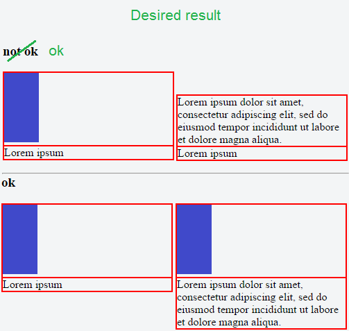
enter image description here

Also note.

Instead of using display: inline-grid, we can use display: inline-flex + flex-direction: column with the same result.

Thus, if the task could not be achieved with inline-grid, probably it could be solved using inline-flex.

For ones, who prefer jsFiddle

body {
 width: 500px;
}

.inline-grid {
 display: inline-grid;
 width: 49%;
}

div {
 border: 1px solid red;
}
<h3>not ok</h3>

<div class="inline-grid">
<div><img src="http://i.imgur.com/joY41yV.png"></div>
<div>Lorem ipsum</div>
</div>

<div class="inline-grid">
<div>Lorem ipsum dolor sit amet, consectetur adipiscing elit, sed do eiusmod tempor incididunt ut labore et dolore magna aliqua.</div>
<div>Lorem ipsum</div>
</div>

<hr>

<h3>ok</h3>

<div class="inline-grid">
<div><img src="http://i.imgur.com/joY41yV.png"></div>
<div>Lorem ipsum</div>
</div>

<div class="inline-grid">
<div><img src="http://i.imgur.com/joY41yV.png"></div>
<div>Lorem ipsum dolor sit amet, consectetur adipiscing elit, sed do eiusmod tempor incididunt ut labore et dolore magna aliqua.</div>
</div>
john c. j.
  • 725
  • 5
  • 28
  • 81

2 Answers2

4

The vertical-align property applies to inline-level and table-cell elements. The default value is baseline. Because you're using display: inline-grid, this rule is factoring into your code.

Override the default with vertical-align: bottom.

.inline-grid {
  display: inline-grid;
  width: 49%;
  vertical-align: bottom; /* new */
}

revised demo

More info:


UPDATE (based on comments)

The only problem, is that vertical-align: bottom (as well as other values of vertical align) also affects second example. What I actually want is to align items according to the middle red line. (As shown in my screenshot). I don't know, maybe it just impossible?

Yes, it's possible. Here's a revised Grid solution:

revised demo

.grid {
  display: grid;
  grid-template-columns: 1fr 1fr;
  grid-template-rows: auto auto;
  grid-auto-flow: column;
  grid-gap: 5px;
}

div > div { border: 1px solid red; }
img       { vertical-align: bottom; }
body      { width: 500px; }
<div class="grid">
  <div><img src="http://i.imgur.com/joY41yV.png"></div>
  <div>Lorem ipsum</div>
  <div style="align-self: end;"><code>align-self: end</code> || Lorem ipsum dolor sit amet, consectetur adipiscing elit, sed do eiusmod tempor incididunt ut labore et dolore magna aliqua.</div>
  <div>Lorem ipsum</div>
</div>

<hr>

<div class="grid">
  <div><img src="http://i.imgur.com/joY41yV.png"></div>
  <div style="align-self: start"><code>align-self: start</code></div>
  <div><img src="http://i.imgur.com/joY41yV.png"></div>
  <div>Lorem ipsum dolor sit amet, consectetur adipiscing elit, sed do eiusmod tempor incididunt ut labore et dolore magna aliqua.</div>
</div>

Note: Consider removing the div wrappers around the images. They may not be necessary. I only left them in my answer because they are needed for properly rendering the (demo?) borders. Once you remove those wrappers, you can also get rid of the vertical-align rule in the CSS.

Michael Benjamin
  • 346,931
  • 104
  • 581
  • 701
1

You have to add vertical-align: bottom;

body {
    width: 500px;
}

.inline-grid {
    display: inline-grid;
    width: 49%;
    vertical-align: bottom;
}

div {
    border: 1px solid red;
}

Here the JSFIDDLE : https://jsfiddle.net/4sh9oo5k/

Rémy Testa
  • 897
  • 1
  • 11
  • 24
  • 1
    Thanks. I upvoted for justice, but I also should note that this answer haven't any differences from Michael's. – john c. j. May 29 '17 at 15:14