I have a single row with 20 or so columns of varying height (due to different amounts of text in them), like this:
<div class="row container-fluid nopadding">
    <div class="col-lg-3 col-md-4 col-sm-6 col-xs-12 ">
        <h1>title1</h1>
        <p>asdasdasdasdasd</p>
    </div>
    <div class="col-lg-3 col-md-4 col-sm-6 col-xs-12">
         <h1>title2</h
         <p>asdasdasddddasdasdadasdasdasdasdasdasdasdasdasdasdasdasdddd</p>
    </div>
    <div class="col-lg-3 col-md-4 col-sm-6 col-xs-12">
        <h1>title3</h1>
        <p>asdasdasdddaasdasdasd</p>
    </div>
    <div class="col-lg-3 col-md-4 col-sm-6 col-xs-12 ">
        <h1>title4</h1>
        <p>asdasdasdasdasdasdasdasdasd</p>
   </div>
   <!---etc etc...--->
</div>
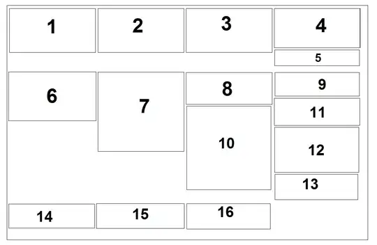
The way they show up right now is:

The way I would LIKE them to stack is without the vertical gaps:

OR alternatively as balanced length columns:

How could I go about achieving this? Is the bootstrap col good for it?