I have been asked to find if there is a quick way to force our mobile web application to be displayed on desktop web browsers. This is a stopgap-measure until we have the time and resources to finish work on responsively rendering correctly on larger-than-mobile devices.
The first thing I thought of for desktop-ifying our mobile webapp was to pull the mobile site into an iFrame and force a width and height (414x736 for now). I was hoping that by doing so, the CSS media selections would honor a 414px width, but that is not happening.
If I dump the width of the viewport to the console, it is in fact showing a width of 414px, but as you will see from the screenshots attached it's clear that the CSS media selections are not honoring a 414px width.
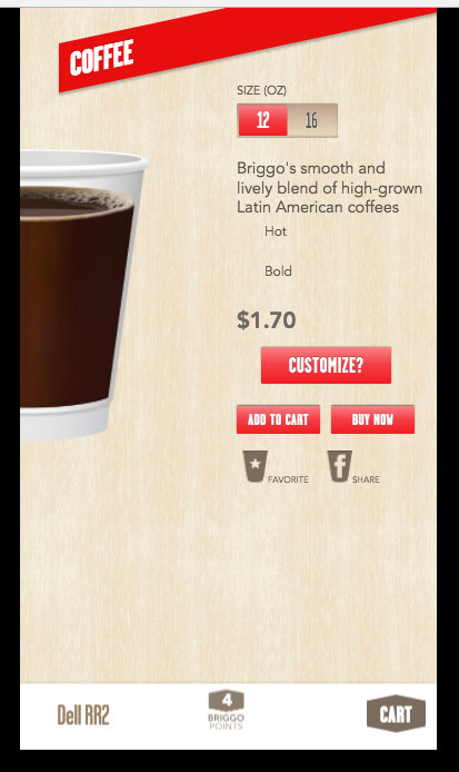
Here is what we want to see (this is just a screenshot of Chrome's debugger in iPhone 6 device mode):

Here is that same view rendered into an iFrame whose width and height have been set to 414 and 736 respectively. The frame size is perfect and functions just as I want, but the CSS media selections are borked:
