3

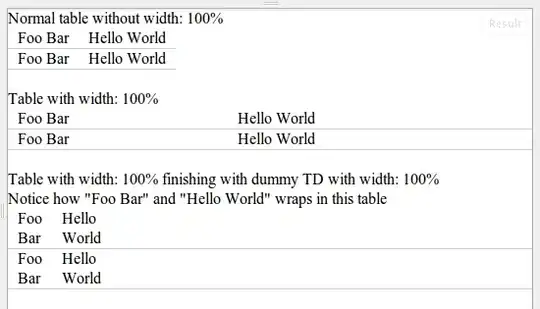
On our site we have tables containing data. We like the column widths we get with a normal table, but we like the border-bottom of tds to stretch the entire width of the page like we get with CSS: table { width:100% }, as can be seen on a demo table widths page, which renders like this:

redered image

Is it possible to achieve the same column widths as with a normal (non-width-100%) table in a table where the border-bottom stretches the entire width?

And no, td { white-space: nowrap } in combination with an extra width: 100% td (see the link above) is not good, as sometimes the tds are long and so we want the tds to wrap exactly like in a normal table.

We need a solution that works in at least IE6-8 + FF.

Btw, is there a better way (tm) of showing HTML snippets than linking to an external page? I can show just source, but having HTML rendered too is very illustrative.

This was originally posted on Webmasters, but following a suggestion there, I now (re)post it here.

Community
  • 1
  • 1
Peter V. Mørch
  • 13,830
  • 8
  • 69
  • 103

4 Answers4

3

I finally figured it out.

My first few attempts dealt with floating <td>s and <tr>s, but apparently I was on the right track but had the wrong element.

I think what you want to do is to float the <tbody>. The <table> will still be 100% width, so it will stretch the whole width of the page, but the <tbody> inside of it will act as a container for everything else, and floating it will release it from the shackles of the size of its <table> container width.

The downside of this is that you won't be able to use <thead> or <tfoot> elements, because you will no longer have any way to align them with the <tbody> content.

Try this out:

table {
  width: 100%;
  border: 1px #000 solid;
}

tbody {
  float: left;
}

td {
  border: 1px #000 solid;
}
AgentConundrum
  • 20,288
  • 6
  • 64
  • 99
  • I can see how this makes the table have 100% width. But the border-bottom of the `td`s are not 100% width, which is what we're after. – Peter V. Mørch Dec 14 '10 at 00:36
  • @Peter: Right, sorry. I lost sight of the forest for the trees. I was so focused on making the cells the right size that I forgot the rows had to be 100% as well. The only thing I can give you is my original "float the ``" plan, but it's fragile as hell. I don't think I can help you, sorry. – AgentConundrum Dec 14 '10 at 00:48
1

You can use the new CSS properties min-width and max-width to bound the columns sizes without setting them explicitly.

To get a proportional version of what would be rendered when the table's width is not specified, I think you'd have to let it render normally (remove your table width setting) and then use javascript to read the column widths and resize.

Pulled this example of using jQuery to syncronize the column widths of two tables from another question:

$("#t1").width($("#t2").width());
$("#t1 tr td").each(function (i){
       $(this).width($($("#t2 tr:first td")[i]).width());
})

Should be a pretty good starting point for scaling your column widths.

Community
  • 1
  • 1
Brad Mace
  • 27,194
  • 17
  • 102
  • 148
  • Thanks for your answer, bemace. The tables contain dynamic content, so I have no idea what to set `min-width` and `max-width` to in the general case. The "render-normally-then-read-widths-then-resize" approach has all kinds of problems since this is used in very many places in our app: Window resize handling needs more javascript, just like ajax updates or mouseover effects cause table "resizes" too. It can be done. But isn't trivial. Hence question here! ;-) – Peter V. Mørch Dec 13 '10 at 23:46
1

This is pretty ugly and not exactly what you asked for, but it works in Firefox and appears to get the same gist...

<html>
<head>
<style type="text/css">
td{background-color:blue;}
div{border:1px solid red;position:absolute;width:100%;}
</style>
</head>
<body>

<table>
<tr>
<td>asdf<div></div></td><td>hello blah blah</td>
</tr>
<tr>
<td>lorem ipsum dolor si amet</td><td>testing</td>
</tr>

</body>
</html>
joelt
  • 2,672
  • 2
  • 24
  • 32
  • I posted an [HTML version](http://www.morch.com/download/tableWidth/tableWidthWithDiv.html) (where I've setup margins etc. carefully) and it [looks great in FF](http://www.morch.com/download/tableWidth/divTableWidth-FF.png), as you point out. It [looks horrible in IE](http://www.morch.com/download/tableWidth/divTableWidth-IE.png), though. Thanks for your suggestion! – Peter V. Mørch Dec 14 '10 at 07:49
0

I was looking for a similar answer to this question, however I don't understand what you mean by

And no, td { white-space: nowrap } in combination with an extra width: 100% td (see the link above) is not good, as sometimes the tds are long and so we want the tds to wrap exactly like in a normal table.

But anyway, I found a solution to my problem. Not sure if it can be used here, but it solved my problem. Maybe it can be helpful to others.

I didn't add in another td. I just applied 100% to every last td with content. So I could add a class to every last td to do that, or I could use the last-child selector to do it for me.

Something like:

table
{
  width:auto;
}

table tr td:last-child
{
  width:100%;
}
cowgirl
  • 51
  • 3
  • The problem with adding another `td` or setting `td:last-child { width:100% }` is that this renders differently from a "normal table". Compare the first third of my screenshot in OP with the last third. I want the rendering/spacing from the first third of the screenshot, but with underlines going accross the entire page width. – Peter V. Mørch Mar 26 '14 at 04:09