I'm trying to create a seating chart app that looks something like this:
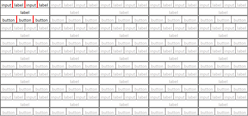
I'm not sure if it can be done with all Bootstrap, because I read that BS "container" class cannot be nested. Also, I'd really like it if I could make the entire chart automatically stretch to both the full width and height of the viewport. I'm currently doing it with a 5x5 html table with a BS grid in each td. I'm currently having problems getting the "gutter" spacing to look right (red bars in diagram). I'm also having trouble getting all of the elements to fit inside the "row" (BS "row" class).

<td style="white-space:nowrap">
        <div class="row">
            <div class="col-xs-3"><input id="39638" type="text" value=""></div><div class="col-xs-3"><label id="39638pc"><?php echo $part['39638'] ?></label></div>
            <div class="col-xs-3"><input id="39638bt" type="text" value=""></div><div class="col-xs-3"><label id="39638bc"><?php echo $part['39638'] ?></div></label></div>
        </div>
        <div class="row">
            <div class="col-xs-12"><label class="name-label">Opas</label></div>
        </div>
        <div class="row">
            <div class="col-xs-4"><button class="btn btn-primary" type="button" onclick="participate(39638)">Good</button></div>
            <div class="col-xs-4"><button class="btn btn-primary" type="button" onclick="behave(39638)">Bad</button></div>
            <div class="col-xs-4"><button class="btn btn-primary" type="button" onclick="comelate(39638)">Late</button></div>
        </div></td>
In style.css:
    table {
    font-family: arial, sans-serif;
    border-collapse: collapse;
    width: 100%;
}

td, th {
    border: 1px solid #dddddd;
    text-align: left;
    /* padding: 8px; */
}

.row .col-xs-3 {
    display: inline-block;
    float: none;
    padding-left: 5px;
    padding-right: 5px;
}

.row .col-xs-4 {
    display: inline-block;
    float: none;
    padding: 0;
}

.row .col-xs-3 input, .row .col-xs-3 label {
    width: 100%;
    text-align: center;
    background-color: pink;
}

.row .col-xs-4 button {
    width: 95%;
    padding: 0;
    margin: 0;
}

td .row {
    margin: 0px;
}

.name-label {
    width: 100%;
    font: bold 14px calibri, sans-serif;
    text-align: center;
    margin: 0;
    padding: 0;
}
