This can be done by editing the default style of the AppBarButton.
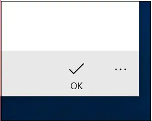
First, generate the default style using Blend, then locate the Compact visual state and change the Visibility target value form Collapsed to Visible. This way no matter what the IsCompact value is, the label will always be visible.
<Style x:Key="FullHeightAppBarButtonStyle"
TargetType="AppBarButton">
<Setter Property="Background"
Value="{ThemeResource AppBarButtonBackground}" />
<Setter Property="Foreground"
Value="{ThemeResource AppBarButtonForeground}" />
<Setter Property="BorderBrush"
Value="{ThemeResource AppBarButtonBorderBrush}" />
<Setter Property="HorizontalAlignment"
Value="Left" />
<Setter Property="VerticalAlignment"
Value="Top" />
<Setter Property="FontFamily"
Value="{ThemeResource ContentControlThemeFontFamily}" />
<Setter Property="FontWeight"
Value="Normal" />
<Setter Property="Width"
Value="68" />
<Setter Property="UseSystemFocusVisuals"
Value="True" />
<Setter Property="AllowFocusOnInteraction"
Value="False" />
<Setter Property="Template">
<Setter.Value>
<ControlTemplate TargetType="AppBarButton">
<Grid x:Name="Root"
BorderBrush="{TemplateBinding BorderBrush}"
BorderThickness="{TemplateBinding BorderThickness}"
Background="{TemplateBinding Background}"
MaxWidth="{TemplateBinding MaxWidth}"
MinWidth="{TemplateBinding MinWidth}">
<Grid.Resources>
<Style x:Name="LabelOnRightStyle"
TargetType="AppBarButton">
<Setter Property="Width"
Value="NaN" />
</Style>
</Grid.Resources>
<VisualStateManager.VisualStateGroups>
<VisualStateGroup x:Name="ApplicationViewStates">
<VisualState x:Name="FullSize" />
<VisualState x:Name="Compact">
<Storyboard>
<ObjectAnimationUsingKeyFrames Storyboard.TargetProperty="Visibility"
Storyboard.TargetName="TextLabel">
<DiscreteObjectKeyFrame KeyTime="0"
Value="Visible" />
</ObjectAnimationUsingKeyFrames>
</Storyboard>
</VisualState>
<VisualState x:Name="LabelOnRight">
<Storyboard>
<ObjectAnimationUsingKeyFrames Storyboard.TargetProperty="Margin"
Storyboard.TargetName="Content">
<DiscreteObjectKeyFrame KeyTime="0"
Value="12,14,0,14" />
</ObjectAnimationUsingKeyFrames>
<ObjectAnimationUsingKeyFrames Storyboard.TargetProperty="MinHeight"
Storyboard.TargetName="ContentRoot">
<DiscreteObjectKeyFrame KeyTime="0"
Value="{ThemeResource AppBarThemeCompactHeight}" />
</ObjectAnimationUsingKeyFrames>
<ObjectAnimationUsingKeyFrames Storyboard.TargetProperty="(Grid.Row)"
Storyboard.TargetName="TextLabel">
<DiscreteObjectKeyFrame KeyTime="0"
Value="0" />
</ObjectAnimationUsingKeyFrames>
<ObjectAnimationUsingKeyFrames Storyboard.TargetProperty="(Grid.Column)"
Storyboard.TargetName="TextLabel">
<DiscreteObjectKeyFrame KeyTime="0"
Value="1" />
</ObjectAnimationUsingKeyFrames>
<ObjectAnimationUsingKeyFrames Storyboard.TargetProperty="TextAlignment"
Storyboard.TargetName="TextLabel">
<DiscreteObjectKeyFrame KeyTime="0"
Value="Left" />
</ObjectAnimationUsingKeyFrames>
<ObjectAnimationUsingKeyFrames Storyboard.TargetProperty="Margin"
Storyboard.TargetName="TextLabel">
<DiscreteObjectKeyFrame KeyTime="0"
Value="8,15,12,17" />
</ObjectAnimationUsingKeyFrames>
</Storyboard>
</VisualState>
<VisualState x:Name="LabelCollapsed">
<Storyboard>
<ObjectAnimationUsingKeyFrames Storyboard.TargetProperty="MinHeight"
Storyboard.TargetName="ContentRoot">
<DiscreteObjectKeyFrame KeyTime="0"
Value="{ThemeResource AppBarThemeCompactHeight}" />
</ObjectAnimationUsingKeyFrames>
<ObjectAnimationUsingKeyFrames Storyboard.TargetProperty="Visibility"
Storyboard.TargetName="TextLabel">
<DiscreteObjectKeyFrame KeyTime="0"
Value="Collapsed" />
</ObjectAnimationUsingKeyFrames>
</Storyboard>
</VisualState>
<VisualState x:Name="Overflow">
<Storyboard>
<ObjectAnimationUsingKeyFrames Storyboard.TargetProperty="Visibility"
Storyboard.TargetName="ContentRoot">
<DiscreteObjectKeyFrame KeyTime="0"
Value="Collapsed" />
</ObjectAnimationUsingKeyFrames>
<ObjectAnimationUsingKeyFrames Storyboard.TargetProperty="Visibility"
Storyboard.TargetName="OverflowTextLabel">
<DiscreteObjectKeyFrame KeyTime="0"
Value="Visible" />
</ObjectAnimationUsingKeyFrames>
</Storyboard>
</VisualState>
<VisualState x:Name="OverflowWithToggleButtons">
<Storyboard>
<ObjectAnimationUsingKeyFrames Storyboard.TargetProperty="Visibility"
Storyboard.TargetName="ContentRoot">
<DiscreteObjectKeyFrame KeyTime="0"
Value="Collapsed" />
</ObjectAnimationUsingKeyFrames>
<ObjectAnimationUsingKeyFrames Storyboard.TargetProperty="Visibility"
Storyboard.TargetName="OverflowTextLabel">
<DiscreteObjectKeyFrame KeyTime="0"
Value="Visible" />
</ObjectAnimationUsingKeyFrames>
<ObjectAnimationUsingKeyFrames Storyboard.TargetProperty="Margin"
Storyboard.TargetName="OverflowTextLabel">
<DiscreteObjectKeyFrame KeyTime="0"
Value="38,0,12,0" />
</ObjectAnimationUsingKeyFrames>
</Storyboard>
</VisualState>
</VisualStateGroup>
<VisualStateGroup x:Name="CommonStates">
<VisualState x:Name="Normal">
<Storyboard>
<PointerUpThemeAnimation Storyboard.TargetName="OverflowTextLabel" />
</Storyboard>
</VisualState>
<VisualState x:Name="PointerOver">
<Storyboard>
<ObjectAnimationUsingKeyFrames Storyboard.TargetProperty="Background"
Storyboard.TargetName="Root">
<DiscreteObjectKeyFrame KeyTime="0"
Value="{ThemeResource AppBarButtonBackgroundPointerOver}" />
</ObjectAnimationUsingKeyFrames>
<ObjectAnimationUsingKeyFrames Storyboard.TargetProperty="BorderBrush"
Storyboard.TargetName="Root">
<DiscreteObjectKeyFrame KeyTime="0"
Value="{ThemeResource AppBarButtonBorderBrushPointerOver}" />
</ObjectAnimationUsingKeyFrames>
<ObjectAnimationUsingKeyFrames Storyboard.TargetProperty="Foreground"
Storyboard.TargetName="Content">
<DiscreteObjectKeyFrame KeyTime="0"
Value="{ThemeResource AppBarButtonForegroundPointerOver}" />
</ObjectAnimationUsingKeyFrames>
<ObjectAnimationUsingKeyFrames Storyboard.TargetProperty="Foreground"
Storyboard.TargetName="TextLabel">
<DiscreteObjectKeyFrame KeyTime="0"
Value="{ThemeResource AppBarButtonForegroundPointerOver}" />
</ObjectAnimationUsingKeyFrames>
<ObjectAnimationUsingKeyFrames Storyboard.TargetProperty="Foreground"
Storyboard.TargetName="OverflowTextLabel">
<DiscreteObjectKeyFrame KeyTime="0"
Value="{ThemeResource AppBarButtonForegroundPointerOver}" />
</ObjectAnimationUsingKeyFrames>
<PointerUpThemeAnimation Storyboard.TargetName="OverflowTextLabel" />
</Storyboard>
</VisualState>
<VisualState x:Name="Pressed">
<Storyboard>
<ObjectAnimationUsingKeyFrames Storyboard.TargetProperty="Background"
Storyboard.TargetName="Root">
<DiscreteObjectKeyFrame KeyTime="0"
Value="{ThemeResource AppBarButtonBackgroundPressed}" />
</ObjectAnimationUsingKeyFrames>
<ObjectAnimationUsingKeyFrames Storyboard.TargetProperty="BorderBrush"
Storyboard.TargetName="Root">
<DiscreteObjectKeyFrame KeyTime="0"
Value="{ThemeResource AppBarButtonBorderBrushPressed}" />
</ObjectAnimationUsingKeyFrames>
<ObjectAnimationUsingKeyFrames Storyboard.TargetProperty="Foreground"
Storyboard.TargetName="Content">
<DiscreteObjectKeyFrame KeyTime="0"
Value="{ThemeResource AppBarButtonForegroundPressed}" />
</ObjectAnimationUsingKeyFrames>
<ObjectAnimationUsingKeyFrames Storyboard.TargetProperty="Foreground"
Storyboard.TargetName="TextLabel">
<DiscreteObjectKeyFrame KeyTime="0"
Value="{ThemeResource AppBarButtonForegroundPressed}" />
</ObjectAnimationUsingKeyFrames>
<ObjectAnimationUsingKeyFrames Storyboard.TargetProperty="Foreground"
Storyboard.TargetName="OverflowTextLabel">
<DiscreteObjectKeyFrame KeyTime="0"
Value="{ThemeResource AppBarButtonForegroundPressed}" />
</ObjectAnimationUsingKeyFrames>
<PointerDownThemeAnimation Storyboard.TargetName="OverflowTextLabel" />
</Storyboard>
</VisualState>
<VisualState x:Name="Disabled">
<Storyboard>
<ObjectAnimationUsingKeyFrames Storyboard.TargetProperty="Background"
Storyboard.TargetName="Root">
<DiscreteObjectKeyFrame KeyTime="0"
Value="{ThemeResource AppBarButtonBackgroundDisabled}" />
</ObjectAnimationUsingKeyFrames>
<ObjectAnimationUsingKeyFrames Storyboard.TargetProperty="BorderBrush"
Storyboard.TargetName="Root">
<DiscreteObjectKeyFrame KeyTime="0"
Value="{ThemeResource AppBarButtonBorderBrushDisabled}" />
</ObjectAnimationUsingKeyFrames>
<ObjectAnimationUsingKeyFrames Storyboard.TargetProperty="Foreground"
Storyboard.TargetName="Content">
<DiscreteObjectKeyFrame KeyTime="0"
Value="{ThemeResource AppBarButtonForegroundDisabled}" />
</ObjectAnimationUsingKeyFrames>
<ObjectAnimationUsingKeyFrames Storyboard.TargetProperty="Foreground"
Storyboard.TargetName="TextLabel">
<DiscreteObjectKeyFrame KeyTime="0"
Value="{ThemeResource AppBarButtonForegroundDisabled}" />
</ObjectAnimationUsingKeyFrames>
<ObjectAnimationUsingKeyFrames Storyboard.TargetProperty="Foreground"
Storyboard.TargetName="OverflowTextLabel">
<DiscreteObjectKeyFrame KeyTime="0"
Value="{ThemeResource AppBarButtonForegroundDisabled}" />
</ObjectAnimationUsingKeyFrames>
</Storyboard>
</VisualState>
</VisualStateGroup>
<VisualStateGroup x:Name="InputModeStates">
<VisualState x:Name="InputModeDefault" />
<VisualState x:Name="TouchInputMode">
<VisualState.Setters>
<Setter Target="OverflowTextLabel.Padding"
Value="0,11,0,13" />
</VisualState.Setters>
</VisualState>
<VisualState x:Name="GameControllerInputMode">
<VisualState.Setters>
<Setter Target="OverflowTextLabel.Padding"
Value="0,11,0,13" />
</VisualState.Setters>
</VisualState>
</VisualStateGroup>
</VisualStateManager.VisualStateGroups>
<Grid x:Name="ContentRoot"
MinHeight="{ThemeResource AppBarThemeMinHeight}">
<Grid.ColumnDefinitions>
<ColumnDefinition Width="*" />
<ColumnDefinition Width="Auto" />
</Grid.ColumnDefinitions>
<Grid.RowDefinitions>
<RowDefinition Height="Auto" />
<RowDefinition Height="Auto" />
</Grid.RowDefinitions>
<ContentPresenter x:Name="Content"
AutomationProperties.AccessibilityView="Raw"
Content="{TemplateBinding Icon}"
Foreground="{TemplateBinding Foreground}"
HorizontalAlignment="Stretch"
Height="20"
Margin="0,14,0,4" />
<TextBlock x:Name="TextLabel"
Foreground="{TemplateBinding Foreground}"
FontSize="12"
FontFamily="{TemplateBinding FontFamily}"
Margin="2,0,2,6"
Grid.Row="1"
TextAlignment="Center"
TextWrapping="Wrap"
Text="{TemplateBinding Label}" />
</Grid>
<TextBlock x:Name="OverflowTextLabel"
Foreground="{TemplateBinding Foreground}"
FontSize="15"
FontFamily="{TemplateBinding FontFamily}"
HorizontalAlignment="Stretch"
Margin="12,0,12,0"
Padding="0,5,0,7"
TextAlignment="Left"
TextWrapping="NoWrap"
Text="{TemplateBinding Label}"
TextTrimming="Clip"
Visibility="Collapsed"
VerticalAlignment="Center" />
</Grid>
</ControlTemplate>
</Setter.Value>
</Setter>
</Style>
After applying the above style to all your buttons, there's one more thing you will need to do. At the moment the label is cut off due to the height of the CommandBar in compact mode. You will want to increase it so the label can fit in. There's a simple way to do this as I detailed it in my answer here. In your case, you will want to set the height to 76 (as the height of the AppBarButton will be 76).

