3

I am playing around with css grid layouts and was following this tutorial and was wondering how could I add a scroll bar that after a certain height the content would vertically scroll.

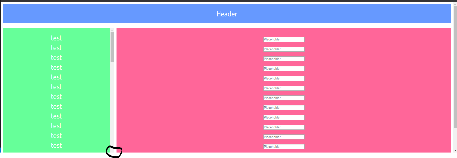
All my attempts so far do make the scrollbar but the bottom arrow gets cut off.

https://codepen.io/anon/pen/rwLRpJ

<div class="grid-container">
    <div class="grid-element header">Header</div>
    <div class="grid-element sidebar">
        <div> test </div>
        <div> test </div>
        <div> test </div>
        <div> test </div>
        <div> test </div>
        <div> test </div>
        <div> test </div>
        <div> test </div>
        <div> test </div>
        <div> test </div>
        <div> test </div>
        <div> test </div>
        <div> test </div>
        <div> test </div>
        <div> test </div>
        <div> test </div>
        <div> test </div>
        <div> test </div>
        <div> test </div>
        <div> test </div>
        <div> test </div>
        <div> test </div>
        <div> test </div>
        <div> test </div>
        <div> test </div>
        <div> test </div>
        <div> test </div>
        <div> test </div>
        <div> test </div>
        <div> test </div>
        <div> test </div>
        <div> test </div>
        <div> test </div>
        <div> test </div>
        <div> test </div>
        <div> test </div>
        <div> test </div>
        <div> test </div>
        <div> test </div>
        <div> test </div>
        <div> test </div>
        <div> test </div>
        <div> test </div>
        <div> test </div>
        <div> test </div>
        <div> test </div>
        <div> test </div>
        <div> test </div>
        <div> test </div>
        <div> test </div>
        <div> test </div>
        <div> test </div>
        <div> test </div>
        <div> test </div>
        <div> test </div>
        <div> test </div>
        <div> test </div>
        <div> test </div>
        <div> test </div>
        <div> test </div>
        <div> test </div>
        <div> test </div>
        <div> test </div>
        <div> test </div>
        <div> test </div>
        <div> test </div>
        <div> test </div>
        <div> test </div>
        <div> test </div>
        <div> test </div>
        <div> test </div>
        <div> test </div>
    </div>
    <div class="grid-element main">
        <div class="input-field">
            <input placeholder="Placeholder" type="text" class="validate">
        </div>
        <div class="input-field">
            <input placeholder="Placeholder" type="text" class="validate">
        </div>
        <div class="input-field">
            <input placeholder="Placeholder" type="text" class="validate">
        </div>
        <div class="input-field">
            <input placeholder="Placeholder" type="text" class="validate">
        </div>
        <div class="input-field">
            <input placeholder="Placeholder" type="text" class="validate">

        </div>
        <div class="input-field">
            <input placeholder="Placeholder" type="text" class="validate">

        </div>
        <div class="input-field">
            <input placeholder="Placeholder" type="text" class="validate">

        </div>
        <div class="input-field">
            <input placeholder="Placeholder" type="text" class="validate">

        </div>
        <div class="input-field">
            <input placeholder="Placeholder" type="text" class="validate">

        </div>
        <div class="input-field">
            <input placeholder="Placeholder" type="text" class="validate">

        </div>
        <div class="input-field">
            <input placeholder="Placeholder" type="text" class="validate">

        </div>
        <div class="input-field">
            <input placeholder="Placeholder" type="text" class="validate">

        </div>
        <div class="input-field">
            <input placeholder="Placeholder" type="text" class="validate">

        </div>
        <div class="input-field">
            <input placeholder="Placeholder" type="text" class="validate">

        </div>
    </div>


</div>

body {
  text-align: center;
  font-family: "Dosis";
}

.grid-container {
  display: grid;
  grid-template-columns: 0.25fr 10px 0.75fr;
  grid-template-rows: auto 20px auto 20px auto 20px auto;
  height: 100vh;
}

.grid-element {
  background-color: #444;
  color: #fff;
  padding: 20px;
  font-size: 2em;
}
.header {
  grid-column-start: 1;
  grid-column-end: 4;
  grid-row-start: 1;
  grid-row-end: 2;
  background: #69F;
}

.sidebar {
  grid-column-start: 1;
  grid-column-end: 2;
  grid-row-start: 3;
  grid-row-end: 6;
  background: #6F9;
  overflow-y: auto;
}

.main {
  grid-column-start: 3;
  grid-column-end: 4;
  grid-row-start: 3;
  grid-row-end: 4;
  background: #F69;

}

Scrollbar being cut off.

Michael Benjamin
  • 346,931
  • 104
  • 581
  • 701
chobo2
  • 83,322
  • 195
  • 530
  • 832
  • The described issue is far from clear. What browser are you using? It looks good in Chrome, on Linux. I rarely say this on SO, but could you provide a screenshot? – tao Jun 13 '17 at 17:48
  • Latest version of Chrome, is what I am trying to get it work on. – chobo2 Jun 13 '17 at 17:50
  • I was viewing it with side panels view in codepen and the height of the window was enough to accommodate full height. I got the issue now. – tao Jun 13 '17 at 17:51
  • Just add `min-height: 0` to `.grid-element`: https://codepen.io/anon/pen/WOGQvv – Michael Benjamin Jun 14 '17 at 02:39
  • An initial setting on grid items is `min-height: auto`. This means the items will be the height of their content, at a minimum. That's what you're seeing in your layout. In order for grid items to shrink below the size of their content, you need to override the default. This can be done with `min-height: 0`. See the dupe for more details. – Michael Benjamin Jun 14 '17 at 02:40

1 Answers1

3

You didn't add overflow-y: auto; to .main, thus making the <body> grow in size to allow that "visible" content to be accessed. For some reason, this makes the .grid-container grow in the available space and .sidebar extends to the parent's full content height.

Additionally, I added:

body {
  margin: 0;       /* to remove its vertical scrollbar */
}
.main {
  grid-row-end: 6; /* assuming you want it same height as sidebar? */
} 

Here's the pen: https://codepen.io/anon/pen/LLZvLE

Clarification: by not setting .mains overflow to auto, it's set to the default visible. This places its overflowing contents outside the scrollable area of the page over the bottom side. Unlike content overflown over the top or left sides, which does not make the scrollable area grow, visible content overflowing over the bottom or right sides make the scrollable area (hence <body>) grow to allow you to access that "visible" content.

This makes the <body> grow in height. I'm not entirely sure why the .grid-container allows itself to grow into that created space though, because you clearly specified it's height as 100vh, not 100%. Might be a grid bug/particularity. I'm still learning grid myself.

However, setting the .mains overflow to auto makes the overflowing content accessible, and <body> no longer grows in height, fixing your problem.


As per comments, here's the simplified grid, removing unnecessary tracks and attributes. If you put it head to head with what you had, I think it makes sense. Of course, you should divide it further, if you need the layout divisions but, for what you have, this seems enough:

body {
  text-align: center;
  font-family: "Dosis";
  margin: 0;
}

.grid-container {
  display: grid;
  grid-template-columns: 1fr 3fr;
  grid-template-rows: 0fr 1fr;
  height: 100vh;
  padding: 10px 10px 0;
  box-sizing: border-box;
}

.grid-element {
  background-color: #444;
  color: #fff;
  padding: 20px;
  font-size: 2em;
  margin-bottom: 10px;
}
.header {
  grid-column-start: 1;
  grid-column-end: 3;
  grid-row-start: 1;
  grid-row-end: 2;
  background: #69F;
}

.sidebar {
  grid-column-start: 1;
  grid-column-end: 2;
  grid-row-start: 2;
  background: #6F9;
  overflow-y: auto;
}

.main {
  grid-column-start: 2;
  grid-row-start: 2;
  background: #F69;
  overflow-y: auto;
  margin-left: 10px;
}
<div class="grid-container">
    <div class="grid-element header">Header</div>
    <div class="grid-element sidebar">
        <div> test </div>
        <div> test </div>
        <div> test </div>
        <div> test </div>
        <div> test </div>
        <div> test </div>
        <div> test </div>
        <div> test </div>
        <div> test </div>
        <div> test </div>
        <div> test </div>
        <div> test </div>
        <div> test </div>
        <div> test </div>
        <div> test </div>
        <div> test </div>
        <div> test </div>
        <div> test </div>
        <div> test </div>
        <div> test </div>
        <div> test </div>
        <div> test </div>
        <div> test </div>
        <div> test </div>
        <div> test </div>
        <div> test </div>
        <div> test </div>
        <div> test </div>
        <div> test </div>
        <div> test </div>
        <div> test </div>
        <div> test </div>
        <div> test </div>
        <div> test </div>
        <div> test </div>
        <div> test </div>
        <div> test </div>
        <div> test </div>
        <div> test </div>
        <div> test </div>
        <div> test </div>
        <div> test </div>
        <div> test </div>
        <div> test </div>
        <div> test </div>
        <div> test </div>
        <div> test </div>
        <div> test </div>
        <div> test </div>
        <div> test </div>
        <div> test </div>
        <div> test </div>
        <div> test </div>
        <div> test </div>
        <div> test </div>
        <div> test </div>
        <div> test </div>
        <div> test </div>
        <div> test </div>
        <div> test </div>
        <div> test </div>
        <div> test </div>
        <div> test </div>
        <div> test </div>
        <div> test </div>
        <div> test </div>
        <div> test </div>
        <div> test </div>
        <div> test </div>
        <div> test </div>
        <div> test </div>
        <div> test </div>
    </div>
    <div class="grid-element main">
        <div class="input-field">
            <input placeholder="Placeholder" type="text" class="validate">
        </div>
        <div class="input-field">
            <input placeholder="Placeholder" type="text" class="validate">
        </div>
        <div class="input-field">
            <input placeholder="Placeholder" type="text" class="validate">
        </div>
        <div class="input-field">
            <input placeholder="Placeholder" type="text" class="validate">
        </div>
        <div class="input-field">
            <input placeholder="Placeholder" type="text" class="validate">

        </div>
        <div class="input-field">
            <input placeholder="Placeholder" type="text" class="validate">

        </div>
        <div class="input-field">
            <input placeholder="Placeholder" type="text" class="validate">

        </div>
        <div class="input-field">
            <input placeholder="Placeholder" type="text" class="validate">

        </div>
        <div class="input-field">
            <input placeholder="Placeholder" type="text" class="validate">

        </div>
        <div class="input-field">
            <input placeholder="Placeholder" type="text" class="validate">

        </div>
        <div class="input-field">
            <input placeholder="Placeholder" type="text" class="validate">

        </div>
        <div class="input-field">
            <input placeholder="Placeholder" type="text" class="validate">

        </div>
        <div class="input-field">
            <input placeholder="Placeholder" type="text" class="validate">

        </div>
        <div class="input-field">
            <input placeholder="Placeholder" type="text" class="validate">

        </div>
    </div>
</div>
tao
  • 82,996
  • 16
  • 114
  • 150
  • Ah, I thought that if I had one set that the other one would figure it out. Still not clear on what you mean "makes the .grid-container overflow and .sidebar extends to the parent's full content height." Also do you have to specify a grid-row-end? – chobo2 Jun 13 '17 at 18:08
  • Thanks, makes more sense. How about with grd-row-end, still bit confused if that is needed if you just want it to go to the last row possible. – chobo2 Jun 13 '17 at 19:54
  • Also with grid-template-rows, if you just want all the rows to be auto can you do "auto" or do you have to do repeat(6, auto)? – chobo2 Jun 13 '17 at 19:56
  • For the last element you don't need to specify `grid-row-end` and `grid-column-end` if you just want it to occupy up the remaining space of the grid. Also, unless you have some really fancy stuff, you don't need to specify tracks for gutters. Just use margins. I simplified your grid to the best of my abilities. Check it out. (Same link). – tao Jun 13 '17 at 20:07
  • To keep the header same size when there's no content in `.main` or `.sidebar` I used `grid-template-rows: 0fr 1fr;`. Now it's pushed by content-height but if that's gone, it starts growing. – tao Jun 13 '17 at 20:53
  • Yea, I removed those gutters as for my design I don't need(I just have header,side nav, main content). I do have one question though I was trying on safari 10.3.2 and I noticed that the scroll bar does not work on safari. Do you know why? – chobo2 Jun 13 '17 at 22:38
  • Check on caniuse if it's supported or if it's a known issue. I'm not at desk now. – tao Jun 13 '17 at 22:41
  • I can't find overflow-y on caniuse but overflow been supported for a long time according to it. – chobo2 Jun 13 '17 at 22:49
  • I'd check http://caniuse.com/css-grid/embed first. – tao Jun 13 '17 at 22:51
  • Ah, grid I am covered on that I checked before looking at grid. 10.3.2 is the first version of ios safari that has full support and is the only version I need to support. It seems like I have to set a height(on the side nav/main) to actually get the scrolling to work. Not sure what to set the height too and it does seem kinda choppy when I scroll. – chobo2 Jun 13 '17 at 22:54