I am trying to layout multiple columns in the following way. I am using Wordpress but editing the PHP, HTML, CSS etc.
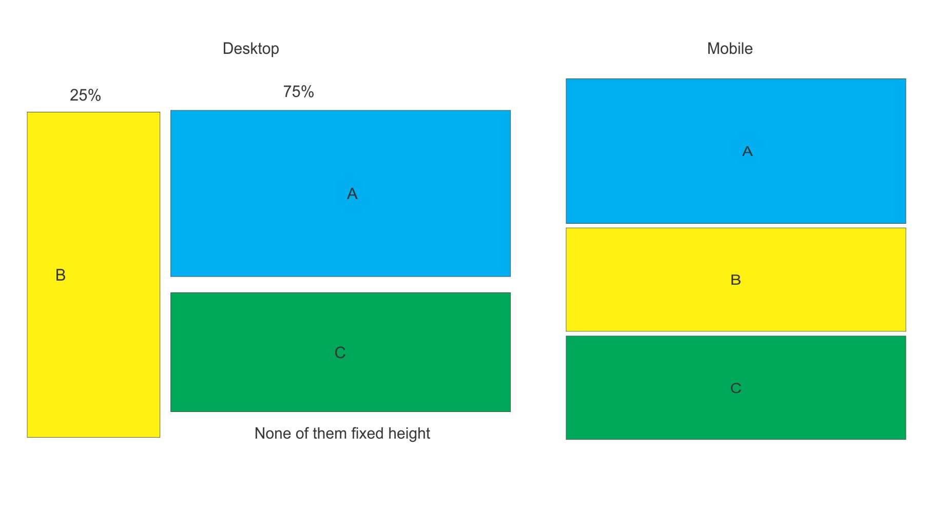
Here is the HTML. Imagine A B C as blocks of code without fixed height and percentage width as shown.
<div class="flex wrap">
     <div class="main">A</div>
     <div class="optional">B</div>
     <div class="main2">C</div>
</div>
As long as I am using flexbox I can play around with view ports to change order of flex. But right now I am not able to get the desired desktop layout.
I can use columns (bootstrap) with nested divs for 2nd column to create the desktop layout, but then the mobile layout will then be BAC or ACB not ABC.
Here is my CSS:
.flex.wrap {
    flex-wrap: wrap;
}

.flex {
    display: flex!important; /* to override display:block */
}

.main {
    order: 2;
    flex: 0 75%;
}

.optional {
    order: 1;
    flex: 0 25%;
}
.main2 {
    order: 3;
    flex: 0 75%
}
I did my research and have seen many such questions being asked but without any satisfactory answer that suits my needs.
I don't have to use flex box and I don't need a pure css solution either - as long as it can work on most modern browsers and mobile. I just need something that works. So I am open to any suggestion.
I could also use display: none on two blocks of code but that will make the code add 67 lines more which I think should not be necessary.
Even if there was a php solution that may work like below it might work.
If (code that determines mobile viewport) echo html
else
echo nothing
And another same code for where I want the desktop version to be. I know this is not elegant but at the end I care for the result including performance rather than anything else.
Any help will be greatly appreciated.