Is it possible to create a CSS grid that allows for different sized content blocks that don't have fixed starting positions with other blocks flowing around?
Here's my test
HTML
<div class="grid">

  <div class="item">Small 1</div>
  <div class="item">Small 2</div>
  <div class="item large">Large 1</div>
  <div class="item large">Large 2</div>

  <div class="item">Small 3</div>
  <div class="item">Small 4</div>
  <div class="item">Small 5</div>
  <div class="item">Small 6</div>

  <div class="item">Small 7</div>
  <div class="item">Small 8</div>
  <div class="item">Small 9</div>
  <div class="item">Small 10</div>

  <div class="item">Small 11</div>
  <div class="item">Small 12</div>
  <div class="item">Small 13</div>

</div>
CSS
* {
  padding: 0;
  margin: 0;
  box-sizing: border-box;
}

body {
  padding: 5em;
}

.grid {
  display: grid;
  grid-template-columns: 25% 25% 25% 25%;
  grid-gap: 1em 1em;
  grid-auto-flow: row dense;
}

.item {
  background: rgba(0, 0, 0, 0.1);
  border-radius: 0.25em;
  padding: 2em;
}

.large {
  background: rgba(255, 0, 0, 0.25);
  grid-column: auto / span 2;
  grid-row: auto / span 2;
}
Fiddle: https://jsfiddle.net/bLjzscLs/
Expected:
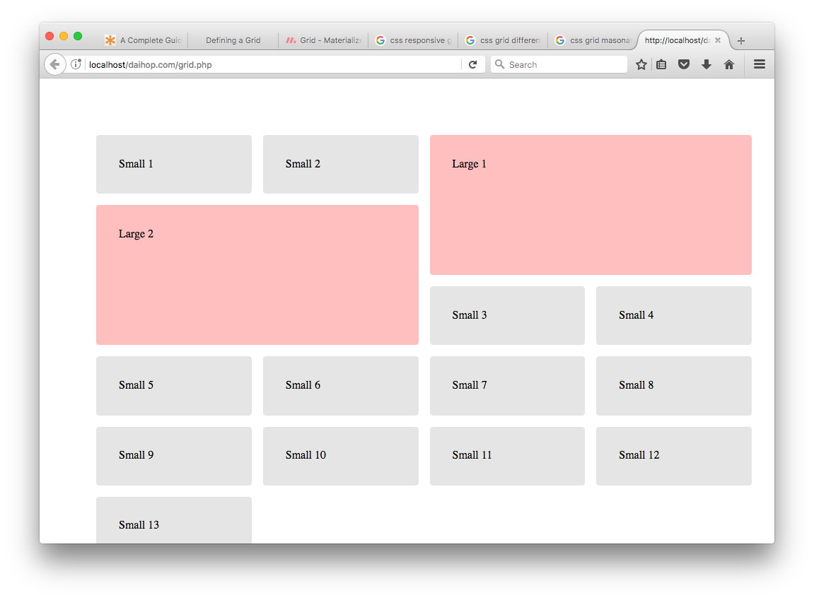
Actual:
