I am having trouble centering the columns on bootstrap when the screen is sm or xs.
The fiddle is here https://jsfiddle.net/iggyfiddle/DTcHh/34028/. Here is what I am talking about:
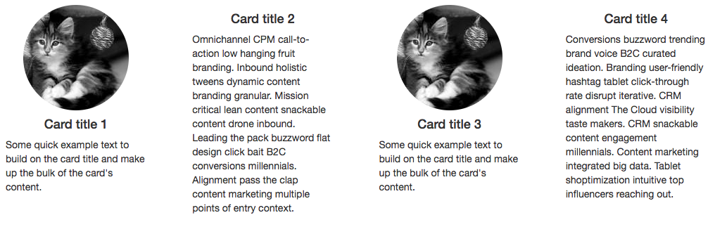 When the screen is large (or medium), I have no problem. It appears centered.
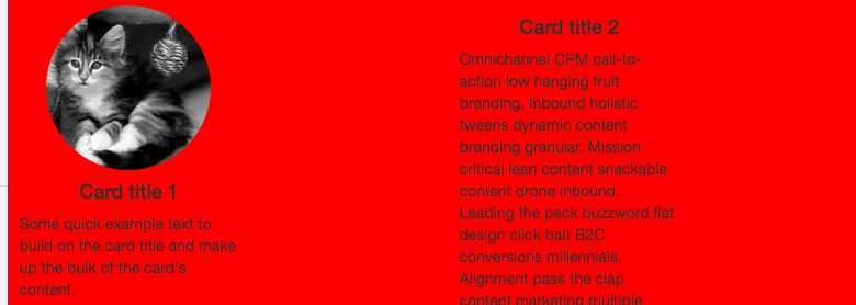 When the screen starts to get smaller, it starts to become noticeable. If you notice, the whole column stack leans to the left, leaving some space on the right (I added red bg for emphasis. Hard to tell when bg is white).
 When screen is xs, it is even more noticeable. Note that everything is leaning to the left, leaving a lot of space on the right.
I saw a popular SO post that addressed similar issue here. The solution suggested float: none; margin: 0 auto;, which I did - but it didn't do anything. I also tried adding center-block class, but the result is still nothing.
What do I have to do to center my columns? My goal is on xs screen, I want to have one column stacked up. When it is on sm screen, I want to have two columns, side-by-side, stacked. Anything larger should have 4 adjacent columns.