Lacking better terms for the problem, this question got a bit long. Sorry!
I've been trying to build a simple horizontal layout with a bunch of <div>s with width: 100%; height: 100% next to each other ("screens" of an app that you can swipe).
In Chrome's responsive preview, as well as on a real device, empty space appeared below the <div>s — no invisible objects, no traces of the excess height in any DOM properties.
Here's a gist, try it via bl.ocks.org. Scrolled all the way down, it looks like this:
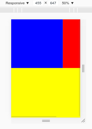
Red/blue are the divs, yellow is bodys background-color.
In a related answer I found this:
Chrome infers the layout height using the width and screen's aspect ratio. i.e. height=width/aspectRatio
Which means that if my content is wider than the viewport, a minimal height will be calculated for it. I find this weird, and came up with workarounds:
- set
html, body { overflow-y: hidden} - put all children of
<body>inside a<div>wrapper
Since both methods have downsides or aren't always applicable, I am wondering: is there a way to control this behavior, like, set the inferred layout height to "auto"?