2

I have a modal dialog I am displaying using the WPF Extended Toolkit's ChildWindow but I don't like the default look of the window since it doesn't support System Colors correctly (it has a forced white background) and doesn't adapt to the Windows Classic Shell when being used. Default ChildWindow dialog style I am therefore trying to create my own style for the ChildWindow but in doing so I've broken the dialog behaviour of the control - how would I style it to get this behaviour back?
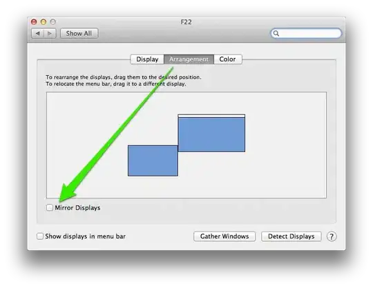
Custom-Styled ChildWindow

My style for the dialog is as follows.

<ResourceDictionary xmlns="http://schemas.microsoft.com/winfx/2006/xaml/presentation"
                    xmlns:x="http://schemas.microsoft.com/winfx/2006/xaml"
                    xmlns:wpfToolkit="http://schemas.xceed.com/wpf/xaml/toolkit">
    <Style TargetType="wpfToolkit:ChildWindow">
        <Setter Property="Template">
            <Setter.Value>
                <ControlTemplate TargetType="wpfToolkit:ChildWindow">
                    <!--<Window WindowState="{TemplateBinding WindowState}" Visibility="{TemplateBinding Visibility}" Background="{TemplateBinding Background}" Foreground="{TemplateBinding Foreground}">-->
                        <Grid>
                            <Grid.RowDefinitions>
                                <RowDefinition Height="Auto"/>
                                <RowDefinition/>
                            </Grid.RowDefinitions>
                            <Border Grid.RowSpan="2"
                                BorderThickness="2"
                                BorderBrush="Gold"/>
                            <Rectangle>
                                <Rectangle.Fill>
                                    <LinearGradientBrush StartPoint="0,0" EndPoint="0,1">
                                        <LinearGradientBrush.GradientStops>
                                            <GradientStop Color="Lime"/>
                                            <GradientStop Color="DarkGreen"/>
                                        </LinearGradientBrush.GradientStops>
                                    </LinearGradientBrush>
                                </Rectangle.Fill>
                            </Rectangle>
                            <TextBlock Foreground="White" Text="{TemplateBinding Caption}"/>
                            <ContentPresenter Grid.Row="1"/>
                        </Grid>
                    <!--</Window>-->
                </ControlTemplate>
            </Setter.Value>
        </Setter>
    </Style>
</ResourceDictionary>

I have tried nesting it in a window to get the dialog behaviour back but instead I get a runtime exception of "Window must be the root of the tree. Cannot add Window as a child of Visual.". What do I need in my style?
jsanalytics
  • 13,058
  • 4
  • 22
  • 43
Sphynx
  • 135
  • 2
  • 12

1 Answers1

2

Start with the default style and customize it to your needs:

enter image description here

XAML:

<Window x:Class="WpfApp27.MainWindow"
    xmlns="http://schemas.microsoft.com/winfx/2006/xaml/presentation"
    xmlns:x="http://schemas.microsoft.com/winfx/2006/xaml"
    xmlns:d="http://schemas.microsoft.com/expression/blend/2008"
    xmlns:mc="http://schemas.openxmlformats.org/markup-compatibility/2006"
    xmlns:xctk="http://schemas.xceed.com/wpf/xaml/toolkit"
    xmlns:local="clr-namespace:WpfApp27"
    mc:Ignorable="d"
    Title="MainWindow" Height="300" Width="300">

<Window.Resources>
    <LinearGradientBrush x:Key="LinearGradientBrushStyle1" StartPoint="0,0" EndPoint="1,1">
        <LinearGradientBrush.GradientStops>
            <GradientStop Color="Lime"/>
            <GradientStop Color="DarkGreen" Offset="0.5"/>
        </LinearGradientBrush.GradientStops>
    </LinearGradientBrush>

    <Style x:Key="ChildWindowStyle1" TargetType="{x:Type xctk:ChildWindow}">
        <Setter Property="Background" Value="Navy"/>
        <Setter Property="Foreground" Value="White"/>
        <Setter Property="WindowBackground" Value="{StaticResource LinearGradientBrushStyle1}"/>
        <Setter Property="MinWidth" Value="120"/>
        <Setter Property="MinHeight" Value="45"/>
        <Setter Property="Template">
            <Setter.Value>
                <ControlTemplate TargetType="{x:Type xctk:ChildWindow}">
                    <Grid x:Name="PART_Root">
                        <Grid.Resources>
                            <Style x:Key="FocusVisualStyle" TargetType="{x:Type Control}">
                                <Setter Property="BorderBrush" Value="Black"/>
                                <Setter Property="Background" Value="Transparent"/>
                                <Setter Property="Margin" Value="-1"/>
                                <Setter Property="Template">
                                    <Setter.Value>
                                        <ControlTemplate>
                                            <Rectangle Fill="{TemplateBinding Background}" Margin="{TemplateBinding Margin}" Stroke="{TemplateBinding BorderBrush}" StrokeThickness="0.5" StrokeDashArray="4 3">
                                                <Rectangle.RenderTransform>
                                                    <TranslateTransform X="{Binding Left}" Y="{Binding Top}"/>
                                                </Rectangle.RenderTransform>
                                            </Rectangle>
                                        </ControlTemplate>
                                    </Setter.Value>
                                </Setter>
                            </Style>
                            <BooleanToVisibilityConverter x:Key="BooleanToVisibilityConverter"/>
                        </Grid.Resources>
                        <Grid x:Name="PART_WindowRoot" HorizontalAlignment="Left" Height="{TemplateBinding Height}" MinWidth="{TemplateBinding MinWidth}" MinHeight="{TemplateBinding MinHeight}" VerticalAlignment="Top" Width="{TemplateBinding Width}">
                            <xctk:WindowControl x:Name="PART_WindowControl" BorderBrush="{TemplateBinding BorderBrush}" BorderThickness="{TemplateBinding BorderThickness}" Background="{TemplateBinding Background}" CloseButtonVisibility="{TemplateBinding CloseButtonVisibility}" CaptionForeground="{TemplateBinding CaptionForeground}" ContentTemplate="{TemplateBinding ContentTemplate}" CaptionFontSize="{TemplateBinding CaptionFontSize}" Caption="{TemplateBinding Caption}" Content="{TemplateBinding Content}" CaptionShadowBrush="{TemplateBinding CaptionShadowBrush}" CloseButtonStyle="{TemplateBinding CloseButtonStyle}" CaptionIcon="{TemplateBinding CaptionIcon}" Height="{TemplateBinding Height}" IsActive="{TemplateBinding IsActive}" WindowStyle="{TemplateBinding WindowStyle}" WindowBackground="{TemplateBinding WindowBackground}" WindowOpacity="{TemplateBinding WindowOpacity}" WindowInactiveBackground="{TemplateBinding WindowInactiveBackground}" WindowBorderBrush="{TemplateBinding WindowBorderBrush}" Width="{TemplateBinding Width}" WindowBorderThickness="{TemplateBinding WindowBorderThickness}"/>
                        </Grid>
                    </Grid>
                    <ControlTemplate.Triggers>
                        <Trigger Property="WindowState" Value="Closed">
                            <Setter Property="Visibility" Value="Collapsed"/>
                        </Trigger>
                    </ControlTemplate.Triggers>
                </ControlTemplate>
            </Setter.Value>
        </Setter>
        <Style.BasedOn>
            <Style TargetType="{x:Type xctk:WindowControl}">
                <Setter Property="CloseButtonStyle">
                    <Setter.Value>
                        <Style TargetType="{x:Type Button}">
                            <Setter Property="Background" Value="Blue"/>
                            <Setter Property="OverridesDefaultStyle" Value="True"/>
                            <Setter Property="Template">
                                <Setter.Value>
                                    <ControlTemplate TargetType="{x:Type Button}">
                                        <Border x:Name="border" BorderThickness="0" Background="{TemplateBinding Background}" Padding="1">
                                            <ContentPresenter ContentTemplate="{TemplateBinding ContentTemplate}" Content="{TemplateBinding Content}" ContentStringFormat="{TemplateBinding ContentStringFormat}" HorizontalAlignment="Center" VerticalAlignment="Center"/>
                                        </Border>
                                    </ControlTemplate>
                                </Setter.Value>
                            </Setter>
                            <Style.Triggers>
                                <DataTrigger Binding="{Binding IsActive, RelativeSource={RelativeSource TemplatedParent}}" Value="False">
                                    <Setter Property="Background" Value="#FFBCBCBC"/>
                                </DataTrigger>
                                <Trigger Property="IsMouseOver" Value="True">
                                    <Setter Property="Background" Value="SkyBlue"/>
                                </Trigger>
                                <Trigger Property="IsPressed" Value="True">
                                    <Setter Property="Background" Value="#FF993D3D"/>
                                </Trigger>
                            </Style.Triggers>
                        </Style>
                    </Setter.Value>
                </Setter>
                <Setter Property="BorderBrush" Value="Transparent"/>
                <Setter Property="BorderThickness" Value="1"/>
                <Setter Property="Background" Value="White"/>
                <Setter Property="CaptionFontSize" Value="15"/>
                <Setter Property="CaptionForeground" Value="white"/>
                <Setter Property="CaptionShadowBrush" Value="Transparent"/>
                <Setter Property="WindowBorderBrush" Value="Gold"/>
                <Setter Property="WindowBackground" Value="#FF0078D7"/>
                <Setter Property="WindowBorderThickness" Value="5"/>
                <Setter Property="WindowInactiveBackground" Value="#FFEBEBEB"/>
                <Setter Property="IsTabStop" Value="False"/>
                <Setter Property="KeyboardNavigation.TabNavigation" Value="None"/>
                <Setter Property="Template">
                    <Setter.Value>
                        <ControlTemplate/>
                    </Setter.Value>
                </Setter>
            </Style>
        </Style.BasedOn>
    </Style>
</Window.Resources>

<Grid>
    <xctk:WindowContainer Grid.Row="0">
        <xctk:ChildWindow Grid.Row="0" Width="200" Height="150" Caption="Child Window" IsModal="True" WindowState="Open" Style="{DynamicResource ChildWindowStyle1}">
            <StackPanel HorizontalAlignment="Center" VerticalAlignment="Center">
                <TextBlock>My Child Window</TextBlock>
                <Button Width="75" Height="25">CHILD</Button>
            </StackPanel>
        </xctk:ChildWindow>
    </xctk:WindowContainer>
</Grid>

jsanalytics
  • 13,058
  • 4
  • 22
  • 43
  • Ah, it looks like the piece I was missing was `WindowControl`; I would want to sort out the style of that close button as well though so would I need to restyle the `WindowControl` in order to do this? Also, are the names you've used (e.g. "PART_WindowRoot") important or is this just something Expression Blend has generated? – Sphynx Jul 02 '17 at 02:51
  • The style for the close button is already included in the XAML. Not surprisingly is called `CloseButtonStyle`. So you can change that. Yes, `PART_WindowRoot` is important and is generated by the tool. Normally these names are referenced in the corresponding code-behind. You could confirm that by inspecting the source code. – jsanalytics Jul 02 '17 at 03:27
  • Sorry, I've not had a proper chance to use this yet; I'll be able to continue this work this weekend. I completely missed "CloseButtonStyle" when I looked over your answer before as I was expecting to see it in a Style tag as `TargetType={x:Type xctk:CloseButton}`. – Sphynx Jul 05 '17 at 20:20
  • OK, no problem, let me know of any questions. I couldn't find type `CloseButton` anywhere, but in case you know where it is (assembly/namespace) please point it out to me. – jsanalytics Jul 05 '17 at 20:44
  • You're right, there is no `CloseButton`, I just assumed. I've implemented more of the style you provided but my project is currently in an untestable state due to other Prism-related reasons. I was wondering though why "ChildWindowStyle1" has a `BasedOn` style defined directly within it; I've managed to implement my "ChildWindowStyle1" with that BasedOn style's property assignments defined as its own instead. – Sphynx Jul 09 '17 at 22:12
  • I believe it has but I'm currently unable to test it to confirm. I'll mark it as accepted for now but might need to come back to you if it's behaving unexpectedly. – Sphynx Jul 09 '17 at 23:01