1

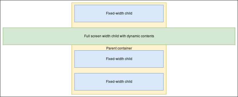
Can I create a layout like on the picture below, while setting the fixed width only on the parent container? I also cannot use position: absolute; left: 0; right: 0; on Full screen width child, as I cannot remove it from the flow, because it's size is dynamic.

I can't change the markup.

The only solution I can think of is setting the fixed width on every Fixed-width child separately, but as I have a lot of them, that's not the most comfortable solution - means adding a class for every child that I add into the parent container.

Desired layout

Here is an example markup you can post a solution to.

HTML

<div class="fixed-width-container">
  <div class="regular-child"></div>
  <div class="full-screen-width-child"></div>
  <div class="regular-child"></div>
  <div class="regular-child"></div>
</div>

CSS

.fixed-width-container {
  width: <some-fixed-width>;
}
Robert Kusznier
  • 6,471
  • 9
  • 50
  • 71
  • Related - https://stackoverflow.com/questions/28565976/css-how-to-overflow-from-div-to-full-width-of-screen – Paulie_D Jul 04 '17 at 16:11
  • Essentially, **unless** the full width element is for styling only...you cannot do this with CSS alone without changing the HTML given the constraints you have imposed. – Paulie_D Jul 04 '17 at 16:14
  • @Paulie_D: That's what I thought, but wanted to make sure that I'm not missing something. Thanks. BTW I think CSS Grid would allow doing that, but we all know how poor support it has so far. – Robert Kusznier Jul 04 '17 at 16:16
  • 1
    You could perhaps wrap those in 2 different containers - 1 for the ones above full width div & the other for ones below it. That's the only way I can think of – Nikhil Nanjappa Jul 04 '17 at 16:19

2 Answers2

1

you can give a try to the flex layout : https://css-tricks.com/snippets/css/a-guide-to-flexbox/

* {
  margin: 0;
  padding: 0;
  box-sizing: border-box;
  text-align: center;
}

body {
  margin: 0;
}

div {
  border: 1px solid #333;
}

.fixed-width-container {
  width: 400px;/* any width set */
  margin: auto;
  padding: 10px 10px 0;
  background: yellow;
  display: flex;
  flex-flow: column;
  align-items: center;
}

.fixed-width-container>div {
  height: 3em;
  margin-bottom: 10px;
  background: lightblue;
  min-width: 100%;
}

.full-screen-width-child {
  width: 99vw;/* 100vw is fine too */
}
<div class="fixed-width-container">
  <div class="regular-child">Fixed-width child</div>
  <div class="full-screen-width-child">Full screen width child with dynamic contents</div>
  <div class="regular-child">Fixed-width child</div>
  <div class="regular-child">Fixed-width child</div>
</div>
codepen to test and play with
G-Cyrillus
  • 101,410
  • 14
  • 105
  • 129
  • Works indeed! Just what I was looking for. Thanks! I made a pen to experiment with your solution: https://codepen.io/anon/pen/vZrNXm . You can link it to you answer; maybe someone will find it helpful – Robert Kusznier Jul 04 '17 at 16:50
  • 1
    Unfortunately `width: 100vw;` introduces another problem - vertical scrollbar (as described here: https://stackoverflow.com/questions/23367345/100vw-causing-horizontal-overflow-but-only-if-more-than-one#23367686). But that answer passess all the criteria of the question, so I leave it accepted. – Robert Kusznier Jul 04 '17 at 17:08
  • Today I figured out that setting `html { overflow-y: scroll; }` fixes the issue with scrollbar. I propose adding that to your answer. – Robert Kusznier Aug 21 '17 at 13:24
0

This is just an attempt, and probably not a very good one. But maybe it will spawn some more sophisticated solutions by others, or even yourself.


Idea: negative margins for the full-width child.

* {
  box-sizing: border-box;
  text-align: center;
}

body {
  width: 100%;
  background: #fff;
}

div {
  border: 1px solid #333;
  margin-bottom: 10px;
}

div:last-child {
  margin-bottom: 0;
}

.fixed-width-container {
  width: 70%;
  margin: auto;
  padding: 10px;
  background: LightYellow;
}

.regular-child,
.full-screen-width-child {
  height: 45px;
  line-height: 45px;
  background: LightBlue;
}

.full-screen-width-child {
  margin-left: -24%;
  margin-right: -24%;
  background: LightGreen;
}
<div class="fixed-width-container">
  <div class="regular-child">Fixed-width child</div>
  <div class="full-screen-width-child">Full screen width child with dynamic contents</div>
  <div class="regular-child">Fixed-width child</div>
  <div class="regular-child">Fixed-width child</div>
</div>

The problematic part here is the dimension of the negative margins. If you use %, it will relate to the width of the fixed-width-container. Here, I chose width: 70% for it. Given a body width of 625px (as is the case for the Stack Snippet preview) and a margin of -24%, that would give a negative margin of 625px * 0.7 * 0.24 = 105px. I'm not sure what's the best approach of making this work for any configuration.

domsson
  • 4,553
  • 2
  • 22
  • 40