7

CSS:

* {
  padding: 0;
  margin: 0;
  box-sizing: border-box;
}
body {
  display: flex;
  background-color: #F5F5F5;
}
body > header {
  display: flex;
  position: fixed;
  width: 100%;
  height: 60px;
  align-items: center;
  background-color: #373737;
  -webkit-box-shadow: 0 3px 3px rgba(0, 0, 0, 0.19);
  box-shadow: 0 3px 3px rgba(0, 0, 0, 0.19);
}
aside {
  width: 250px;
  background-color: #484848;
  font-size: 18px "SL";
  margin-top: 60px;
}
aside > ul.side-menu {
  list-style-type: none;
  margin-top: 25px;
  width: 100%;
}
aside > ul > li > a {
  display: block;
  text-decoration: none;
  font-family: "SL";
  font-size: 18px;
  line-height: 40px;
  padding-left: 20px;
  color: #CCCCCC;
  border-bottom: 1px solid #8E8E8E;
  transition: 300ms;
}
aside > ul > li > a.active {
  color: white;
}

HTML:

<body>

  <header>

  </header>

  <aside>
    <ul class="side-menu">
      <li><a href="#" class="active">123</a></li>
      <li><a href="#">123</a></li>
      <li><a href="#">123</a></li>
      <li><a href="#">123</a></li>
    </ul>
  </aside>
</body>

Codepan:

https://codepen.io/UADev/pen/zzmdPG

When you're opening fullscreen, this is what's happening:

enter image description here

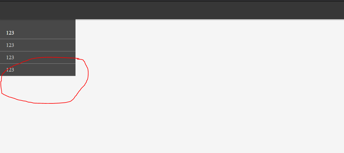
Tried to use height: 100% on body and html elements, but it doesn't work correctly when you have another flex element with flex-wrap: wrap inside one of the flex-child elements like aside or section that follows immediately after body. I tried to remove display:flex from one of those elements and it's broke the layout, but problem disappeared.

Src
  • 5,252
  • 5
  • 28
  • 56

1 Answers1

5

Just add min-height: 100vh to the parent (body) and the default value align-items: stretch will cause the children to to fill the height of the parent.

* {
  padding: 0;
  margin: 0;
  box-sizing: border-box;
}
body {
  display: flex;
  background-color: #F5F5F5;
  min-height: 100vh;
}
body > header {
  display: flex;
  position: fixed;
  width: 100%;
  height: 60px;
  align-items: center;
  background-color: #373737;
  -webkit-box-shadow: 0 3px 3px rgba(0, 0, 0, 0.19);
  box-shadow: 0 3px 3px rgba(0, 0, 0, 0.19);
}
aside {
  width: 250px;
  background-color: #484848;
  font-size: 18px "SL";
  margin-top: 60px;
}
aside > ul.side-menu {
  list-style-type: none;
  margin-top: 25px;
  width: 100%;
}
aside > ul > li > a {
  display: block;
  text-decoration: none;
  font-family: "SL";
  font-size: 18px;
  line-height: 40px;
  padding-left: 20px;
  color: #CCCCCC;
  border-bottom: 1px solid #8E8E8E;
  transition: 300ms;
}
aside > ul > li > a.active {
  color: white;
}
<body>

  <header>

  </header>

  <aside>
    <ul class="side-menu">
      <li><a href="#" class="active">123</a></li>
      <li><a href="#">123</a></li>
      <li><a href="#">123</a></li>
      <li><a href="#">123</a></li>
    </ul>
  </aside>
</body>
Michael Coker
  • 52,626
  • 5
  • 64
  • 64
  • min-height: 100vh; Resolved the problem. I cleaned my example (you can update the code in answer, so it woun't be confusing for others. I'm sorry that i updated it after you answered). Please, can you explain a little more ? – Src Jul 09 '17 at 01:19
  • @Src what part don't you understand? `body` doesn't expand the height of the window by default, even though the `background-color` on `body` will. So `aside` will only be as tall as the parent, and the parent isn't the height of the viewport. Making body at least the height of the viewport (`min-height: 100vh`) makes it, well... at least the height of the viewport. So now the `aside` will stretch (because of `align-items: stretch` - the default) to fill the parent. – Michael Coker Jul 09 '17 at 01:24
  • Ok, got it. I never used `vh` before and also tried to use 100% height on body, so that's why i was wondering.. Thank you once more) – Src Jul 09 '17 at 01:32
  • @Src ah cool, yeah `100vh` works a lot better than `100%`. To make `body { height: 100%; }` work, you also have to add `height: 100%` to `html` – Michael Coker Jul 09 '17 at 01:33
  • I tried to use 100% height on body and html elements before, but problem was still remaining when i had a `flex` container with `flex-wrap: wrap` inside one of the `flex-child` elements like `aside` or `section` in my example. But `100hv` handeled this problem just OK. – Src Jul 09 '17 at 02:03
  • Just did some advanced testing and turns out that the problem not completely gone. Look what's happened when i scaled down the browser window: http://i65.tinypic.com/v4yq8y.jpg . But it is probably the topic for another question) – Src Jul 09 '17 at 02:17
  • 1
    My bad, seems like i was using `heigh` instead of `min-height`. Sorry, my bad) – Src Jul 09 '17 at 09:41