-1

I am quite new to CSS and HTML so I am having trouble with aligning two divs next to each other.

This is my HTML:

<!DOCTYPE html>
<html>
    <head>
        <title>cards</title>
        <link rel="stylesheet" type="text/css" href="mystyle.css"/>
    </head>
    <body>
        <div id="card_container">
            <div id="card_image_container">
                <img src="https://openclipart.org/image/2400px/svg_to_png/177482/ProfilePlaceholderSuit.png"/>
            </div>
            <div id="card_content_container">
                <div id="card_content_title">
                    <h1>ADVERT</h1>
                    <h2>EXAMPLE
                </div>
                <div id="card_content_text">
                    <p>
                    <b>Heading</b><br/>
                    Info
                    </p>

                    <p>
                    <b>Heading 2</b><br/>
                    Info 2
                    </p>
                </div>
                <div id="card_content_actions">

                </div>
            </div>
        </div>
    </body>
</html>

and this is my CSS:

*{
    padding: 0px;
    margin: 0px;
}

#card_container{
    margin-left: auto;
    margin-right: auto;
    width: 36%;
    margin-top: 10%;
    border: 1px solid grey;
}
#card_container > div{
    display: inline-block;
}
#card_image_container{
    width: 40%;
    background-color: green;
}
#card_image_container img{
    vertical-align: bottom;
    width: 100%;
    height: 100%;
}
#card_content_container{
    vertical-align: top;
    background-color: red;
    width: 59%;
}

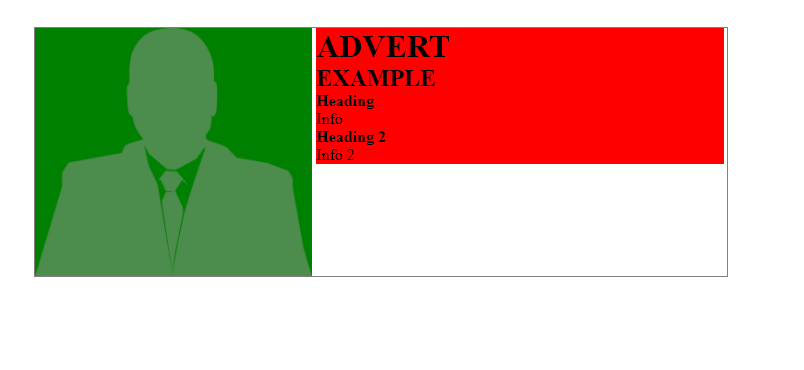
And this is the problem I have:

white spaces around div

As you can see - my div has white spaces around it, I know this is due to 1% of width left over but if I change my:

#card_content_container{
    vertical-align: top;
    background-color: red;
    width: 59%;
}

width to 60%, the content_container gets moved to next line.

I need card_content_container to fill the remaining 60% so it's aligned perfectly.

Here is js fiddle:

https://jsfiddle.net/gbcdp2on/

  • Remove the space between the inline block divs – Huangism Jul 17 '17 at 16:31
  • @dippas the issue in this question is not the same as the dupe link. There is probbaly a question that answers this but that one is not it. This is a inline-block and white space issue – Huangism Jul 17 '17 at 16:35
  • @Huangism look at the dupe questions ;) – dippas Jul 17 '17 at 16:36
  • @dippas i have looked at it and I didn't see anywhere mentioning the space issue with inline block – Huangism Jul 17 '17 at 16:38
  • @dippas I just feel like if the OP followed that link then he/she would not know why the issue existed in the first place and will simply use a different method to do this and therefore not really learning why this happened. – Huangism Jul 17 '17 at 16:47
  • @Huangism it is very explicit in [here](https://stackoverflow.com/questions/5078239/how-to-remove-the-space-between-inline-block-elements) the 2nd dupe question linked, what is the problem. – dippas Jul 17 '17 at 16:56
  • @dippas the second one is perfect – Huangism Jul 17 '17 at 17:23

5 Answers5

0

Inline elements are sensitive to the white space in your code -- so just remove the white space. In your case you need to remove it between your two divs so like </div><div id="card_content_container">

jsFiddle example

Another option would be to float the div on the left:

#card_image_container {
  width: 40%;
  background-color: green;
  float:left;
}

jsFiddle example

j08691
  • 204,283
  • 31
  • 260
  • 272
0

You can use flexbox

#card_container {
    display: flex;
    margin-left: auto;
    margin-right: auto;
    width: 36%;
    margin-top: 10%;
    border: 1px solid grey;
}
#card_image_container{
    flex: 4;
    background-color: green;
}
#card_content_container{
    flex: 6;
    vertical-align: top;
    background-color: red;
}

https://jsfiddle.net/2sq6gu79/

Alex Bieg
  • 355
  • 2
  • 15
0

Try wrapping your parent container with display:flex

*{
 padding: 0px;
 margin: 0px;
}

#card_container{
  display:flex;
 margin-left: auto;
 margin-right: auto;
 width: 70%;
 margin-top: 10%;
 border: 1px solid grey;
}

#card_image_container{
 width: 40%;
 background-color: green;
}
#card_image_container img{
 width: 100%;
 height: 100%;
}
#card_content_container{
 background-color: red;
 width: 60%;
}
  <div id="card_container">
   <div id="card_image_container">
    <img src="https://openclipart.org/image/2400px/svg_to_png/177482/ProfilePlaceholderSuit.png"/>
   </div>
   <div id="card_content_container">
    <div id="card_content_title">
     <h1>ADVERT</h1>
     <h2>EXAMPLE
    </div>
    <div id="card_content_text">
     <p>
     <b>Heading</b><br/>
     Info
     </p>
     
     <p>
     <b>Heading 2</b><br/>
     Info 2
     </p>
    </div>
    <div id="card_content_actions">
    
    </div>
   </div>
  </div>
Shahar Kazaz
  • 1,146
  • 1
  • 9
  • 21
0

Your issue is the white space between inline-block elements

Set the 59% to 60% and then update your markup to not include a space between the inline-bock elements

<div id="card_image_container">
     ...
</div><div id="card_content_container">
     ....
</div>

CSS

#card_content_container{
    width: 60%;
}

the reason the space is there when you set 60% width is because your element are inline-block, so the white space counts as a space. There are other ways to write the html if you want it to be easier to read

for example using a comment in between

<div id="card_image_container">
     ...
</div><!--
--><div id="card_content_container">
     ....
</div>

There are many ways to achieve what you want but your particular issue is the space between inline-block elements

Huangism
  • 16,278
  • 7
  • 48
  • 74
0

You can achieve this using flexbox.

*{
    padding: 0px;
    margin: 0px;
}

#card_container{
    display: flex;
  margin: auto;
    width: 36%;
    margin-top: 10%;
    border: 1px solid grey;
}
#card_image_container{
    width: 40%;
    background-color: green;
}
#card_image_container img{
    vertical-align: bottom;
    width: 100%;
    height: 100%;
}
#card_content_container{
    vertical-align: top;
    background-color: red;
    width: 60%;
}
Rajesh P
  • 343
  • 1
  • 8