1

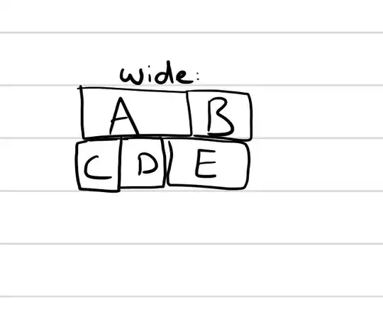
What I would like to do is quite particular, so I've drawn a picture to illustrate it:

the desired behavior

I can easily implement this:

enter image description here

but it doesn't look good on this site because the E element is much taller than C or D.

What I would like, is for C and D to stack when the browser window is wide, but not when it's medium width.

I'm trying to implement this with CSS and Flexbox, and I've tried grouping together C and D in a div, but this creates problems at the medium layout.
Michael Benjamin
  • 346,931
  • 104
  • 581
  • 701
Mohamad Zeina
  • 404
  • 3
  • 20

2 Answers2

1

Flexbox is 1D layout. Of course you can add some nesting, some fixed heights, but it's 1D and isn't perfect solution here.

It's much much better to use CSS Grid Layout here, because it's 2D layout.

.grid {
  display: grid;
}

/* just styles for demo */
.grid__item {
  font-size: 3em;
  padding: 20px;
  background-color: orange;
  color: white;
  margin: 10px;
  
  /* using flexbox for text centering */
  display: flex;
  align-items: center;
  justify-content: center;
}

/* medium screen */
@media screen and (min-width: 700px) and (max-width: 999px) {
  .a {
    grid-column: 1 / span 2;
  }
}

/* wide screen */
@media screen and (min-width: 1000px) {
  .grid {
    grid-template-columns: 1fr 1fr 1fr;
  }
  
  .a {
    grid-column: 1 / span 2;
  }
  
  .d {
    grid-row: 3;
  }
  
  .e {
    grid-column: 2 / span 2;
    grid-row: 2 / span 2;
  }
}
<div class="grid">
  <div class="grid__item a">A</div>
  <div class="grid__item b">B</div>
  <div class="grid__item c">C</div>
  <div class="grid__item d">D</div>
  <div class="grid__item e">E</div>
</div>

If you need IE/Edge support you'll have to use outdated syntax and specify place for every row manually. IE/Edge implementation doesn't have grid cell auto-placement. So if you don't specify grid-column/grid-row for every cell they will all stack in very first cell. So for IE/Edge -ms-grid-row and -ms-grid-column default value is 1. Demo:

.grid {
  display: grid;
}

/* just styles for demo */
.grid__item {
  font-size: 3em;
  padding: 20px;
  background-color: orange;
  color: white;
  margin: 10px;
  
  /* using flexbox for text centering */
  display: flex;
  align-items: center;
  justify-content: center;
}

/* medium screen */
@media screen and (min-width: 700px) and (max-width: 999px) {
  .grid {
    display: -ms-grid;
    -ms-grid-columns: 1fr 1fr;
  }
  
  .a {
    -ms-grid-column: 1;
    -ms-grid-column-span: 2;
    grid-column: 1 / span 2;
  }
  
  .b {
    -ms-grid-row: 2;
  }
  
  .c {
    -ms-grid-row: 2;
    -ms-grid-column: 2;
  }
  
  .d {
    -ms-grid-row: 3;
  }
  
  .e {
    -ms-grid-row: 3;
    -ms-grid-column: 2;
  }
}

/* wide screen */
@media screen and (min-width: 1000px) {
  .grid {
    display: -ms-grid;
    -ms-grid-columns: 1fr 1fr 1fr;
    grid-template-columns: 1fr 1fr 1fr;
  }
  
  .a {
    -ms-grid-column: 1;
    -ms-grid-column-span: 2;
    grid-column: 1 / span 2;
  }
  
  .b {
    -ms-grid-column: 3;
  }
  
  .c {
    -ms-grid-row: 2;
  }
  
  .d {
    -ms-grid-row: 3;
    grid-row: 3;
  }
  
  .e {
    -ms-grid-row: 2;
    -ms-grid-row-span: 2;
    grid-row: 2 / span 2;
    -ms-grid-column: 2;
    -ms-grid-column-span: 2;
    grid-column: 2 / span 2;
  }
}
<div class="grid">
  <div class="grid__item a">A</div>
  <div class="grid__item b">B</div>
  <div class="grid__item c">C</div>
  <div class="grid__item d">D</div>
  <div class="grid__item e">E</div>
</div>

If you want to test resizing here is jsFiddle.

Vadim Ovchinnikov
  • 13,327
  • 5
  • 62
  • 90
0

demo

change the flex value as you desired

.box {
  background-color: green;
  margin: 5px; 
  /* padding: 30px; */
}

.one {
   display: flex; 

}

.a {
  flex: 3;
}

.b {
  flex: 2;
}

.two {
  display: flex;
  
}

.three {
  flex: 2;
}

.four {
  flex: 3;
}
<div class="main">
    <div class="one">
        <div class="a box">a</div>
        <div class="b box">b</div>
    </div>
    <div class="two">
        <div class="three">
            <div class="c box">c</div>
            <div class="d box">d</div>
        </div>
        <div class="four box">
            <div class="e">e</div>
        </div>
    </div>

</div>
bhv
  • 5,188
  • 3
  • 35
  • 44
  • write media queries and change flex values – bhv Jul 18 '17 at 02:09
  • thank you, this achieves the desired look at a wide layout but breaks when you narrow the window. That's because it will try to keep C and D vertically aligned (since they're in a div together) – Mohamad Zeina Jul 18 '17 at 10:34
  • @MobyMotion it causes when the screen is smaller to 250px, but any how can use with media queries to adjust the layout and your desired result for mobile devices in one after one , - or just decrease the padding to work fine .. updated the code – bhv Jul 18 '17 at 10:51