2

I'm currently trying to place a horizontal dashed line through my log-log graph using the below code. K2H_HUBp[:,1] and DivR are two [1x6000] arrays. The variable ones is a [1x6000] array full of ones.

The point of this plot is showing how the radii of "potatoes" compares with "sweet potatoes". Hence if they were the same, all of the data points should fall on this y = 1 line.

plt.scatter(K2H_HUBp[:,1],DivR,s=2.5,alpha=0.15,c = '#A9A9A9')
plt.loglog(K2H_HUBp[:,1], ones, '--',dashes=(1, 1),linewidth=0.9,c='#3C323C')
plt.ylim((0.1,10))
plt.xlim((0.35,12))
ax = plt.gca()
ax.tick_params(which = 'both', direction = 'in',right='on',top='on')
ax.set_xscale('log')
ax.set_yscale('log')
plt.ylabel("Radius (Potatos/Sweet Potatos)")
plt.xlabel("Radius (Potatos)")

I'd like the ones line to be equally dashed through the plot. I have the problem of getting this graph here where the lines aren't equally spaced out.

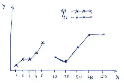
I'm looking for the graph to be very similar to this one (yes this is a linear graph and I'm working with a log-log graph)

I've tried modifying the dashes() parameters with no luck.

Thanks in advance for your guidance. :)
Jake Clark
  • 29
  • 1
  • 4
  • 1
    What do you mean by an 'unequal fashion'? What is `abcdp` and `zero` in your code? (Note: if `zero == 0`, then you can't plot it on a log-log plot). Also note that the bottom graphs in Figure 1 of that paper are not log-log (on the left is linear-linear, on the right is log-linear). In a simple test, I was able to plot a horizontal dashed line on a log-log plot without problems. If you could add a [MCVE] that clearly shows the problem that would be helpful. – tmdavison Jul 27 '17 at 08:35
  • The dashes should actually come out in a constant ratio of 1 to 20, due to the argument `dashes=(1, 20)`. To get a 1 to 1 ratio, use `dashes=(1, 1)` or just leave that argument out. If that is not what you're looking for, I would suggest you clearly state what you get, what you expect and in how far what you get is not what you expect. (Use at least 3 sentences for that and best use a picture to explain) – ImportanceOfBeingErnest Jul 27 '17 at 10:08
  • Hey tom and ImportanceOfBeingErnest, I did try and place the plots into here but was having problems loading images into the question yesterday. I'll try and reload them today. Unfortunately, this doesn't solve my problem and I'll re-articulate it now :) Thank-you for your pointers on how to improve communicating my problem, it's a great help! – Jake Clark Jul 28 '17 at 01:01

2 Answers2

1

You can either plot it with an other loglog-plot or with a standard plot. Is this code giving you what you're after?

import numpy as np
import matplotlib.pyplot as plt

fig, (ax1, ax2) = plt.subplots(2, 1)

x = np.linspace(0.01, 10, 100)
y = x**5

ax1.loglog(x, y, '.')
ax1.plot([x[0], x[-1]], [y[0], y[-1]], '--', label='with plot')
ax1.legend()

ax2.loglog(x, y, '.')
ax2.loglog([x[0], x[-1]], [y[0], y[-1]], '--', label='with loglog')
ax2.legend()

fig.show()
# plt.show()

enter image description here

pathoren
  • 1,634
  • 2
  • 14
  • 22
  • Hey pathoren, unfortunately that's not working for me. Still getting the same lines. – Jake Clark Jul 28 '17 at 01:02
  • Which matplotlib version are you using? Im using MPL 2.0, and I think they did a lot of updates with the lines and dashes in 2.0. – pathoren Jul 28 '17 at 13:42
0

So it turns out Pyplot has a nifty function called hlines. This function just draws a horizontal line using the following arguments:

matplotlib.pyplot.hlines(y, xmin, xmax, colors='k', linestyles='solid', label='', hold=None, data=None, **kwargs)

In my case i've now completely removed the code:

plt.loglog(K2H_HUBp[:,1], ones, '--',dashes=(1, 1),linewidth=0.9,c='#3C323C')

and have replaced it with:

plt.hlines(1, 0.001, 20, linestyles='dashed',linewidth=0.9,colors='#3C323C')

plotting a y = 1 line from x 0.001 to x 20. This then gives me my desired result being this graph.

Thanks for all your guidance and I hope this helps someone else in the future!

Jake Clark
  • 29
  • 1
  • 4