0

I'm a React Native n00b, so perhaps I'm missing something brutally obvious.

      <Image
        source={signoutGradient}
        resizeMode="cover"
        style={{ height: 60, justifyContent: 'center', alignItems: 'center', backgroundColor: 'rgba(0,0,0,0)' }}
      >
        <Button
          title="SIGN OUT"
          color="#FFFFFF"
          onPress={this.onPressSignOut}
        />
      </Image>

... gives me this in portrait on my iOS device (good):

portrait

... but this in landscape mode (bad) when I rotate the device. How come? How to fix this? I am expecting that the size of the actual PNG image file doesn't matter, because it should get stretched to be larger if it needs to be. That doesn't seem to be happening.
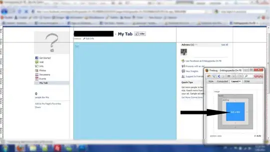
landscape

xaphod
  • 6,392
  • 2
  • 37
  • 45
  • Try `resizeMode="contain"` and maybe you will have to set its width and height to be fixed with respect to your window dimensions – Khalil Khalaf Jul 28 '17 at 18:50
  • @KhalilKhalaf how do i "set its width and height to be fixed with respect to your window dimensions" ? – xaphod Jul 28 '17 at 19:01
  • From [**this**](https://stackoverflow.com/a/32031698/5890227), you can get the height and width of your window. Then you would set your image to be for example `height/10` and `width/2`, etc. Let me know how it goes and I will help more. – Khalil Khalaf Jul 28 '17 at 20:32

2 Answers2

1

FYI the Dimensions module doesn't automatically update when the screen rotates. It is only an option if you can somehow detect the rotation and force a rerender.

One option is wrapping the components that need to be responsive with a View and then use the onLayout property. The function passed as onLayout will receive a {nativeEvent: { layout: {x, y, width, height}}} containing the View's updated position and dimensions any time they change; if you write these to the component's state you can automatically recalculate your new height and width and trigger a rerender when the screen rotates (e.g. set onLayout on your root View and update the image's width to be the width of the entire screen). You can ctrl+f for "onLayout" here.

The flex style prop also updates on rotation, so you could possibly set flex:1 for example on your root component and somehow use flexbox to keep everything styled responsively.

SoZettaSho
  • 950
  • 11
  • 20
  • As much as possible already has `flex: 1`. The issue is that the size of the component does change but `resizeMode="cover"` does not rescale the image as it should upon rotation – xaphod Aug 10 '17 at 18:13
  • @xaphod What happens if you update state for the component containing the image after a rotation? Does it resize? – SoZettaSho Aug 10 '17 at 23:11
0

Yep adding flex: 1 to your image style should fix your issue. As long as you are setting only a default height and not a width. In my case I had set both width and height for my image and had the same issue when the device went landscape. Once I removed the width and added flex: 1 my issue was resolved

Austin Cline
  • 81
  • 1
  • 4
  • No, flex: 1 causes the image to take up a lot more space than it should, ie ignore its fixed height. Wrapping it in a View fixes that but the image still does not scale as resizeMode="cover" implies it should. – xaphod Aug 10 '17 at 18:12