1

At the moment, viewing this table on a small screen will produce a horizontal scroll bar. Instead, how do I force it to display full-wdith and "zoomed out" on small screens?

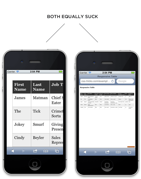
I'm trying to achieve what is happening on the right hand picture here: https://css-tricks.com/wp-content/uploads/2011/04/doublesuck.png

I'm hoping there is some sort of media query CSS I can use.

.td {
  /* width: 100% !important; */
  font-family: "Helvetica Neue", Helvetica, Roboto, Arial, sans-serif;
  color: #2b2c37;
}

.tracking-provider {
  text-align: left;
  font-family: 'Helvetica Neue', Helvetica, Roboto, Arial, sans-serif;
  color: #737373;
  border: 1px solid #e4e4e4;
  padding: 12px;
}

.tracking-number {
  text-align: left;
  font-family: 'Helvetica Neue', Helvetica, Roboto, Arial, sans-serif;
  color: #737373;
  border: 1px solid #e4e4e4;
  padding: 12px;
}

.date-shipped {
  text-align: left;
  font-family: 'Helvetica Neue', Helvetica, Roboto, Arial, sans-serif;
  color: #737373;
  border: 1px solid #e4e4e4;
  padding: 12px;
}

.order-actions {
  text-align: left;
  font-family: 'Helvetica Neue', Helvetica, Roboto, Arial, sans-serif;
  color: #737373;
  border: 1px solid #e4e4e4;
  padding: 12px;
}
<table class="td" cellspacing="0" cellpadding="6" border="1">
  <thead>
    <tr>
      <th class="tracking-provider" scope="col">Provider</th>
      <th class="tracking-number" scope="col">Tracking Number</th>
      <th class="date-shipped" scope="col">Date</th>
      <th class="order-actions" scope="col">&nbsp;</th>
    </tr>
  </thead>
  <tbody>
    <tr class="tracking">
      <td class="tracking-provider">
        Startrack </td>
      <td class="tracking-number">
        99999999999999 </td>
      <td class="date-shipped">
        <time datetime="2017-07-30">July 30, 2017</time>
      </td>
      <td class="order-actions">
        <a href="http://google.com" target="_blank">Track</a>
      </td>
    </tr>
  </tbody>
</table>
TinyTiger
  • 1,801
  • 7
  • 47
  • 92

3 Answers3

1

1) Fix Your Design

Whilst there's nothing wrong with your request per say; the image you link to does state

both equally suck

because they do. I would overall suggest reworking how your data is laid out; not sticking with a traditional multicolumn table syntax.

2) Frankenstein CSS Solution

Anyhow; as a solution; you want to use two rules: One for big screens and one for small screens. The "big screens" rule is a default and while I show it here for clarity; it's information that you already know and is simply a tweak on the default in browsers.

table {
     display    : table;
     max-width  : 100%;
     box-sizing : border-box;
     border-collapse: collapse;
}

Now; for media queries for small devices; say less than 768px (this figure is pretty arbetary; simply choose the scale that is smaller than your table columns comfortably fit into):

@media screen only and (max-width:765px){
    table {
        max-width  :100vw;  
        width      :100vw; 
        font-size  :<figure>vw;  
    }
}

The above rule will work if all child elements of the <table> are scaled by percentage or screen width or other non-absolute value (ie <td> width is declared as a % not as px, etc.).

The font size is an opional bonus variable and again will depend on your table size and how much data you want to fit on the screen and how readable you want this data to be. Also note the font size may require an !important; flag on it to overwrite cell or row specific font sizing on the table.

If you are keen to scale fonts (as per your example image) I would suggest looking into precise control responsive typography by Mike.

3) Use The Vewport Meta Tag

The Viewport Meta Tag will go a long way towards helping you jump this hurdle.

4) Don't Zoom or Transform: Scale

The CSS zoom rule is not implemented in many browsers. It should not be used. Using transform:scale also does work in some browsers (Chrome) but does not work at all in others (Firefox).

Martin
  • 22,212
  • 11
  • 70
  • 132
0

You can make use of the media query within the CSS. You can change the width when you have different sizes. Here is a small example of how it works!

.td {
  /* width: 100% !important; */
  font-family: "Helvetica Neue", Helvetica, Roboto, Arial, sans-serif;
  color: #2b2c37;
}

.tracking-provider {
  text-align: left;
  font-family: 'Helvetica Neue', Helvetica, Roboto, Arial, sans-serif;
  color: #737373;
  border: 1px solid #e4e4e4;
  padding: 12px;
}

.tracking-number {
  text-align: left;
  font-family: 'Helvetica Neue', Helvetica, Roboto, Arial, sans-serif;
  color: #737373;
  border: 1px solid #e4e4e4;
  padding: 12px;
}

.date-shipped {
  text-align: left;
  font-family: 'Helvetica Neue', Helvetica, Roboto, Arial, sans-serif;
  color: #737373;
  border: 1px solid #e4e4e4;
  padding: 12px;
}

.order-actions {
  text-align: left;
  font-family: 'Helvetica Neue', Helvetica, Roboto, Arial, sans-serif;
  color: #737373;
  border: 1px solid #e4e4e4;
  padding: 12px;
}

@media(max-width: 500){
  .td{
    width: 100%;
  }
}
<table class="td" cellspacing="0" cellpadding="6" border="1">
  <thead>
    <tr>
      <th class="tracking-provider" scope="col">Provider</th>
      <th class="tracking-number" scope="col">Tracking Number</th>
      <th class="date-shipped" scope="col">Date</th>
      <th class="order-actions" scope="col">&nbsp;</th>
    </tr>
  </thead>
  <tbody>
    <tr class="tracking">
      <td class="tracking-provider">
        Startrack </td>
      <td class="tracking-number">
        99999999999999 </td>
      <td class="date-shipped">
        <time datetime="2017-07-30">July 30, 2017</time>
      </td>
      <td class="order-actions">
        <a href="http://google.com" target="_blank">Track</a>
      </td>
    </tr>
  </tbody>
</table>
N. Ivanov
  • 1,795
  • 2
  • 15
  • 28
  • on the bottom of the CSS you will see the `@media` query – N. Ivanov Aug 08 '17 at 08:24
  • but the table is still producing horizontal scroll, and not shrinking down to size of screen. – TinyTiger Aug 08 '17 at 08:26
  • well have a read about how the media query works, and play around. A suggestion that I can give you is to lower the font size. – N. Ivanov Aug 08 '17 at 08:27
  • Thanks for helping, but I already know about media query because I suggest that in the question. I'm trying to figure out what to use inside the media query. That is the problem. – TinyTiger Aug 08 '17 at 08:29
0

you can use this simple css to zoom out table,, I used two thirds of parent width.. you can try it with your table.

.tftable {
  font-size: 12px;
  color: #333333;
  width: 100%;
  border-width: 1px;
  border-color: #9dcc7a;
  border-collapse: collapse;
}

.tftable th {
  font-size: 12px;
  background-color: #abd28e;
  border-width: 1px;
  padding: 8px;
  border-style: solid;
  border-color: #9dcc7a;
  text-align: left;
}

.tftable tr {
  background-color: #bedda7;
}

.tftable td {
  font-size: 12px;
  border-width: 1px;
  padding: 8px;
  border-style: solid;
  border-color: #9dcc7a;
}

.tftable tr:hover {
  background-color: #ffffff;
}

.tftable {
  zoom: 50 %;
  transform: scale(calc(2/3));
}
<table class="tftable" border="1">
  <tr>
    <th>Header 1</th>
    <th>Header 2</th>
    <th>Header 3</th>
    <th>Header 4</th>
    <th>Header 5</th>
    <th>Header 6</th>
    <th>Header 7</th>
    <th>Header 8</th>
  </tr>
  <tr>
    <td>Row:1 Cell:1</td>
    <td>Row:1 Cell:2</td>
    <td>Row:1 Cell:3</td>
    <td>Row:1 Cell:4</td>
    <td>Row:1 Cell:5</td>
    <td>Row:1 Cell:6</td>
    <td>Row:1 Cell:7</td>
    <td>Row:1 Cell:8</td>
  </tr>
  <tr>
    <td>Row:2 Cell:1</td>
    <td>Row:2 Cell:2</td>
    <td>Row:2 Cell:3</td>
    <td>Row:2 Cell:4</td>
    <td>Row:2 Cell:5</td>
    <td>Row:2 Cell:6</td>
    <td>Row:2 Cell:7</td>
    <td>Row:2 Cell:8</td>
  </tr>
  <tr>
    <td>Row:3 Cell:1</td>
    <td>Row:3 Cell:2</td>
    <td>Row:3 Cell:3</td>
    <td>Row:3 Cell:4</td>
    <td>Row:3 Cell:5</td>
    <td>Row:3 Cell:6</td>
    <td>Row:3 Cell:7</td>
    <td>Row:3 Cell:8</td>
  </tr>
  <tr>
    <td>Row:4 Cell:1</td>
    <td>Row:4 Cell:2</td>
    <td>Row:4 Cell:3</td>
    <td>Row:4 Cell:4</td>
    <td>Row:4 Cell:5</td>
    <td>Row:4 Cell:6</td>
    <td>Row:4 Cell:7</td>
    <td>Row:4 Cell:8</td>
  </tr>
  <tr>
    <td>Row:5 Cell:1</td>
    <td>Row:5 Cell:2</td>
    <td>Row:5 Cell:3</td>
    <td>Row:5 Cell:4</td>
    <td>Row:5 Cell:5</td>
    <td>Row:5 Cell:6</td>
    <td>Row:5 Cell:7</td>
    <td>Row:5 Cell:8</td>
  </tr>
  <tr>
    <td>Row:6 Cell:1</td>
    <td>Row:6 Cell:2</td>
    <td>Row:6 Cell:3</td>
    <td>Row:6 Cell:4</td>
    <td>Row:6 Cell:5</td>
    <td>Row:6 Cell:6</td>
    <td>Row:6 Cell:7</td>
    <td>Row:6 Cell:8</td>
  </tr>
</table>
Kresimir Pendic
  • 3,597
  • 1
  • 21
  • 28