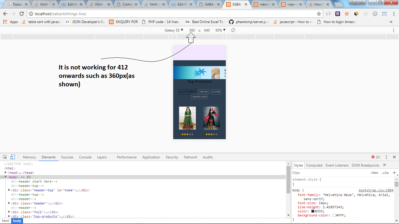
I have a situation where I want to make flipkart banner responsive.
It will work fine for screen sizes more than 768px, but it does not work for mobile sizes.
I have tried this thread Make banner ads responsive but it is only working for older banner not for new banner.
DEMO HERE: https://jsfiddle.net/hwub8sw1/
Here is what i have tried:
style.css
* {margin:0; padding:0;}

div[data-wrid^=WRID] {
    margin: 0 auto;
    max-width:100% !important;
}

div[data-wrid^=WRID] img {
  max-width:100% !important;
  margin:0 auto;
}

iframe {
  max-width:730px !important;
     text-align:center !important;
     margin:0 auto;
}

@media (max-width:730px) {
    iframe {
      max-width:100% !important;
    }

     div[data-wrid^=WRID] img {
      max-width:100% !important;
      margin:0 auto;
    }
}


@media (max-width:400px) {
    iframe {
      max-width:100% !important;
    }

     div[data-wrid^=WRID] img {
      max-width:90% !important;
      margin:0 auto;
    }
}


@media (min-width:320px) {
    iframe {
      max-width:100% !important;
    }

     div[data-wrid^=WRID] img {
      max-width:90% !important;
      margin:0 auto;
    }/* smartphones, iPhone, portrait 480x320 phones */
}

@media (min-width:481px) {
      iframe {
      max-width:100% !important;
    }

     div[data-wrid^=WRID] img {
      max-width:100% !important;
      margin:0 auto;
    }
/* portrait e-readers (Nook/Kindle), smaller tablets @ 600 or @ 640 wide. */
}
@media (min-width:641px) {

      iframe {
      max-width:100% !important;
    }

     div[data-wrid^=WRID] img {
      max-width:100% !important;
      margin:0 auto;
    }
/* portrait tablets, portrait iPad, landscape e-readers, landscape 800x480 or 854x480 phones */
}
html
 <div data-wrid="WRID-149802169852992393" data-widgettype="staticBanner" data-responsive="yes" data-class="affiliateAdsByFlipkart" height="90" width="728" style="text-align:center;"></div>
      <script async src="//affiliate.flipkart.com/affiliate/widgets/FKAffiliateWidgets.js"></script>