1

I am creating a responsive dashboard with a fixed header and sidebar nav. I am trying to create the template depicted below but am having issues with div stacking:

template

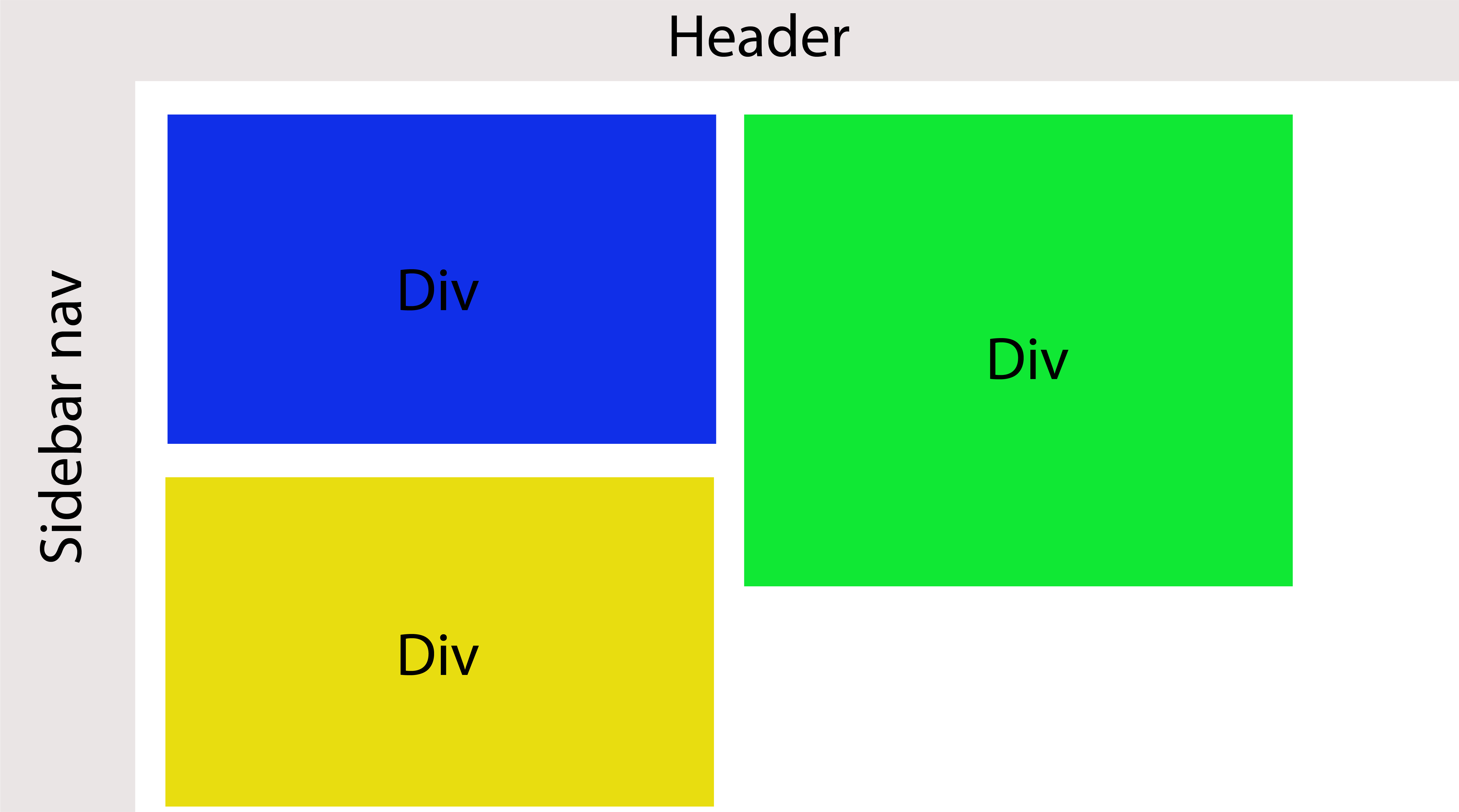
Instead, I can only get them to stack like in this image here:

template 2

I have a wrapper around the divs that has the following styles:

width: 100%;
padding: 15px;

The divs themselves are wrapped in a container with the following styles:

display: inline-block;
width: 50%;
padding: 15px;
float: left;
vertical-align: top;

Apparently, vertical-align: top is supposed to solve this issue but I haven't been able to get the yellow div to the right position. Any ideas?

Community
  • 1
  • 1
  • 2
    Can you provide your full code (html and css part) on jsfiddle ? Do you plan to use Bootstrap or not – Rémy Testa Aug 08 '17 at 15:10
  • 1
    I'm voting to close this question as off-topic because this is an often asked question that is answered by searching on SO or Google for "masonry" solution or https://masonry.desandro.com/. – Rob Aug 08 '17 at 15:15
  • Possible duplicate of [How do I float articles in two columns?](https://stackoverflow.com/questions/22817038/how-do-i-float-articles-in-two-columns) – Jo. Aug 08 '17 at 15:52

4 Answers4

0

.wrapper{
width: 100%;
padding: 15px;
height:100%;
}

.floating_div{
  margin:10px;
  float:left;
  width: 45%;
  height:300px;
  display:inline-block;
  vertical-align:top;
}

.m-t{
  margin-top:15px;
}

.blue_bg{
  background:blue;
}

.green_bg{
  background:green;
}

.yellow_bg{
  background:yellow;
}

.floating_div .inner_div{
  height:150px;
}
<div class="wrapper">
  <div class="floating_div">
    <div class="inner_div blue_bg">Inner Div 1</div>
    <div class="inner_div yellow_bg m-t"> Inner DIv 2</div>
  </div>
  <div  class="floating_div green_bg ">
    Left Div 2
  </div>
</div>

Is this the same that you are looking for?

Here is JSFiddle

Hope this helps.

Bhavin Shah
  • 2,462
  • 4
  • 22
  • 35
0

This should do it for you:

https://jsfiddle.net/hncuyy6o/1/

`<div class="wrapper">
  <div class="hai">
    <div class="one"></div>    
    <div class="three"></div>
   </div>
     <div class="two"></div>
</div>`

CSS:

    .wrapper{

width: 100%;
padding: 15px;
}

.hai{
  display: inline-block;
}
.one{
  vertical-align: top;
  width: 200px;
  height: 300px;
  background-color: blue;
  display: inline-block;
}

.two{
    vertical-align: top;
  width: 200px;
  height: 400px;
  background-color: red;
   display: inline-block;
}

.three{
  width: 200px;
  height: 300px;
  background-color: yellow;
  display: block;
  position: absolute;
}

Hope that helps.

Dragomir Kolev
  • 1,088
  • 10
  • 25
-1

Simplest way to achieve that is wrapping yellow and blue box with another div. It works unless You have media queries changing layout much. Another thing is to use flexbox with colums.

-1

You can Javascript Masonry Grid Layout to achieve that.

Masonry is a JavaScript grid layout library. It works by placing elements in optimal position based on available vertical space, sort of like a mason fitting stones in a wall. You’ve probably seen it in use all over the Internet.

enter image description here

Using Masonry Library, its simple as this.

<div class="grid">
  <div class="grid-item">...</div>
  <div class="grid-item">...</div>
  <div class="grid-item">...</div>
</div>

Jquery:

$('.grid').masonry({
  // options
  itemSelector: '.grid-item',
  columnWidth: 200
});
Sagun Gautam
  • 470
  • 6
  • 20