0

I am working on a webpage and the idea is that there are boxes at the bottom of the page with some text on it. So making a box is not that hard,

but my question is: How can you make the boxes like this that I drew:

enter image description here

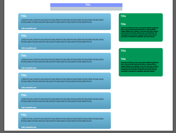
How can you make/arrange the boxes like on the link I provided. My attempts at making it the same has thus far failed, the boxes aren't appearing or it looks very messy.

So far I have this:

.div1 {
  width: 500px;
  height: 100px;
  border-radius: 25px;
  padding: 15px;
  box-sizing: border-box;
  background: #73B7DB;
  margin-left: 5%;
  color: #fff;
}

.div2 {
  width: 200px;
  height: 100px;
  border-radius: 25px;
  padding: 15px;
  box-sizing: border-box;
  background: #73B7DB;
  color: #fff;
  margin-left: 5%;
}

.container2 {
  float: left;
  margin: 0 auto;
  width: 100%;
  display: flex;
}
<div class="container2">
  <div class="div1">Title!</div>
  <br>
  <div class="div2">Title!</div>
</div>
Michael Benjamin
  • 346,931
  • 104
  • 581
  • 701
Lego
  • 117
  • 10

2 Answers2

0

You can put them in a flex wrapper and define the containers themselves also as flex containers with flex-direction: column as shown below.

body {
  margin: 0;
}

* {
  box-sizing: border-box;
}

.wrapper {
  display: flex;
  width: 100%;
}

.container1,
.container2 {
  display: flex;
  flex-direction: column;
}

.container1 {
  width: 70%;
}

.container2 {
  width: 30%;
}

.div1 {
  width: 90%;
  height: 100px;
  border-radius: 25px;
  padding: 15px;
  background: #73B7DB;
  margin-left: 5%;
  color: #fff;
  margin-bottom: 10px;
}

.div2 {
  width: 90%;
  height: 160px;
  border-radius: 25px;
  padding: 15px;
  background: green;
  color: #fff;
  margin-left: 5%;
  margin-bottom: 10px;
}
<div class="wrapper">

  <div class="container1">
    <div class="div1">Title!</div>
    <div class="div1">Title!</div>
    <div class="div1">Title!</div>
    <div class="div1">Title!</div>
    <div class="div1">Title!</div>
  </div>
    <div class="container2">
      <div class="div2">Title!</div>
      <div class="div2">Title!</div>
      <div class="div2">Title!</div>
      <div class="div2">Title!</div>
      <div class="div2">Title!</div>
    </div>
  </div>
Johannes
  • 64,305
  • 18
  • 73
  • 130
0

isn't flex-direction: column; he need to use flex-wrap:wrap; in container 2, beacause when you use display:flex; , flexbox dont respect the width of the elements, then you need to apply the property flex-wrap:wrap;. i'll recommend you use porcentege instead pixels

.div1,.div2 {
  width: 100%;
  height: 100px;
  border-radius: 25px;
  padding: 15px;
  box-sizing: border-box;
  background: #73B7DB;
  margin-left: 5%;
  color: #fff;
}

.container2 {
  float: left;
  margin: 0 auto;
  width: 68%;
  display: flex;
  flex-wrap:wrap;
}
<div class="container2">
  <div class="div1">Title!</div>
  <br>
  <div class="div2">Title!</div>
</div>
Risa__B
  • 451
  • 4
  • 8