I am trying to produce some charts of the dummy data at the bottom of this message and have a few questions.
Would it be recommended to generate a new dataframe with summary stats so that the Year column becomes unique and the second column provides the total count or can I work with the data as is?
Related to this, if I do want to create a new dataframe, what is the best way to make it so that it has: Year, TotalCount, Counts per Term, Counts per Society?
My dummyyearcount dataframe has been created using:
dummyyearcount <- count(dummydata, 'Year')
Is there a way to do multiple counts within the one line of code? If so, how?
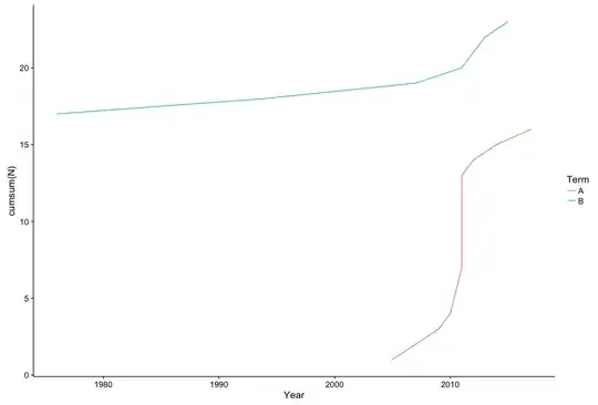
Regarding the plots, I am looking to plot a cumulative line plot, however when running the code below, it is looking for a y axis value. Is there are a way to make it do a count of the number of publications within that year rather and then split it out by society or term as opposed to me having to output a summary table and feeding in the Total Count as the y-axis?
The code below is what I have for the line plot, which complains with: "Error: geom_line requires the following missing aesthetics: y"
Also, how can I make this cumulative so in years of no publications it will just flat line?
ggplot() + aes(dummydata$Year, group=dummydata$Term, color=dummydata$Term) + geom_line(show.legend = TRUE) +
  theme(axis.ticks=element_line(colour = 'black'), panel.background = element_rect('white'),
        panel.grid.major = element_line(colour = 'gray85'), panel.border = element_rect(colour = 'black', fill = FALSE)) +
  scale_y_continuous(expand = c(0,0), limits = c(0,5)) + scale_x_continuous(expand = c(0,0))
Output from dput():
structure(list(Year = c(2017L, 2011L, 2012L, 2010L, 2011L, 2015L,
2011L, 2011L, 2012L, 1994L, 2005L, 2009L, 1976L, 2007L, 2014L,
2013L, 2007L), Title = structure(1:17, .Label = c("Title of paper A",
"Title of paper B", "Title of paper C", "Title of paper D", "Title of paper E",
"Title of paper F", "Title of paper G", "Title of paper H", "Title of paper I",
"Title of paper J", "Title of paper K", "Title of paper L", "Title of paper M",
"Title of paper N", "Title of paper O", "Title of paper P", "Title of paper Q"
), class = "factor"), Authors = structure(c(1L, 1L, 2L, 1L, 3L,
4L, 7L, 1L, 8L, 5L, 4L, 6L, 10L, 10L, 9L, 4L, 2L), .Label = c("Bloggs",
"Jones", "Jones and Bloggs", "Smith", "Smith and Jones", "Smith, Jones and Wilson",
"White", "White and Bloggs", "Wilson", "Wilson and Jones"), class = "factor"),
    Society = structure(c(4L, 4L, 1L, 1L, 4L, 4L, 2L, 3L, 4L,
    1L, 1L, 4L, 4L, 2L, 4L, 4L, 4L), .Label = c("ABC", "MNO",
    "N", "XYZ"), class = "factor"), Term = structure(c(1L, 1L,
    1L, 1L, 1L, 2L, 2L, 1L, 2L, 2L, 1L, 1L, 2L, 1L, 1L, 2L, 2L
    ), .Label = c("A", "B"), class = "factor")), .Names = c("Year",
"Title", "Authors", "Society", "Term"), class = "data.frame", row.names = c(NA,
-17L))
An example plot of the look I am eventually wanting to achieve:

I am still very new to R so any help would be appreciated.


