2

I'm trying to use CSS Grid as a 2d alternative to fill the space for a small test blog I am creating. I've run into a small issue regarding positioning.

Firstly, as it's a blog, I'm not too sure how long the content is going to be inside the articles. Therefore I can't use a set positioning to modify the layout.
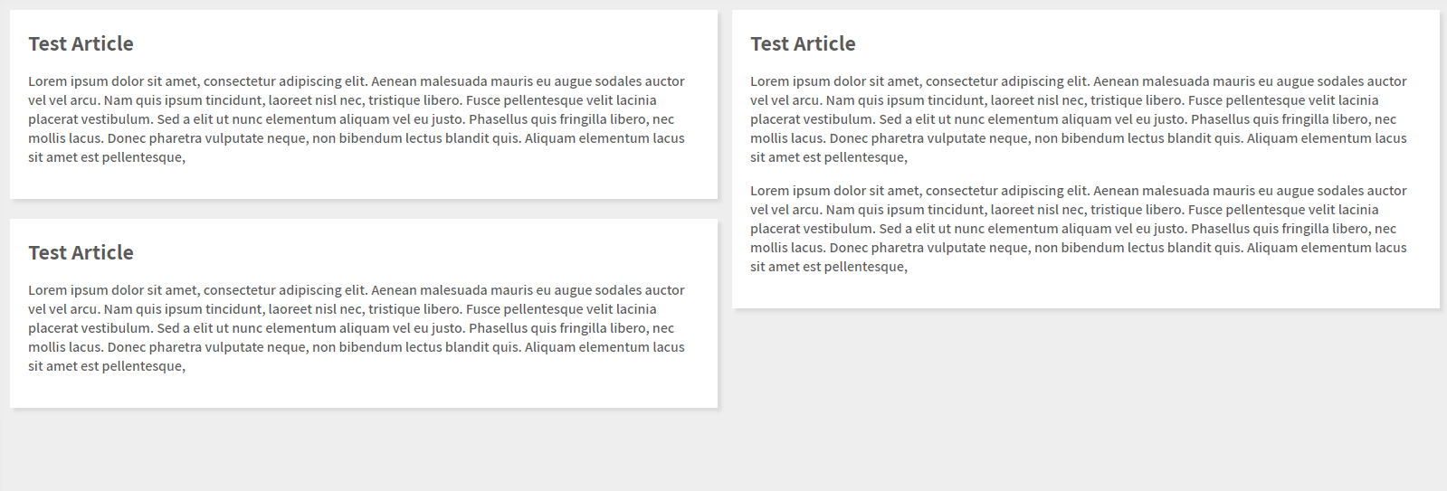
My current view is:

enter image description here

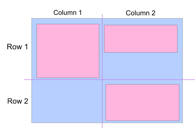
However, I would like the view to look like:

enter image description here

Currently, my code is structured as:

CSS

.articles {
    margin: 20px;
    display: grid;
    grid-template-columns: repeat(2, 1fr);
    grid-gap: 1em;
}
article {
    align-self: start;
}

HTML

<div class="articles">
    <article>lorem ipsum...</article>
    <article>lorem ipsum...</article>
    <article>lorem ipsum...</article>
</div>

It seems the align-self is working as it should by removing the empty content because of the larger (Second) paragraph. However the third paragraph is staying in its current static position rather than moving up into the now blank, position where align-self: stretch would have been.

I'm not too sure what I can try to fix this issue.

ConorReidd
  • 276
  • 5
  • 25
  • You may want to look at Flex-box and use flex columns, or divide your content as actual columns and let them fill the columns as you go. – MiltoxBeyond Aug 15 '17 at 18:42
  • 1
    @MiltoxBeyond I see, perhaps this isn't an appropriate use for CSS Grid. – ConorReidd Aug 15 '17 at 18:44
  • 2
    CSS Grid can do this better than Flexbox, so be patient and someone who knows how will post an answer ... Flexbox will need a fixed height on the parent if you choose to go down that path, which most don't as one want it to be dynamic – Asons Aug 15 '17 at 18:48
  • 1
    Also just to mention. @TylerH, The last edit you made changing the code to a snippet is not valid to the question. Showing a snippet does not bring my issue to light and gives the wrong idea of what my problem is. Please stop editing my post to help with your achievements, especially without fully understanding the question. – ConorReidd Aug 15 '17 at 18:54
  • 1
    @TylerH Yeah, it was a poor snippet which didn't even show the issue. – Don Aug 15 '17 at 18:55
  • 1
    for grid element to "stretch" through columns or rows, you need to tell them via CSS to span so many rows or columns. It is not being done on itself. You may want to use the masonry javascript library for this kind of behavior :( not flex or grid does that on itself ) column-count and colum-fill might have hepled but might never validate and will deasapear – G-Cyrillus Aug 15 '17 at 18:57
  • 1
    @ConorReidd I'm not editing your post for achievements (i've already earned all the edit-related achievements and badges, for the record). Don't be rude. I'm editing your post to improve it; as a Stack Snippet, there's less fluff, and it also better highlights the fact that your post lacks a [mcve]. – TylerH Aug 15 '17 at 18:58

2 Answers2

4

CSS Grid or Flexbox probably aren't the appropriate choice for something like this, but CSS columns may be:

body {
  background: #EEE;
}

.articles {
  -webkit-column-width: 300px;
  -moz-column-width: 300px;
  column-width: 300px;
  -webkit-column-gap: 30px;
  -moz-column-gap: 30px;
  column-gap: 30px;
  width: 90%;
  max-width: 1100px;
  margin: 30px auto;
}

article {
  margin: 15px 0;
  padding: 15px;
  background: #FFF;
  box-shadow: 0 3px 10px rgba(0, 0, 0, 0.25);
  display: inline-block;
  -webkit-column-break-inside: avoid;
  -moz-column-break-inside: avoid;
  column-break-inside: avoid;
}
<div class="articles">
  <article>
    <h2>Article Title</h2>
    <p>Lorem ipsum dolor sit amet, consectetur adipiscing elit. Morbi finibus odio in enim feugiat sagittis. Mauris ac nulla ac nulla volutpat scelerisque vel eu nisi. Curabitur vehicula vestibulum ligula eu condimentum.</p>
    <p>Lorem ipsum dolor sit amet, consectetur adipiscing elit. Morbi finibus odio in enim feugiat sagittis. Mauris ac nulla ac nulla volutpat scelerisque vel eu nisi. Curabitur vehicula vestibulum ligula eu condimentum.</p>
  </article>
  <article>
    <h2>Article Title</h2>
    <p>Lorem ipsum dolor sit amet, consectetur adipiscing elit. Morbi finibus odio in enim feugiat sagittis.</p>
  </article>
  <article>
    <h2>Article Title</h2>
    <p>Lorem ipsum dolor sit amet, consectetur adipiscing elit. Morbi finibus odio in enim feugiat sagittis. Mauris ac nulla ac nulla volutpat scelerisque vel eu nisi. Curabitur vehicula vestibulum ligula eu condimentum.</p>
  </article>
  <article>
    <h2>Article Title</h2>
    <p>Lorem ipsum dolor sit amet, consectetur adipiscing elit. Morbi finibus odio in enim feugiat sagittis. Mauris ac nulla ac nulla volutpat scelerisque vel eu nisi. Curabitur vehicula vestibulum ligula eu condimentum.</p>
    <p>Lorem ipsum dolor sit amet, consectetur adipiscing elit. Morbi finibus odio in enim feugiat sagittis. Mauris ac nulla ac nulla volutpat scelerisque vel eu nisi. Curabitur vehicula vestibulum ligula eu condimentum.</p>
  </article>
</div>
pixleight
  • 188
  • 7
  • colum-fill can be also usefull. but i'm not sure that column css will remain in the spec since flex & grid shown up :( old draft https://www.w3.org/TR/2001/WD-css3-multicol-20010118/ latest https://www.w3.org/TR/css3-multicol/ & https://www.w3.org/TR/css3-multicol/#cr-exit-criteria – G-Cyrillus Aug 15 '17 at 19:03
  • Is there any way I can use percentage width as the column width? – ConorReidd Aug 15 '17 at 19:06
  • @ConorReidd you can take a look at vw units instead % – G-Cyrillus Aug 15 '17 at 19:09
  • @G-Cyr for sure, columns definitely need to be prefixed if they're to be used. Flex would be great for this if you have a defined container height, but I don't believe it'll wrap properly without one. – pixleight Aug 15 '17 at 19:10
  • @ConorReidd yes, you should be able to use any size value. https://developer.mozilla.org/en-US/docs/Web/CSS/column-width – pixleight Aug 15 '17 at 19:12
2

This isn't really possible with CSS Grid. In CSS Grid the children are arranged into columns and rows. What you're looking for is for them to be arranged just as columns. There may be a way to get this to work using flexbox alone (I'll add it here if I figure it out) but really what you want is a grid with 2 columns where each column is a flexbox.

The reason this just isn't possible is because of the row height. There's no concept of only columns in CSS Grid. When an element is added to a grid with no rows defined the grid will automatically add an auto-row whose heights can be controlled by the grid-auto-rows property (Same for columns). So after your first article is added you can think of it as adding a rigid row. enter image description here

The point of Grid is that it is a 2 dimensional layout tool where Flexbox and normal document flow focus heavily on 1 dimensional (With a few exceptions, like float). You can see the the height of the articles will dictate the height of rows they're contained in.

The only way to get an effect like this is with pre-defined heights for the articles where there are multiple sizes to span multiple rows.

As other answers have said, the best approach here is likely Flexbox. I don't recommend Columns as it's a bit buggy and not exactly well supported (though if you're using CSS Grid maybe that doesn't matter to you)

Don
  • 3,987
  • 15
  • 32