1

I have toggle buttons on a WPF form that I use to display boolean value.

Some of those button are supposed to be "read only", so I setted them with IsEnabled = false.

However, those should display their IsChecked state nonetheless but they all apear as unchecked

screenshot

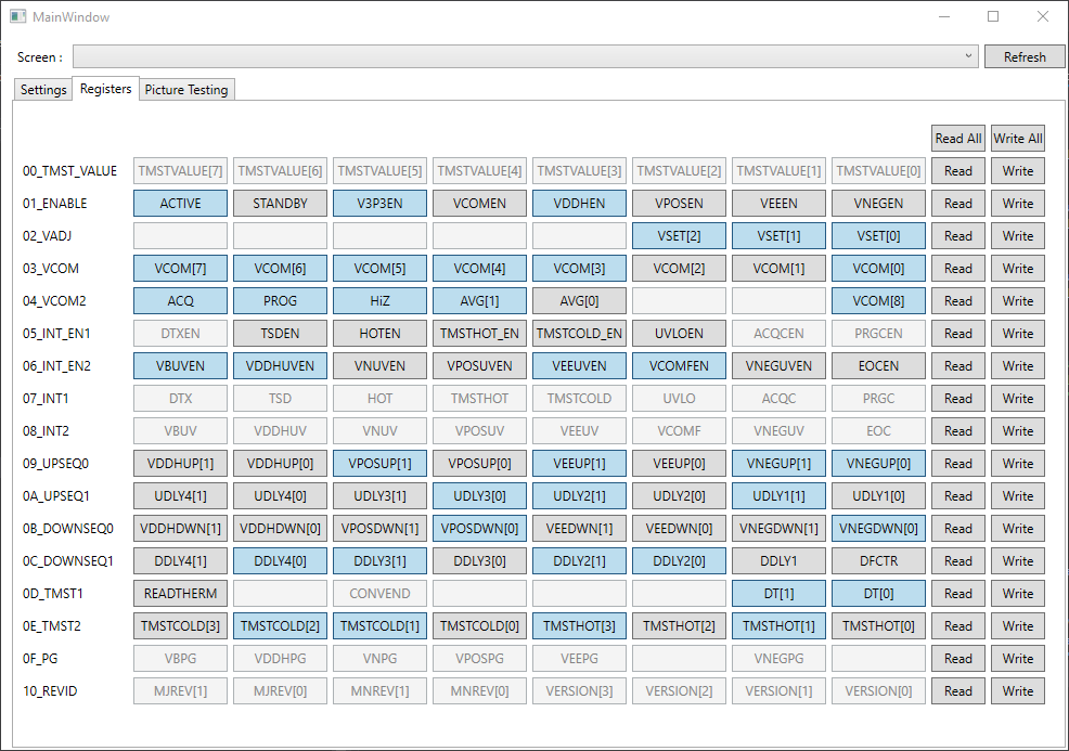
As you can see, all the disabled seem unchecked, where some should look checked.

I'm creating the toggle buttons by code but the problem is there too with "static" toggle buttons

ToggleButton tb = new ToggleButton();

tb.Name = "btnRegisterR" + register + "P" + pos;
tb.Content = tuple.Item1";
tb.IsChecked = rnd.NextDouble() >= 0.5;
tb.IsEnabled = tuple.Item2;
tb.VerticalAlignment = VerticalAlignment.Top;
tb.HorizontalAlignment = HorizontalAlignment.Left;
tb.Height = 25;
tb.Width = 87;
tb.Margin = new Thickness(xPos, yPos, 0, 0);

registerGrid.Children.Add(tb);

Edit : I don't think this is a duplicate of the linked question, as I'm not looking so much to disable interaction on the button as for it to look disabled but keep displaying its status. The linked question only answer the functional part wheras i'm asking mostly about the styling part.

For exemple, in Winforms, there was the apperance button for a checkbox, which allow 2 separate display states (by default a gray button when unselected/unchecked and a light blue one when selected/checked).

On top of that, the control could be enabled/disabled, which, in its disable state, would whitend the whole control but still display diferrently when enabled or disabled.

Edit 2 : For futher clarification, here is what I was using in an old Winform App with checkboxes with an appearance setting set to "button"

demo

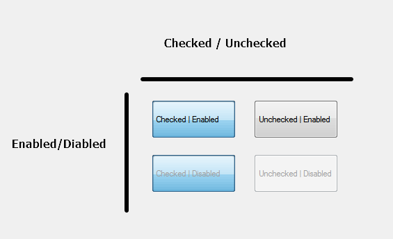
You can clearly visualy separate the ones that are enabled or disabled while still be able to see the state of the input (checked or not). I'm just trying to replicate this display behavior in WPF, without succes for the moment as the "Checked|Disabled" and the "Unchecked|Disabled" look exactly the same with the WPF toggle button.

Edit 3 :

I ended up using multitrigger in the style to make it work. don't know if it's the best solution, but, at least, it give the same results as in winform

end

<Style x:Key="FocusVisual">
    <Setter Property="Control.Template">
        <Setter.Value>
            <ControlTemplate>
                <Rectangle Margin="2" SnapsToDevicePixels="true" Stroke="{DynamicResource {x:Static SystemColors.ControlTextBrushKey}}" StrokeThickness="1" StrokeDashArray="1 2"/>
            </ControlTemplate>
        </Setter.Value>
    </Setter>
</Style>
<SolidColorBrush x:Key="Button.Static.Background" Color="#FFDDDDDD"/>
<SolidColorBrush x:Key="Button.Static.Border" Color="#FF707070"/>
<SolidColorBrush x:Key="Button.MouseOver.Background" Color="#FFBEE6FD"/>
<SolidColorBrush x:Key="Button.MouseOver.Border" Color="#FF3C7FB1"/>
<SolidColorBrush x:Key="Button.Pressed.Background" Color="#FFC4E5F6"/>
<SolidColorBrush x:Key="Button.Pressed.Border" Color="#FF2C628B"/>
<SolidColorBrush x:Key="Button.Disabled.Background" Color="#FFF4F4F4"/>
<SolidColorBrush x:Key="Button.Disabled.Border" Color="#FFADB2B5"/>
<SolidColorBrush x:Key="Button.Disabled.Foreground" Color="#FF838383"/>
<Style x:Key="disabledAndCheckedButton" TargetType="{x:Type ToggleButton}">
    <Setter Property="FocusVisualStyle" Value="{StaticResource FocusVisual}"/>
    <Setter Property="Background" Value="{StaticResource Button.Static.Background}"/>
    <Setter Property="BorderBrush" Value="{StaticResource Button.Static.Border}"/>
    <Setter Property="Foreground" Value="{DynamicResource {x:Static SystemColors.ControlTextBrushKey}}"/>
    <Setter Property="BorderThickness" Value="1"/>
    <Setter Property="HorizontalContentAlignment" Value="Center"/>
    <Setter Property="VerticalContentAlignment" Value="Center"/>
    <Setter Property="Padding" Value="1"/>
    <Setter Property="Template">
        <Setter.Value>
            <ControlTemplate TargetType="{x:Type ToggleButton}">
                <Border x:Name="border" BorderBrush="{TemplateBinding BorderBrush}" BorderThickness="{TemplateBinding BorderThickness}" Background="{TemplateBinding Background}" SnapsToDevicePixels="true">
                    <ContentPresenter x:Name="contentPresenter" Focusable="False" HorizontalAlignment="{TemplateBinding HorizontalContentAlignment}" Margin="{TemplateBinding Padding}" RecognizesAccessKey="True" SnapsToDevicePixels="{TemplateBinding SnapsToDevicePixels}" VerticalAlignment="{TemplateBinding VerticalContentAlignment}"/>
                </Border>
                <ControlTemplate.Triggers>
                    <Trigger Property="Button.IsDefaulted" Value="true">
                        <Setter Property="BorderBrush" TargetName="border" Value="{DynamicResource {x:Static SystemColors.HighlightBrushKey}}"/>
                    </Trigger>
                    <Trigger Property="IsMouseOver" Value="true">
                        <Setter Property="Background" TargetName="border" Value="{StaticResource Button.MouseOver.Background}"/>
                        <Setter Property="BorderBrush" TargetName="border" Value="{StaticResource Button.MouseOver.Border}"/>
                    </Trigger>
                    <Trigger Property="IsChecked" Value="true">
                        <Setter Property="Background" TargetName="border" Value="{StaticResource Button.Pressed.Background}"/>
                        <Setter Property="BorderBrush" TargetName="border" Value="{StaticResource Button.Pressed.Border}"/>
                    </Trigger>
                    <MultiTrigger>
                        <MultiTrigger.Conditions>
                            <Condition Property="IsChecked" Value="False" />
                            <Condition Property="IsEnabled" Value="False" />
                        </MultiTrigger.Conditions>
                        <MultiTrigger.Setters>
                            <Setter Property="Background" TargetName="border" Value="{StaticResource Button.Disabled.Background}"/>
                            <Setter Property="BorderBrush" TargetName="border" Value="{StaticResource Button.Disabled.Border}"/>
                            <Setter Property="TextElement.Foreground" TargetName="contentPresenter" Value="{StaticResource Button.Disabled.Foreground}"/>
                        </MultiTrigger.Setters>
                    </MultiTrigger>
                    <MultiTrigger>
                        <MultiTrigger.Conditions>
                            <Condition Property="IsChecked" Value="True" />
                            <Condition Property="IsEnabled" Value="False" />
                        </MultiTrigger.Conditions>
                        <MultiTrigger.Setters>
                            <Setter Property="TextElement.Foreground" TargetName="contentPresenter" Value="{StaticResource Button.Disabled.Foreground}"/>
                        </MultiTrigger.Setters>
                    </MultiTrigger>
                </ControlTemplate.Triggers>
            </ControlTemplate>
        </Setter.Value>
    </Setter>
</Style>
Remy Grandin
  • 1,638
  • 1
  • 14
  • 34
  • 1
    Possible duplicate of [How can I prevent a ToggleButton from being Toggled without setting IsEnabled](https://stackoverflow.com/questions/2548863/how-can-i-prevent-a-togglebutton-from-being-toggled-without-setting-isenabled) – Fruchtzwerg Aug 20 '17 at 18:35
  • I don't think my question is a duplicate, see my edit for details. – Remy Grandin Aug 20 '17 at 21:33
  • 1
    _"I'm not looking so much to disable interaction on the button as for it to look disabled but keep displaying it's status"_ -- that makes no sense for at least two reasons: first, why do you want a button that's not disabled, to look disabled? Are you intentionally trying to confuse your users? And second, _"look disabled"_ is the exact opposite of _"displaying it's [sic] status"_. The disabled "look" is a specific look, which does _not_ show the coloring you seem to want. Please fix your question so that it can be understood what it is you actually want. – Peter Duniho Aug 20 '17 at 22:17
  • 2
    On top of all of that, you should be using XAML, not code-behind, to create your UI, where you'd have the opportunity to edit the control template so that it looks exactly like you want under any condition. – Peter Duniho Aug 20 '17 at 22:17
  • 1
    @PeterDuniho : I totally want my disabled button to be disabled, but I don't want it to not display it's checked state when disabled. When i'm speaking of status, I'm speaking about it's "IsChecked" property, sorry for the misunderstanding. I agree that whenever possible the controls should be defined in the XAML, but here they are generated from a configuration file read at runtime, so I have to create them by code. I added an edit to clarify the states I'm looking to reproduce in WPF. – Remy Grandin Aug 21 '17 at 13:19

1 Answers1

1

I just tried to solve your problem and you can do it by setting the tb.IsHitTestVisible=false; but leave IsEnabled=true.
This will allow the Button to retain it's visual state but it will disable any interaction with it.
Treat it as a IsReadOnly.
EDIT:
After long think I went ahead and used Blend to create Style for your Button:

<Style x:Key="FocusVisual">
        <Setter Property="Control.Template">
            <Setter.Value>
                <ControlTemplate>
                    <Rectangle Margin="2" SnapsToDevicePixels="true" Stroke="{DynamicResource {x:Static SystemColors.ControlTextBrushKey}}" StrokeThickness="1" StrokeDashArray="1 2"/>
                </ControlTemplate>
            </Setter.Value>
        </Setter>
    </Style>
    <SolidColorBrush x:Key="Button.Static.Background" Color="#FFDDDDDD"/>
    <SolidColorBrush x:Key="Button.Static.Border" Color="#FF707070"/>
    <SolidColorBrush x:Key="Button.MouseOver.Background" Color="#FFBEE6FD"/>
    <SolidColorBrush x:Key="Button.MouseOver.Border" Color="#FF3C7FB1"/>
    <SolidColorBrush x:Key="Button.Pressed.Background" Color="#FFC4E5F6"/>
    <SolidColorBrush x:Key="Button.Pressed.Border" Color="#FF2C628B"/>
    <SolidColorBrush x:Key="Button.Disabled.Background" Color="#FFF4F4F4"/>
    <SolidColorBrush x:Key="Button.Disabled.Border" Color="#FFADB2B5"/>
    <SolidColorBrush x:Key="Button.Disabled.Foreground" Color="#FF838383"/>
    <Style x:Key="disabledAndCheckedButton" TargetType="{x:Type ToggleButton}">
        <Setter Property="FocusVisualStyle" Value="{StaticResource FocusVisual}"/>
        <Setter Property="Background" Value="{StaticResource Button.Static.Background}"/>
        <Setter Property="BorderBrush" Value="{StaticResource Button.Static.Border}"/>
        <Setter Property="Foreground" Value="{DynamicResource {x:Static SystemColors.ControlTextBrushKey}}"/>
        <Setter Property="BorderThickness" Value="1"/>
        <Setter Property="HorizontalContentAlignment" Value="Center"/>
        <Setter Property="VerticalContentAlignment" Value="Center"/>
        <Setter Property="Padding" Value="1"/>
        <Setter Property="Template">
            <Setter.Value>
                <ControlTemplate TargetType="{x:Type ToggleButton}">
                    <Border x:Name="border" BorderBrush="{TemplateBinding BorderBrush}" BorderThickness="{TemplateBinding BorderThickness}" Background="{TemplateBinding Background}" SnapsToDevicePixels="true">
                        <ContentPresenter x:Name="contentPresenter" Focusable="False" HorizontalAlignment="{TemplateBinding HorizontalContentAlignment}" Margin="{TemplateBinding Padding}" RecognizesAccessKey="True" SnapsToDevicePixels="{TemplateBinding SnapsToDevicePixels}" VerticalAlignment="{TemplateBinding VerticalContentAlignment}"/>
                    </Border>
                    <ControlTemplate.Triggers>
                        <Trigger Property="Button.IsDefaulted" Value="true">
                            <Setter Property="BorderBrush" TargetName="border" Value="{DynamicResource {x:Static SystemColors.HighlightBrushKey}}"/>
                        </Trigger>
                        <Trigger Property="IsMouseOver" Value="true">
                            <Setter Property="Background" TargetName="border" Value="{StaticResource Button.MouseOver.Background}"/>
                            <Setter Property="BorderBrush" TargetName="border" Value="{StaticResource Button.MouseOver.Border}"/>
                        </Trigger>
                        <Trigger Property="IsChecked" Value="true">
                            <Setter Property="Background" TargetName="border" Value="{StaticResource Button.Pressed.Background}"/>
                            <Setter Property="BorderBrush" TargetName="border" Value="{StaticResource Button.Pressed.Border}"/>
                        </Trigger>
                        <Trigger Property="IsEnabled" Value="false">
                            <Setter Property="Background" TargetName="border" Value="{StaticResource Button.Disabled.Background}"/>
                            <Setter Property="BorderBrush" TargetName="border" Value="{StaticResource Button.Disabled.Border}"/>
                            <Setter Property="TextElement.Foreground" TargetName="contentPresenter" Value="{StaticResource Button.Disabled.Foreground}"/>
                        </Trigger>
                    </ControlTemplate.Triggers>
                </ControlTemplate>
            </Setter.Value>
        </Setter>
    </Style>  

This bit of code would go into your App.xaml file where you can reference it anywhere in your app.
You would use this piece as follows:

<ToggleButton Content="{Binding .}" Style="{StaticResource disabledAndCheckedButton}"/>  

And if you want to keep the code-behind

(not cool bro)

then use this snippet where you programatically generate buttons:

Style style = this.FindResource("disabledAndCheckedButton") as Style;
tb.Style = style;  

Let us know if you need any help.

XAMlMAX
  • 2,268
  • 1
  • 14
  • 23
  • Yes indeed, but the button is not visually different between with this property enabled or not. I added an edit to the OP to clarify what i'm looking to accomplish. – Remy Grandin Aug 21 '17 at 13:21
  • @RemyGrandin Ah, I was behind a proxy at work before so I couldn't see any pictures. And I didn't read the question correctly it seems. If you want to have that you will need to create your own style for the `ToggleButton` in XAML it is really not that scary. Once you get to know it you will love it! Use Blend to amend the default style so you won't have to reinvent the wheel. – XAMlMAX Aug 21 '17 at 21:49