I'm new with grid layout, and I'm trying an auto wrapping design with it.
My code is the following:
#grid {
display: grid;
grid-template-columns: repeat(auto-fill, minmax(350px, 1fr));
grid-template-rows: 200px 200px 200px 200px;
grid-gap: 10px;
}
#grid > div {
background-color: #ccddaa;
min-width: 310px;
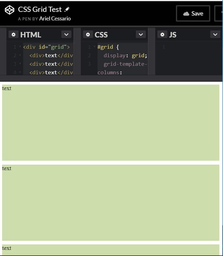
}<div id="grid">
<div>text</div>
<div>text</div>
<div>text</div>
<div>text</div>
</div>Codepen example: https://codepen.io/arielcessario/pen/GvdwLJ
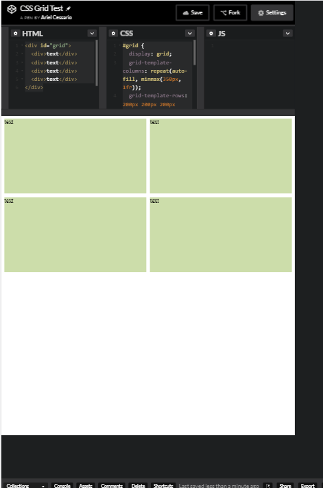
The thing I have noticed is that when I resize chrome/Opera window (not in dev mode, not mobile emulation), the result is the following:
As you can see, all is stacked as expected.
But when I try to emulate a mobile device, or try it in a mobile browser, this is what I get:
This is a screenshot of the project in mobile:

It never stacks, no matter the width.
Notes:
- When I inspect in mobile view, the width of any box is never smaller than 379px, the full width of the grid is never less than 768px.
- If I use fixed max-with kind of works, but percentage doesn't.
- On Firefox emulator works fine, but on Firefox mobile browser it doesn't.
- As Michael_B pointed out, the pen works fine on mobile, the problem is with the real project and if you emulate on chrome.
I guess I'm missing something but I can't find it. Thanks in advance.