-2

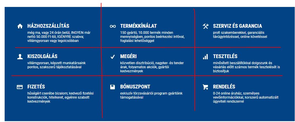
How can i get the result, that you can see on the picture? I the col-md-4 divs, i want the 2 divs next to each other. The ikon to the left side, and text next to the ikon.

What i tried, witout any custom css: Whit this code, the to divs are under each other, and not floating.

echo '<div class="col-md-4 elony">
                    <div class="elony_ikon_div pull-left">'.$elony['elony_ikon'].'</div>
                    <div class="pull-right">
                        <span class="elony_nev">'.$elony['elony_nev'].'</span>
                        <p class="elony_text">'.$elony['elony_text'].'</p>
                    </div>
                    <div class="clearfix"></div>
                </div>';

enter image description here

Parkolo11
  • 93
  • 3
  • 13

3 Answers3

1

To make the two divs stay next to each other u could start a new div with class row as in:

echo '<div class="col-md-4 elony">
          <div class = "row">
              <div class = "col-md-6">
                   '.$elony['elony_ikon'].'
              </div>
              <div class = "col-md-6">
                   '.$elony['elony_text'].'
              </div>
          </div>';
Dozimikes
  • 28
  • 3
1

You have to add the row class surrounding the two items you want beside each other. In this case you would be looking at:

<div class="col-md-4 elony">
    <div class="row"> <!-- add the row here -->
        <div class="elony_ikon_div pull-left">'.$elony['elony_ikon'].'</div>
        <div class="pull-right">
            <span class="elony_nev">'.$elony['elony_nev'].'</span>
            <p class="elony_text">'.$elony['elony_text'].'</p>
        </div>
        <div class="clearfix"></div>
    </div> <!-- close the row here -->
</div>
Sam
  • 2,856
  • 3
  • 18
  • 29
0

Bootstrap can do this for you. What you need to do is nesting .col-* elements into other .col-* elements. Therefore you could add two elements next to each other inside an element that is next to two other elements. I created an basic column-nesting code example:

Tip: Always wrapping columns inside a .row element, this prevents wrapping errors and removes the outer gutter of the columns.

.box {
  border: 1px solid #333;
}

.icon{
  width: 100%;
  height: auto;
}
<link rel="stylesheet" href="https://maxcdn.bootstrapcdn.com/bootstrap/3.3.7/css/bootstrap.min.css" integrity="sha384-BVYiiSIFeK1dGmJRAkycuHAHRg32OmUcww7on3RYdg4Va+PmSTsz/K68vbdEjh4u" crossorigin="anonymous">

<div class="container">
  <div class="row">
    <div class="col-xs-4 box">
      <div class="row">
        <div class="col-xs-4"><img src="https://icon.now.sh/accessibility" class="icon" alt=""></div>
        <div class="col-xs-8">Lorem ipsum dolor sit amet, consectetur adipisicing elit.</div>
      </div> 
    </div>
    <div class="col-xs-4 box">
      <div class="row">
        <div class="col-xs-4"><img src="https://icon.now.sh/accessibility" class="icon" alt=""></div>
        <div class="col-xs-8">Lorem ipsum dolor sit amet, consectetur adipisicing elit.</div>
      </div> 
    </div>
    <div class="col-xs-4 box">
      <div class="row">
        <div class="col-xs-4"><img src="https://icon.now.sh/accessibility" class="icon" alt=""></div>
        <div class="col-xs-8">Lorem ipsum dolor sit amet, consectetur adipisicing elit.</div>
      </div> 
    </div>
  </div>
</div>
Cody Gray - on strike
  • 239,200
  • 50
  • 490
  • 574
Gerrit Halfmann
  • 1,332
  • 8
  • 17