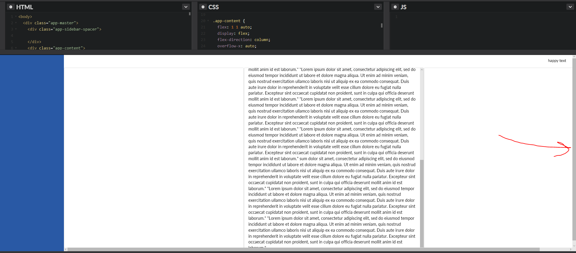
I've noticed an anomaly in Edge and IE when using flexbox with scrolling columns coupled with a horizontal scroll. The following codepen demonstrates correct functionality in Chrome and FireFox; however, there is an extra scroll bar on the very right of the view for a slight vertical overflow (the height of the horizontal scroll bar) that is only present in IE 11 and Edge:
The raw html for reference:
<body>
  <div class="app-master">
    <div class="app-sidebar-spacer">

    </div>
    <div class="app-content">
      <div class="app-header">
        <div class="ui secondary small menu">
          <a class="right item">
            <div>
              <span>happy text</span>
            </div>
          </a>
        </div>
      </div>
      <div class="app-work-zone">

        <div class="app-zone-content">
          <div class="ui segment app-zone-segment">

          </div>
        </div>
        <div class="app-zone-buffer">
        </div>

        <div class="app-zone-content">
          <div class="ui segment app-zone-segment">

            <div>
              "Lorem ipsum dolor sit amet, consectetur adipiscing elit, sed do eiusmod tempor incididunt ut labore et dolore magna aliqua.
              Ut enim ad minim veniam, quis nostrud exercitation ullamco laboris nisi ut aliquip ex ea commodo consequat.
              Duis aute irure dolor in reprehenderit in voluptate velit esse cillum dolore eu fugiat nulla pariatur. Excepteur
              sint occaecat cupidatat non proident, sunt in culpa qui officia deserunt mollit anim id est laborum." "Lorem
              ip"Lorem ipsum dolor sit amet, consectetur adipiscing elit, sed do eiusmod tempor incididunt ut labore et dolore
              magna aliqua. Ut enim ad minim veniam, quis nostrud exercitation ullamco laboris nisi ut aliquip ex ea commodo
              consequat. Duis aute irure dolor in reprehenderit in voluptate velit esse cillum dolore eu fugiat nulla pariatur.
              Excepteur sint occaecat cupidatat non proident, sunt in culpa qui officia deserunt mollit anim id est laborum."
              "Lorem ipsum dolor sit amet, consectetur adipiscing elit, sed do eiusmod tempor incididunt ut labore et dolore
              magna aliqua. Ut enim ad minim veniam, quis nostrud exercitation ullamco laboris nisi ut aliquip ex ea commodo
              consequat. Duis aute irure dolor in reprehenderit in voluptate velit esse cillum dolore eu fugiat nulla pariatur.
              Excepteur sint occaecat cupidatat non proident, sunt in culpa qui officia deserunt mollit anim id est laborum."
              sum dolor sit amet, consectetur adipiscing elit, sed do eiusmod tempor incididunt ut labore et dolore magna
              aliqua. Ut enim ad minim veniam, quis nostrud exercitation ullamco laboris nisi ut aliquip ex ea commodo consequat.
              Duis aute irure dolor in reprehenderit in voluptate velit esse cillum dolore eu fugiat nulla pariatur. Excepteur
              sint occaecat cupidatat non proident, sunt in culpa qui officia deserunt mollit anim id est laborum." "Lorem
              ipsum dolor sit amet, consectetur adipiscing elit, sed do eiusmod tempor incididunt ut labore et dolore magna
              aliqua. Ut enim ad minim veniam, quis nostrud exercitation ullamco laboris nisi ut aliquip ex ea commodo consequat.
              Duis aute irure dolor in reprehenderit in voluptate velit esse cillum dolore eu fugiat nulla pariatur. Excepteur
              sint occaecat cupidatat non proident, sunt in culpa qui officia deserunt mollit anim id est laborum."

            </div>
          </div>
        </div>
        <div class="app-zone-buffer">
        </div>

        <div class="app-zone-content">
          <div class="ui segment app-zone-segment">

          </div>
        </div>
        <div class="app-zone-buffer">
        </div>

      </div>
    </div>
  </div>
</body>
The raw css for reference:
 html,
 body {
   height: 100%;
   margin: 0;
   min-height: 100%;
   padding: 0;
 }

 .app-master {
   display: flex;
   flex-direction: row;
   height: 100%;
 }

 .app-sidebar-spacer {
   flex: 0 0 215px;
   background-color: #2959a5;
 }

 .app-content {
   flex: 1 1 auto;
   display: flex;
   flex-direction: column;
   overflow-x: auto;
 }

 .app-header {
   min-height: 43px;
 }

 .app-header>.ui.menu {
   width: 100%;
 }

 .app-work-zone {
   flex: 1 1 auto;
   display: flex;
   flex-direction: row;
   min-height: 0;
 }

 .app-zone-content {
   flex: 1 1 0;
   min-width: 600px;
 }

 .app-zone-buffer {
   width: 2px;
   text-align: center;
 }

 .app-zone-segment {
   height: 100%;
   overflow-y: auto;
 }
Notes:
- I have semantic-ui loading in the codepen for basic styling, but the layout is developed using pure flexbox (not the semantic grid system).
- Semantic ui already uses normalizer, so it is turned off in the codepen css.
- In codepen I have "autoprefixer" turned on.
- When viewing in IE, adjust the height of the preview window, and the preview window's vertical scroll bar will suddenly show scrolling.
- All of my custom classes are prefixed with "app-".
Below are pictures of what seems to be a working implementation of this concept by the folks over at Asana; however, I am struggling to understand the implementation.
Image 1) With the window collapsed resulting in correct horizontal scrolling in Edge, no content hidden at the bottom of the screen, and no extraneous scroll bar at the very left of the view:
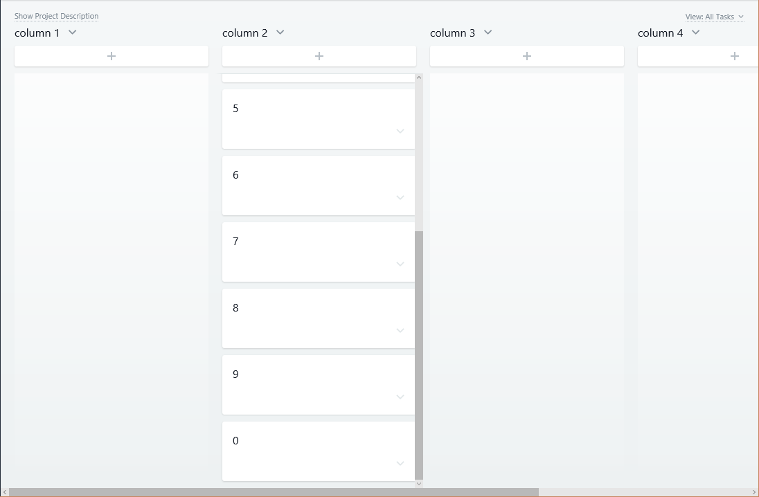
Image 2) With the window expanded (and no horizontal scrolling in Edge to demonstrate no content was hidden when horizontal scrolling was in effect):
So, is this actually a bug in IE and Edge, or does the seemingly functional implementation by Asana demonstrate a work around?
Edit 1) Added more in-depth description of the anomaly.
Edit 2) Added updated codepen link to track cross browser progress.
Edit 3) Updated final codepen with functional hacks. Functionality should now look identical across IE11, Edge, Chrome, and FF. The complete functional hack list is:
@supports (-ms-ime-align: auto) and (not (object-fit: cover)) {
  .app-content {
    overflow-x: scroll;
  }
}

@media screen and (-ms-high-contrast: active), (-ms-high-contrast: none) {
  .app-content {
    overflow-x: scroll;
  }
}
The following media query reverts overflow-x to auto in browsers where it was set to scroll (see hacks just above this one) when the browser width is greater than 825px. This number is derived from the 225px used for the left side-nav, and the 200 px minimum used for each flexbox item to the right of the side-nav. This prevents an extraneous horizontal scroll bar in IE11 and Edge when browser width is greater than 825px.
@media (min-width: 825px) {
  .app-content {
    overflow-x: auto;
  }
}