0

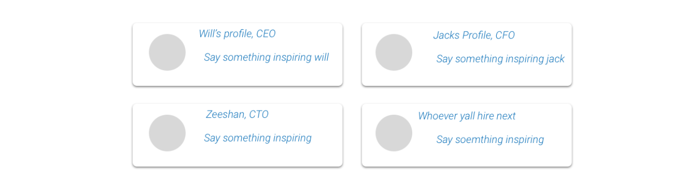
I have made 4 rectangle boxes in CSS. Here is the fiddle for it.

At this moment, they are looking exactly similar to the below design. I am wondering, how I can make exactly same (below) design (which I have made in fiddle) in Bootstrap 4

enter image description here

The CSS which I am using for the boxes are:

/***** Company heads CTO, CFO, and CEO START ************/

.company-heads {
    margin-left: 300px;
    padding-top: 80px;
    font-style: italic;
    margin-right: 289px
}

.company-heads .rectangle {
    border-radius: 10px;
    display: inline-block;
    margin-bottom: 30px;
    margin-right: 22px;
    width: 355px;
    height: 100px;
    border: 1px solid #000;
    background-color: white;
    padding: 10px 10px 10px 100px;
    position: relative;
}

.company-heads .rectangle .circle {
    background: #aaa;
    border-radius: 100%;
    height: 60px;
    width: 60px;
    position: absolute;
    top: 20px;
    left: 20px;
}


/***** Company heads CTO, CFO, and CEO FINISH ************/

The width of the rectangle box is currently 355px but can be adjust according to the screen size.

I tried using the following code in Bootstrap 4 but it didn't work out.

<div class="container">
   <div class="row justify-content-center">
      <div class="col-lg-3 left-side">ABC</div>
      <div class="col-lg-3 right-side">DEF</div>
  </div
</div>
Martin Lindgren
  • 374
  • 2
  • 14

1 Answers1

1

.row {
  text-align:center;
}

.col-md-4 {
  border-radius:20px;
  margin:10px;
  border:1px solid #000;
  display:inline-block;
  float:none !important;
}

.col-md-2 {
  border-radius:100%;
  height:60px;
  width:60px;
  background:#ccc;
  width:25%;
  margin:20px;
}

.row h1, .row p {
  font-style:italic;
  text-align:left;
}

.row h1 {
  font-size:1.4em;
}

.row p {
  font-size:1em;
}
<link type="text/css" rel="stylesheet" href="https://maxcdn.bootstrapcdn.com/bootstrap/3.3.7/css/bootstrap.min.css">

<div class="container">
  <div class="row">
    <div class="col-md-4">
      <div class="col-md-2"></div>
        <h1>Will's profile, CEO</h1>
        <p>Say something inspiring will</p>
    </div>
    <div class="col-md-4">
      <div class="col-md-2"></div>
        <h1>Will's profile, CEO</h1>
        <p>Say something inspiring will</p>
    </div>
  </div>
  <div class="row">
    <div class="col-md-4">
      <div class="col-md-2"></div>
        <h1>Zeeshan, CTO</h1>
        <p>Say something inspiring</p>
    </div>
    <div class="col-md-4">
      <div class="col-md-2"></div>
        <h1>Whoever yall hire next</h1>
        <p>Say something inspiring</p>
    </div>
  </div>
</div>

Here is the codepen of the demo working. New Demo

h1 {
  font-style: italic;
}

p {
  font-style: italic;
}

.col-md-5 {
  border-radius:15px;
  margin:10px;
  border:1px solid #000;
}

.col-md-2 {
  border-radius:100%;
  height:60px;
  width:60px;
  background:#ccc;
  width:25%;
  margin:20px;
}

.row h1 {
  font-size:1.4em;
}

.row p {
  font-size:1em;
}
<link type="text/css" rel="stylesheet" href="https://maxcdn.bootstrapcdn.com/bootstrap/3.3.7/css/bootstrap.min.css">

<div class="container">
  <div class="row">
    <div class="col-md-5">
      <div class="col-md-2"></div>
        <h1>Will's profile, CEO</h1>
        <p>Say something inspiring will</p>
    </div>
    <div class="col-md-5">
      <div class="col-md-2"></div>
        <h1>Will's profile, CEO</h1>
        <p>Say something inspiring will</p>
    </div>
  </div>
  <div class="row">
    <div class="col-md-5">
      <div class="col-md-2"></div>
        <h1>Zeeshan, CTO</h1>
        <p>Say something inspiring</p>
    </div>
    <div class="col-md-5">
      <div class="col-md-2"></div>
        <h1>Whoever yall hire next</h1>
        <p>Say something inspiring</p>
    </div>
  </div>
</div>
Jorden
  • 153
  • 1
  • 3
  • 16
  • You forgot the italics! – Ragxion Aug 28 '17 at 18:35
  • oh of course. How could I forget thank you for pointing that out haha. – Jorden Aug 28 '17 at 18:37
  • @Jorden1337 It looks good. Those 4 boxes are center to the screen. Can we use `.col-md-6` instead of `.col-md-5` ? In demo, it is little bit left to the screen. I think in that way, it will be center to the screen (without using margin-left and padding-left). –  Aug 28 '17 at 18:45
  • @ZimSystem The problem with the CSS code which I am using is it is looking different on different computers so that's why I decided to switch to Bootstrap. On my computer two rectangles are coming on one line whereas in another computer `3 rectangles are coming on one line and 1 rectangle in another line`. –  Aug 28 '17 at 19:15
  • @ZimSystem What changes do I need to make in this [fiddle](https://jsfiddle.net/vexogq5o/1/embedded/result/) so that is looks exactly similar on different computers. –  Aug 28 '17 at 19:17
  • @ZimSystem then what is the purpose of using `.col-md-12` they're both block-level elements? Thats why I used `.col-md-12` instead of `.row`. In addition, it keeps the grid intact. Nothing gets affected when the screen is re-sized. – Jorden Aug 28 '17 at 19:55
  • @Jorden1337 Can we use .col-md-6 instead of .col-md-5 ? In demo, the rectangle square boxes is quite left to the screen. Is there any way we can center it ? –  Aug 28 '17 at 20:11
  • It works but it's a hack. `col-*` shouldn't be nested that way, they should be wrapped in another `row`. Only columns may be immediate children of rows.(https://getbootstrap.com/docs/3.3/css/#grid) In BS 3, [**offsets are used to center columns**](https://stackoverflow.com/questions/18153234/center-a-column-using-twitter-bootstrap-3). – Carol Skelly Aug 29 '17 at 11:44