0

I need to have a sidemenu that scales depending on the browser size. But also i need a header and footer, and the also a content container next to the sidemenu. So lets say that the sidemenu is 1/4 of the width and the content container is 3/4 of the width, but the height of both the sidemenu and the content container is always 100% of the browser size or more, depending on the content inside the content container and the sidemenu.

I would think this would be simple, just have the flext-dir. to col. and "flex: 1" on the childeren. (and a little more code, its in the fiddle link under)

But as soon as I wrap the sidemenu inside a new div, so that I can make the content container go next to the sidemenu and not under. The vertical fill from flexbox, fails.

https://jsfiddle.net/frrvdq2n/2/

So do anyone have som suggestions on how to solve this, or maybe other tips to create this idea. Thanks ahead :)

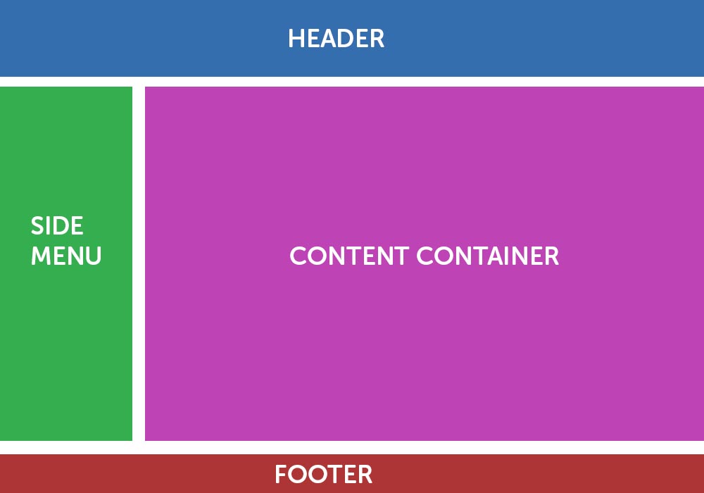
IMG. of how om thinking the sizing should be on most browser sizes.

Here is also the code, just incase:

HTML

  <!--<div class="container"> uncomment to see colapse-->
    <div class="wrapper">
      <div class="row3">Option One</div>
      <div class="row3">Option Two</div>
      <div class="row3">Option Three</div>
    </div>
  <!--</div>uncomment to see colapse-->

CSS

.wrapper, html, body {
  height:100%;
  margin:0;
}

.wrapper {
   display: flex;
   flex-direction: column;
}

.row3 {
   background-color: green;
   flex:2;
   display: flex;
}
Anders Lund
  • 77
  • 2
  • 9

3 Answers3

0

With your initial code sample, all you need is to also give .container a height.

.container, .wrapper, html, body {
    height:100%;
    margin:0;
}

.wrapper {
    display: flex;
    flex-direction: column;
}

.row3 {
    background-color: green;
    flex:2;
    display: flex;
}
<div class="container">
    <div class="wrapper">
        <div class="row3">Option One</div>
        <div class="row3">Option Two</div>
        <div class="row3">Option Three</div>
    </div>
</div>

From the above sample, you can now easily create a layout that looks like the image posted, by adding 2 children to the middle row3, to be the side bar and the content

.container, .wrapper, html, body {
    height:100%;
    margin:0;
}

.wrapper {
    display: flex;
    flex-direction: column;
}

.row3 {
    background-color: green;
    flex:2;
    display: flex;
}

.col2:nth-child(1) {
    background-color: lightblue;
    flex-basis: 25%;
}

.col2:nth-child(2) {
    background-color: lightgreen;
    flex-basis: 75%;
}
<div class="container">
    <div class="wrapper">
        <div class="row3">Option One</div>
        <div class="row3">
            <div class="col2">Option Two A</div>
            <div class="col2">Option Two B</div>        
        </div>
        <div class="row3">Option Three</div>
    </div>
</div>

And by start playing with the flex-grow and flex-basis on the row3 elements, you can have them sized by content, a set height and fill the remaining space.

.container, .wrapper, html, body {
    height:100%;
    margin:0;
}

.wrapper {
    display: flex;
    flex-direction: column;
}

.row3:nth-child(1) {
    background-color: green;
    flex-basis: 50px;              /*  a set height  */
}

.row3:nth-child(2) {
    flex:1;                         /*  fill the remain  */
    display: flex;
    margin: 10px 0;
}

.row3:nth-child(3) {
    background-color: green;        /*  sized by content  */
}

.col2:nth-child(1) {
    background-color: lightblue;
    flex-basis: 25%;
}

.col2:nth-child(2) {
    background-color: lightgreen;
    flex-basis: 75%;
    margin-left: 10px;
}
<div class="container">
    <div class="wrapper">
        <div class="row3">Option One</div>
        <div class="row3">
            <div class="col2">Option Two A</div>
            <div class="col2">Option Two B</div>        
        </div>
        <div class="row3">Option Three</div>
    </div>
</div>
Asons
  • 84,923
  • 12
  • 110
  • 165
0

You can inbricate flex boxes and use typical HTML5 structure:

DEMO (with aside sliding off screen to see the flex behavior )

body {
  min-height:100vh;
  margin:0;
}
html {
  height:100%;
}
html,body {
  display:flex;
  flex-direction:column;
}
header {
  margin:0 0 10px ;
  background:rgb(52, 110, 174);
}
footer {
  background:rgb(173, 53, 54); 
  margin:10px 0 0px ;
}
main {
  flex:1;
  display:flex;
}
aside {
  min-width:200px;
  flex:1;
  background:rgb(53, 174, 79);
}
section {
  flex:5;
  margin-left:10px;
  background:rgb(190, 67, 181);
}
header,footer,aside,section {
font-size:3vmax;
color:white;
display:flex;
align-items:center;
justify-content:center;
line-height:2em;
<header>header</header>
<main>
  <aside>
    aside
  </aside>
  <section>
    section or single div 
  </section>
</main>
<footer>footer</footer>

Here is a similar layout How can I make my flexbox layout take 100% vertical space? Almost a duplicate, similar method but different layout order :)

G-Cyrillus
  • 101,410
  • 14
  • 105
  • 129
0

Check out the below code snippet. The secret sauce to all of this is wrapping all of the components in a div that has 100vh height. Using viewport units is a great way to ensure content remains in the browser viewport regardless of browser size. The only place I use Flexbox is to put the sidemenu and content next to each other.

body {
  padding: 0;
  margin: 0;
}

.view_wrapper {
  width: 100%;
  height: 100vh;
}

header, footer {
  position: relative;
  left: 0;
  width: 100%;
  height: 10%;
  background: #616D74;
  color: white;
}

header {
  top: 0;
}

footer {
  bottom: 0;
}

.main_container {
  width: 100%;
  height: 80%;
  display: flex;
}

.sidemenu_container {
  width: 25%;
  height: 100%;
  padding: 10px 5px 10px 0px;
  box-sizing: border-box;
}

.sidemenu {
  width: 100%;
  height: 100%;
  background: #F36E55;
}

.content_container {
  width: 75%;
  height: 100%;
  padding: 10px 0px 10px 5px;
  box-sizing: border-box;
}

.content {
  width: 100%;
  height: 100%;
  background: #E2DCD0;
 }
}
<div class="view_wrapper">

<header></header>
<div class="main_container">
  <div class="sidemenu_container">
     <div class="sidemenu">
     </div>
  </div>
  <div class="content_container">
    <div class="content">
    </div>
  </div>
</div>
<footer></footer>
</div>
Celso
  • 575
  • 1
  • 6
  • 17