1

I Designed a measurement card where the profile image is cutted out by an half elips, i tried several methos (svg mask, svg clipping), but all these methods didn't work. Specially on Safari.

Does anyone has an idea how to realize this layout? enter image description here

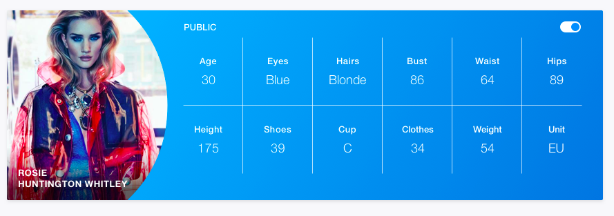
Here is the SVG Half Circle if it helps ya SVG CIRCLE

kdskii
  • 307
  • 1
  • 3
  • 14
  • have you tried to use a canvas? https://stackoverflow.com/questions/4276048/html5-canvas-fill-circle-with-image – Bellian Sep 01 '17 at 10:50
  • the problem is, that this is an profile image, so it changes by each user. I can not use a fix image in the css. It would be great to cropp the div element that way. – kdskii Sep 01 '17 at 10:58
  • The canvas can perform image manipulation (see link) or more precise: https://stackoverflow.com/a/6889378/3588584. The client will then crop the image and display it. No need for fixed images and is widely supported. – Bellian Sep 01 '17 at 11:01
  • 1
    you could try with border-radius, it will give a similar effect – Ovidiu Unguru Sep 01 '17 at 11:06
  • @OvidiuUnguru yeah, i already tried it but it will never look like the design. At least i couldn't get it – kdskii Sep 01 '17 at 11:07
  • Have you checked [this](https://stackoverflow.com/a/10503105/8375199) answer? – G.Hunt Sep 01 '17 at 11:17

1 Answers1

2

You can use the border radius to achieve this layout:

If you want an elliptic shape you have to oversize the clipping element and place the image offsetted inside it:

document.getElementById('button1').addEventListener('click', function(){
  document.getElementById('profile').classList.toggle('view');
});
.profile{
  background: #1111cc;
  width:300px;
  height:100px;
  position:relative;
  overflow:hidden;
  margin: 20px;
}


.clip{
  position:absolute;
  background: red;
  width: 100px;
  height:130px;
  top: -15px;
  border-top-right-radius: 50px 65px;
  border-bottom-right-radius: 50px 65px;
  overflow:hidden;
}
.img{
  position: absolute;
  top: 15px;
  background: rgba(100,100,100,0.8);
  width:100px;
  height:100px;
}
.name{
  position: absolute;
  bottom: 15px;
  margin: 0;
  padding: 0 10px 0 0;
  background: rgba(255, 255, 255, 0.8);
  box-sizing: border-box;
  width: 100px;
}

.profile.view .clip{
  overflow: initial;
}
.profile.view{
  overflow: initial;
}
<div id="profile" class="profile">
  <div class="clip">
    <img class="img" src="https://i.stack.imgur.com/oiszU.png">
    <p class="name">My name is too long for this world..</p>
  </div>
</div>
<button id="button1">view all shapes</button>
Bellian
  • 2,009
  • 14
  • 20
  • thx dude, that works with the shape, but the problem is that if i display the user name on it it moves out of the shape also the shadow inside wich is behind the name. Any idea how to solve that? Long names should only break but never leave the element – kdskii Sep 04 '17 at 10:51
  • Updated the example. You have to position the name exacly like the image before. I aligned the name at the bottom via `bottom: 15px;` and limited the max width of the text to `90px`. For your case you have to adjust the widths and heights as you need it to be. – Bellian Sep 04 '17 at 10:56