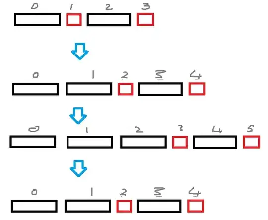
I am trying to get a responsive layout that on the desktop looks like:
and on mobile looks basically like the 90-degree rotation of that:
I have got the desktop working, and the mobile version nearly working, but my approach to the mobile version feels wrong. It feels like a 'redo' turning off flex and using floats instead. When really I just want to turn my "rows" into "columns" but I have tried and failed using combinations of width and flow direction that I took from here: https://css-tricks.com/snippets/css/a-guide-to-flexbox/
Also I have a secondary problem, this HTML is 'responsive' when I resize the screen but it doesn't work when I use chrome to emulate mobile devices!
In short, I'm getting confused and feeling I'm doing it all wrong! What would be the correct approach?
This is my current code:
body {
  display: flex;
}

.game-area {
  padding-top: 24px;
  padding-left: 54px;
  width: 1156px;
  /*display: flex;
    flex-direction: row;*/
  margin: auto;
  background-color: #27332F;
}

.tile {
  float: left;
  height: 100px;
  width: 100px;
  margin-left: 20px;
  text-align: center;
  vertical-align: middle;
  background-color: orange;
  color: white;
}

.row {
  display: flex;
  width: 100%;
  clear: left;
  padding: 5px;
  justify-content: space-evenly;
}

#highest {
  float: left;
}

#lowest {
  float: right;
}

@media screen and (max-width: 1200px) {
  .game-area {
    width: 1156px;
  }
  .tile {
    margin-left: 20px;
  }
}

@media screen and (max-width: 960px) {
  .game-area {
    width: 916px;
  }
}

@media screen and (max-width: 768px) {
  .game-area {
    width: 724px;
  }
}

@media screen and (max-width: 600px) {
  .game-area {
    width: 556px;
  }
}

@media screen and (max-width: 420px) {
  .game-area {
    padding-left: 15px;
    padding-top: 27px;
  }
  .row {
    width: 33%;
    display: block;
    clear: none;
    float: left;
    flex-direction: column;
    justify-content: space-evenly;
  }
  .tile {
    float: none;
    height: 50px;
    font-size: 8pt;
  }
}

@media screen and (max-width: 320px) {
  .game-area {
    width: 290px;
  }
}
<meta name="viewport" content="width=device-width">
<div class="game-area" id="game-area-div">
<div id="number-row" class="row">
<div class="tile">1</div>
<div class="tile">2</div>
<div class="tile">3</div>
<div class="tile">4</div>
<div class="tile">5</div>
<div class="tile">6</div>
<div class="tile">7</div>
</div>
<div id="answer-row-1" class="row">
<div class="tile">2</div>
<div class="tile">4</div>
<div class="tile">6</div>
</div>
<div id="answer-row-2" class="row">
<div class="tile">1</div>
<div class="tile">3</div>
<div class="tile">5</div>
<div class="tile">7</div>
</div>
</div>UPDATE Thanks to this answer the media tags are now working properly :) using:
<meta name="viewport" content="width=device-width">

