4

I have two divs on my page; side panel and main panel.

In the side panel I will always have a bunch of blocks on content, the number with change all the time. And the main panel will have some block of content. Generally the side panel will have bigger height than main panel.

I am looking for the main panel height to equal the content in that panel and I am looking for a way to have the height of the side panel equal to the size of the main panel. While the the overflow of the side panel scroll. Im not looking to set a static height for either, because the amount of content changes.

Currently I'm using grid but all for changing that if there is a way to do this.

Here is a Codepen mockup of what I currently have: https://codepen.io/aculbreth/full/VMjRyx

.box {
  display: grid;
  grid-template-columns: 1fr 4fr;
  grid-gap: 20px;
  grid-auto-columns: max-content;
  background: #efefea;
  margin: 50px auto;
  padding: 20px;
  box-sizing: border-box;
  .side_panel {
    background:#fff;
    padding:20px;
    box-sizing: border-box;
    .side_panel_box {
      text-align:center;
      border: 1px solid #000;
      margin-bottom:20px;
    }
  }
  .main_panel {
    background:#fff;
    padding:20px;
    box-sizing: border-box;
    display:block;
    grid-auto-columns: max-content;

  }
}

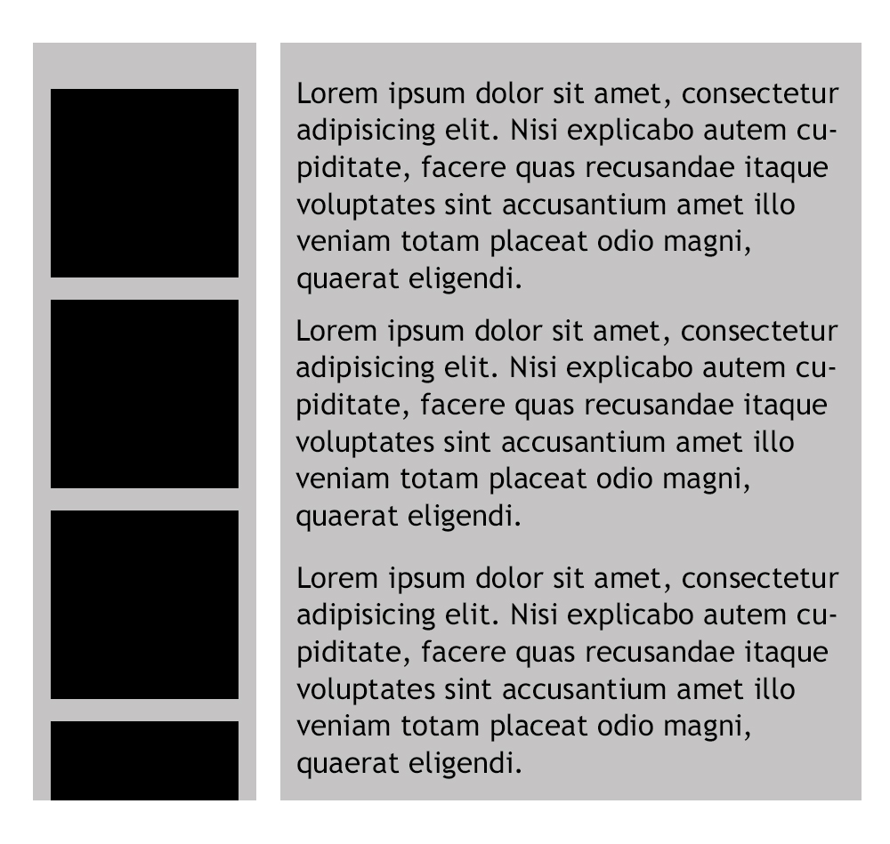
Here is a rough mockup of what i'm looking for: enter image description here

Andrew C
  • 257
  • 4
  • 14
  • 2
    We'll need a [mcve] in your question. Also, that's not plain CSS. If that's pre-processed code like less or sass please edit your tags. – j08691 Sep 21 '17 at 19:27
  • Included an image of a rough mockup im looking for – Andrew C Sep 21 '17 at 19:38
  • @AndrewC, take a look at https://stackoverflow.com/questions/35387368/setting-equal-height-for-divs-with-flexboxdepending-on-the-shortest-one -- you may want to look at flexbox and an absolutely positioned inner el. Haven't run into this need before, but interesting research project! ;) – Snowmonkey Sep 21 '17 at 19:49
  • 1
    [One flex item sets the height limit for siblings](https://stackoverflow.com/q/34194042/3597276) – Michael Benjamin Sep 22 '17 at 01:26

1 Answers1

3

As you've tagged your post with jQuery, it can be done via jquery pretty painlessly. As your CSS was questioned, I remade it to be simple css, and the jQuery simply sets the side pane height to the main content height. Hope it helps!

*** Please note, to see either of these work well, view them full-page.

$(document).ready(function() {
  var maxHeight = $(".main_panel p").height();
  $(".side_panel").height(maxHeight);
})
.box {
  display: grid;
  grid-template-columns: 1fr 4fr;
  grid-gap: 20px;
  grid-auto-columns: max-content;
  background: #efefea;
  margin: 50px auto;
  padding: 20px;
  box-sizing: border-box;
}

.side_panel {
  background: #fff;
  padding: 20px;
  box-sizing: border-box;
  overflow: auto;
}

.side_panel_box {
  text-align: center;
  border: 1px solid #000;
  margin-bottom: 20px;
}

.main_panel {
  background: #fff;
  padding: 20px;
  box-sizing: border-box;
  display: block;
  grid-auto-columns: max-content;
}
<script src="https://ajax.googleapis.com/ajax/libs/jquery/2.1.1/jquery.min.js"></script>
<div class="box">
  <div class="side_panel">
    <div class="side_panel_box">
      <h1>Title</h1>
      <p>Some text here</p>
    </div>
    <div class="side_panel_box">
      <h1>Title</h1>
      <p>Some text here</p>
    </div>
    <div class="side_panel_box">
      <h1>Title</h1>
      <p>Some text here</p>
    </div>
    <div class="side_panel_box">
      <h1>Title</h1>
      <p>Some text here</p>
    </div>
    <div class="side_panel_box">
      <h1>Title</h1>
      <p>Some text here</p>
    </div>
    <div class="side_panel_box">
      <h1>Title</h1>
      <p>Some text here</p>
    </div>
    <div class="side_panel_box">
      <h1>Title</h1>
      <p>Some text here</p>
    </div>
    <div class="side_panel_box">
      <h1>Title</h1>
      <p>Some text here</p>
    </div>
    <div class="side_panel_box">
      <h1>Title</h1>
      <p>Some text here</p>
    </div>
    <div class="side_panel_box">
      <h1>Title</h1>
      <p>Some text here</p>
    </div>
    <div class="side_panel_box">
      <h1>Title</h1>
      <p>Some text here</p>
    </div>
    <div class="side_panel_box">
      <h1>Title</h1>
      <p>Some text here</p>
    </div>
    <div class="side_panel_box">
      <h1>Title</h1>
      <p>Some text here</p>
    </div>
  </div>

  <div class="main_panel">
    <p>Lorem ipsum dolor sit amet, consectetur adipisicing elit. Nisi explicabo autem cupiditate, facere quas recusandae itaque voluptates sint accusantium amet illo veniam totam placeat odio magni, quaerat eligendi. Distinctio et cupiditate nemo fugit,
      praesentium, ea obcaecati dolores non amet autem sequi laboriosam labore vero fugiat dolorem qui voluptatibus omnis eos architecto, recusandae corporis rerum quod. Ea minus et odio voluptate quaerat facere incidunt, impedit repellat eos nihil quis
      modi vel molestiae, eum vitae nam nemo quasi sit aperiam unde ex fugiat. Magnam dolores, enim consectetur veniam illum error eaque ea necessitatibus nam ipsam maxime dolore temporibus animi odio eum molestiae iure. Ut quos cupiditate ad perferendis
      dolorum nemo deserunt exercitationem magni ipsa iste ea fugit expedita sapiente numquam reprehenderit dolore, quo minus excepturi asperiores sit voluptatibus accusamus necessitatibus, ipsam. Delectus iste cupiditate asperiores vero repellendus atque
      aliquid temporibus perspiciatis reiciendis quibusdam similique, nesciunt accusantium tempora voluptatem optio qui odit ullam amet eveniet illum incidunt quis quia repudiandae animi. Recusandae, consequuntur laboriosam praesentium fugit possimus
      nemo ut porro reiciendis quo aperiam et aliquam fuga consectetur fugiat veritatis necessitatibus officiis, officia repellendus, rem. Voluptatem itaque, dolores autem at, culpa cum quam ratione laborum quo totam, nemo sed dolor, hic nisi nobis illo.</p>

  </div>


</div>

Doing the same thing in pure CSS, here's the following. Note that this is applied pretty much directly from here, and applied to this particular use case.

.box {
  display: flex;
}

.flex-item {
  flex: 0 0 50%;
  position: relative;
}

.flex-item-inner {
  position: absolute;
  top: 0;
  left: 0;
  right: 0;
  bottom: 0;
  overflow: auto;
}

.side_panel {
  background: #fff;
  padding: 20px;
  box-sizing: border-box;
  overflow: auto;
}

.side_panel_box {
  text-align: center;
  border: 1px solid #000;
  margin-bottom: 20px;
}

.main_panel {
  background: #fff;
  padding: 20px;
  box-sizing: border-box;
  display: block;
  grid-auto-columns: max-content;
}
<div class="box">
  <div class="flex-item side_panel">
    <div class="flex-item-inner">
      <div class="side_panel_box">
        <h1>Title</h1>
        <p>Some text here</p>
      </div>
      <div class="side_panel_box">
        <h1>Title</h1>
        <p>Some text here</p>
      </div>
      <div class="side_panel_box">
        <h1>Title</h1>
        <p>Some text here</p>
      </div>
      <div class="side_panel_box">
        <h1>Title</h1>
        <p>Some text here</p>
      </div>
      <div class="side_panel_box">
        <h1>Title</h1>
        <p>Some text here</p>
      </div>
      <div class="side_panel_box">
        <h1>Title</h1>
        <p>Some text here</p>
      </div>
      <div class="side_panel_box">
        <h1>Title</h1>
        <p>Some text here</p>
      </div>
      <div class="side_panel_box">
        <h1>Title</h1>
        <p>Some text here</p>
      </div>
      <div class="side_panel_box">
        <h1>Title</h1>
        <p>Some text here</p>
      </div>
      <div class="side_panel_box">
        <h1>Title</h1>
        <p>Some text here</p>
      </div>
      <div class="side_panel_box">
        <h1>Title</h1>
        <p>Some text here</p>
      </div>
      <div class="side_panel_box">
        <h1>Title</h1>
        <p>Some text here</p>
      </div>
      <div class="side_panel_box">
        <h1>Title</h1>
        <p>Some text here</p>
      </div>
    </div>
  </div>

  <div class="flex-item main_panel">
    <p>Lorem ipsum dolor sit amet, consectetur adipisicing elit. Nisi explicabo autem cupiditate, facere quas recusandae itaque voluptates sint accusantium amet illo veniam totam placeat odio magni, quaerat eligendi. Distinctio et cupiditate nemo fugit,
      praesentium, ea obcaecati dolores non amet autem sequi laboriosam labore vero fugiat dolorem qui voluptatibus omnis eos architecto, recusandae corporis rerum quod. Ea minus et odio voluptate quaerat facere incidunt, impedit repellat eos nihil quis
      modi vel molestiae, eum vitae nam nemo quasi sit aperiam unde ex fugiat. Magnam dolores, enim consectetur veniam illum error eaque ea necessitatibus nam ipsam maxime dolore temporibus animi odio eum molestiae iure. Ut quos cupiditate ad perferendis
      dolorum nemo deserunt exercitationem magni ipsa iste ea fugit expedita sapiente numquam reprehenderit dolore, quo minus excepturi asperiores sit voluptatibus accusamus necessitatibus, ipsam. Delectus iste cupiditate asperiores vero repellendus atque
      aliquid temporibus perspiciatis reiciendis quibusdam similique, nesciunt accusantium tempora voluptatem optio qui odit ullam amet eveniet illum incidunt quis quia repudiandae animi. Recusandae, consequuntur laboriosam praesentium fugit possimus
      nemo ut porro reiciendis quo aperiam et aliquam fuga consectetur fugiat veritatis necessitatibus officiis, officia repellendus, rem. Voluptatem itaque, dolores autem at, culpa cum quam ratione laborum quo totam, nemo sed dolor, hic nisi nobis illo.</p>

  </div>


</div>
Snowmonkey
  • 3,716
  • 1
  • 16
  • 16
  • Thanks for this! My first thought was jquery, as it being a simple solution. I probably shouldnt have tagged jquery, but looking if there was a pure css solution. – Andrew C Sep 21 '17 at 19:42
  • @AndrewC, updated my answer to include both the jQuery version and a pure CSS version, taken from that link I'd mentioned above. – Snowmonkey Sep 21 '17 at 20:12