1

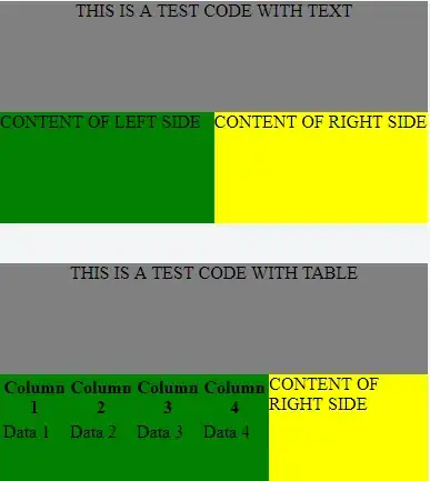
I have a composition of flex itens in a column and row, as the follow image:

enter image description here

This images are built using the following code:

<div class="container">
  <div class='header'>
    THIS IS A TEST CODE WITH TEXT
  </div>

  <div class='content'>
    <div class='leftcontent'>
      CONTENT OF LEFT SIDE
    </div>
    <div class='rightcontent'>
      CONTENT OF RIGHT SIDE
    </div>
  </div>
</div>

<br />
<br />

<div class="container">
  <div class='header'>
    THIS IS A TEST CODE WITH TABLE
  </div>

  <div class='content'>
    <div class='leftcontent'>
      <table>
        <thead>
          <tr>
            <th>Column 1</th>
            <th>Column 2</th>
            <th>Column 3</th>
            <th>Column 4</th>
          </tr>

        </thead>
        <tbody>
          <tr>
            <td>Data 1</td>
            <td>Data 2</td>
            <td>Data 3</td>
            <td>Data 4</td>
          </tr>

        </tbody>
      </table>
    </div>
    <div class='rightcontent'>
      CONTENT OF RIGHT SIDE
    </div>
  </div>
</div>

CSS:

.container {
  display: flex;
  flex-direction: column;
  background-color: grey;
  width: 100%;
  height: 200px;
}

.header {
  flex: 1;
  text-align: center;
}

.content {
  flex: 1;
  display: flex;
  flex-direction: row;
}

.leftcontent {
  flex: 5;
  background-color: green;
}

.rightcontent {
  flex: 5;
  background-color: yellow;
}

The upper schema is a test made with text. The bottom schema is a try using a table on the left side.

As you can see, at the bottom schema, the table is larger than expected and is not following my flex rules. I know tables has a special rendering mechanism, but I need help to set the table width as 50% like the schema with text only. In that case I need the overflowed table to show up an horizontal scroll, just in the left side of the content (that related to the table so I can scroll it horizontally and see its contents).
Here is the JSFiddle for it

Asons
  • 84,923
  • 12
  • 110
  • 165
Mendes
  • 17,489
  • 35
  • 150
  • 263
  • to keep table within a width set, you need to reset table-layout . but, that works also with a width set as reference https://jsfiddle.net/z2r6qxz1/2/ or overflow on parent https://jsfiddle.net/z2r6qxz1/5/ – G-Cyrillus Sep 26 '17 at 20:30
  • Just add `overflow: auto` to `.leftcontent`. https://jsfiddle.net/z2r6qxz1/4/ – Michael Benjamin Sep 26 '17 at 20:30

1 Answers1

1

min-width defaults to auto, which mean it won't shrink smaller than its contents size.

Add min-width: 0 to left-content and it will allow it to shrink.

Updated fiddle

Stack snippet

.container {
  display: flex;
  flex-direction: column;
  background-color: grey;
  width: 100%;
  height: 200px;
}

.header {
  flex: 1;
  text-align: center;
}

.content {
  flex: 1;
  display: flex;
  flex-direction: row;
}

.leftcontent {
  min-width: 0;
  flex: 5;
  background-color: green;
}

.rightcontent {
  flex: 5;
  background-color: yellow;
}
<div class="container">
  <div class='header'>
    THIS IS A TEST CODE WITH TEXT
  </div>

  <div class='content'>
    <div class='leftcontent'>
      CONTENT OF LEFT SIDE
    </div>
    <div class='rightcontent'>
      CONTENT OF RIGHT SIDE
    </div>
  </div>
</div>

<br />
<br />

<div class="container">
  <div class='header'>
    THIS IS A TEST CODE WITH TABLE
  </div>

  <div class='content'>
    <div class='leftcontent'>
      <table>
        <thead>
          <tr>
            <th>Column 1</th>
            <th>Column 2</th>
            <th>Column 3</th>
            <th>Column 4</th>
          </tr>

        </thead>
        <tbody>
          <tr>
            <td>Data 1</td>
            <td>Data 2</td>
            <td>Data 3</td>
            <td>Data 4</td>
          </tr>

        </tbody>
      </table>
    </div>
    <div class='rightcontent'>
      CONTENT OF RIGHT SIDE
    </div>
  </div>
</div>

If you want to be able to scroll the content, use overflow: auto or òverflow: scroll instead

Stack snippet

.container {
  display: flex;
  flex-direction: column;
  background-color: grey;
  width: 100%;
  height: 200px;
}

.header {
  flex: 1;
  text-align: center;
}

.content {
  flex: 1;
  display: flex;
  flex-direction: row;
}

.leftcontent {
  overflow: auto;
  flex: 5;
  background-color: green;
}

.rightcontent {
  flex: 5;
  background-color: yellow;
}
<div class="container">
  <div class='header'>
    THIS IS A TEST CODE WITH TEXT
  </div>

  <div class='content'>
    <div class='leftcontent'>
      CONTENT OF LEFT SIDE
    </div>
    <div class='rightcontent'>
      CONTENT OF RIGHT SIDE
    </div>
  </div>
</div>

<br />
<br />

<div class="container">
  <div class='header'>
    THIS IS A TEST CODE WITH TABLE
  </div>

  <div class='content'>
    <div class='leftcontent'>
      <table>
        <thead>
          <tr>
            <th>Column 1</th>
            <th>Column 2</th>
            <th>Column 3</th>
            <th>Column 4</th>
          </tr>

        </thead>
        <tbody>
          <tr>
            <td>Data 1</td>
            <td>Data 2</td>
            <td>Data 3</td>
            <td>Data 4</td>
          </tr>

        </tbody>
      </table>
    </div>
    <div class='rightcontent'>
      CONTENT OF RIGHT SIDE
    </div>
  </div>
</div>
Asons
  • 84,923
  • 12
  • 110
  • 165