19

The problem is happening on Chrome/Android and possibly Chrome on other mobile devices. I have only been able to test it on a Nexus 5x so far. I am using Handlebars.js to dynamically display quotes inside paragraph tags. Whenever the displayed quote is less than three lines, the font-size shrinks. I am having a difficult time debugging this font sizing issue because it only seems to be happening on Chrome for Mobile. The issue does not replicate in Chrome dev tools responsive mode. The font resizing does not happen in IOS Safari or Firefox Mobile.

If you have Chrome on a mobile device would you please have a run through of the game and see if you notice the issue? LINK HERE

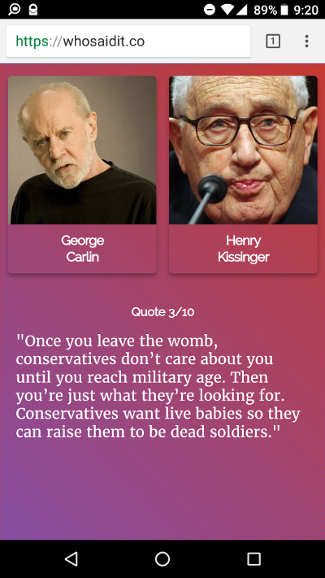
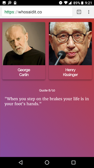
Here are two pictures side-by-side that illustrate the problem. Font in left picture is bigger than font in right picture:

enter image description here enter image description here

Here is the code for that section of the site (link to repository):

#game-screen {
  margin-top: 2%;
  @media (max-width: 550px) {
    margin-top: 4%;
  }
  #game-quotes {
    width: 90%;
    margin: 0 auto;
    @media (max-width: 550px) {
      width: 95%;
    }
    p {
      font-size: 3.6rem;
      @media (max-width: 750px) {
        font-size: 2.4rem;
      }
      @media (max-width: 550px) {
        font-size: 1.4rem;
      }
    }
  }
}
<div id="game-screen">
  <div id="game-pictures">
  </div>
  <div id="game-quotes">
    <h6 class="center">Quote {{counter}}/10</h6>
    <p>"{{content}}"</p>
  </div>
</div>

Does anyone have an idea of what might be causing this font-resizing?

Thanks in advance if you can offer any help.

Link to Repository

Edit: Thanks to all of you who helped me!

Joel Hoelting
  • 1,862
  • 2
  • 23
  • 45
  • 1
    Interesting one. Have you tried using other units for font size? `px` for example? – Morpheus Oct 06 '17 at 10:51
  • I looked your website, I am not able to point out the problem. Can you please clear it in the better way? – Chirag Jain Oct 06 '17 at 12:28
  • @Morpheus: px still doing the same thing, there must be some other css thats causing this but why only on chrome mobile? – Joel Hoelting Oct 06 '17 at 17:43
  • maybe it's the fractional font size being computed differently at different times? the font-size is always reporting as computed at 16.8px for me in the dev tools. and in your screen shots, the lowercase *n* is 8px tall in one and 9px tall in the other, including the aliasing. off-by-one feels a lot like a rounding error/decision at render time to me. – worc Oct 06 '17 at 21:48
  • 2
    Can you check if your Chrome font size is at 100% in settings on your phone? Chrome for Android has an option to render font at a different value. You can find this option in: Menu -> Settings -> Accessibility. I did a mistake like this some weeks ago and I want to be sure that is not the case here. Sorry if I'm out of the line here. – Cheesy Oct 10 '17 at 21:18
  • Have you tried manipulating the viewport meta tag? Check out [https://developer.mozilla.org/en-US/docs/Mozilla/Mobile/Viewport_meta_tag](https://developer.mozilla.org/en-US/docs/Mozilla/Mobile/Viewport_meta_tag) – Julio Feferman Oct 11 '17 at 05:39
  • @Cheesy: you were right about this. I found this stack post describing the exact issue thanks to your suggestion [Chrome on Android Resizes Font](https://stackoverflow.com/questions/11289166/chrome-on-android-resizes-font). Feel free to answer the question and I will mark it answered. – Joel Hoelting Oct 11 '17 at 05:53
  • with that information, it looks like this is a duplicate of [how to override font boosting in mobile chrome](https://stackoverflow.com/questions/13430897/how-to-override-font-boosting-in-mobile-chrome) – worc Oct 11 '17 at 23:10
  • @JoelHoelting thank you just did that. – Cheesy Oct 12 '17 at 07:58

9 Answers9

10

For cross compatibility for my web pages I tend to use the following:

<meta name="viewport" content="width=device-width, initial-scale=1.0">

This seems to work with no additional styling with CSS needed for the mobile platforms. Not sure if it what you want though.

owen sziber
  • 144
  • 9
3

Can you check if your Chrome font size is at 100% in settings on your phone? Chrome for Android has an option to render font at a different value. You can find this option in: Menu -> Settings -> Accessibility. I did a mistake like this some weeks ago and I want to be sure that is not the case here. Sorry if I'm out of the line here.

I also found that for some unknown reason sometimes Chrome for Android set this font setting wrong at installation time. I could not replicate this behavior but I got one phone, of a relative, with this so it might be possible that you are not aware of the fact that this setting is not set at 100%.

Cheesy
  • 339
  • 3
  • 6
1

i added a * after your paragraph selector to selects all the paragraph's. maybe this will solve your problem. please tell me if it worked, i wanna know the outcome :)

#game-screen {
  margin-top: 2%;
  @media (max-width: 550px) {
    margin-top: 4%;
  }
  #game-quotes {
    width: 90%;
    margin: 0 auto;
    @media (max-width: 550px) {
      width: 95%;
    }
    p *{
      font-size: 3.6rem;
      @media (max-width: 750px) {
        font-size: 2.4rem;
      }
      @media (max-width: 550px) {
        font-size: 1.4rem;
      }
    }
  }
}
MultiDutch
  • 36
  • 8
1

I'm not sure if this is the answer to your question but I find this consistent for CSS:

body {
    /** Setting the 'font-size' property of the <body> to 62.5%
     *   allows you to use the 'em' measurement as you would in 'px' form.
     *   ...hope that's clear.
    */
    font-size: 62.5%;
}

#someDivInBody {
    font-size: 1.65em; /* or '16.5px' by CSS */
}

This method has allows me to use the em measurement as I would in px but with more consistency and control.

Lapys
  • 936
  • 2
  • 11
  • 27
1

The rem unit is unlike px or em. When you resize the window, using rem will keep the ratio of the text and the window size the same. Try using em or px to resolve the issue :)

Josh Corbett
  • 31
  • 2
  • 6
  • But the window isn't getting resized so the font-size shouldn't change either. I tried with px and em, doesn't fix the issue. It's frustrating because the resizing doesn't occur in dev tools, so i can't get to the root of it. – Joel Hoelting Oct 08 '17 at 18:02
1

This may be because of the resolution of the phone or tablet. It may be best to customize your webpage to stay the same size, no matter the device.

try using max-width:Resolution;

You will have to apply this to the body class for this to apply to everything.

I.E.

`.body {`<br>
`    max-width: 3840px;` /*4K resolution, for 4K displays*/

This SHOULD fix the text issue. If not, please refer to https://www.w3schools.com or https://developer.mozilla.org/en-US/. it may be able to help you.

EgMusic
  • 136
  • 17
1

I have experienced this same issue and it's very annoying. I filed a bug for Chrome (see details here: https://bugs.chromium.org/p/chromium/issues/detail?id=877833#c9) and they basically said it wasn't worth it to them to fix it. In my case, as suggested by @Cheesy, my android's accessiblity was set to larger than standard font size. That does not invalidate the issue, IMO. If large font size makes ALL font larger great. But it should not inconsistently be resizing font in some places on the page while ignoring others.

jay-danger
  • 613
  • 8
  • 14
1

The only way to fix this for my React application was using this CSS rule:

* {
  max-height: 999999px;
}

I have no idea why this works.

It was an extremely specific issue that I had with my Samsung Note 8 and nothing else worked. I also tried different meta tags combinations and all possible text-size-adjust values, nothing worked but this.

Hopes this helps someone from diving into this rabbit hole that I just came out of.

GMaiolo
  • 4,207
  • 1
  • 21
  • 37
  • Thanks for this. Was it Chrome that you encountered this problem in? – Arad Alvand Feb 07 '21 at 19:13
  • @Arad glad it helped you; it was happening in Chrome in my specific device for unknown reasons, also happened in Firefox if I recall correctly. – GMaiolo Feb 07 '21 at 21:45
  • Got ya, thank you. This was the only solution that actually worked for me. A couple of other answers are saying that including a meta viewport tag must also solve this. But I already had it, and it doesn't seem to disable the font boosting behavior for me. Have you tried that? – Arad Alvand Feb 07 '21 at 22:02
0

For me, I had to include minimum-scale in the meta tag:

<meta name="viewport" content="width=device-width, initial-scale=1, minimum-scale=1"/>
David Callanan
  • 5,601
  • 7
  • 63
  • 105