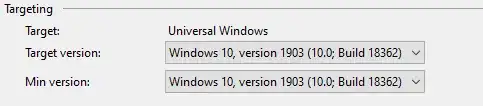
EDIT: Google announced the web version of the Android Market earlier today. It appears that the "feature graphic" is used (in a smaller size) for the top features (see large images near the top: http://market.android.com/) and at the top of individual app pages.
The little I found was this:
- Use a safe frame of 924x400 (50 pixel
of safe padding on each side). All
the important content of the graphic
should be within this safe frame.
Pixels outside of this safe frame may
be cropped for stylistic purposes.
- If incorporating text, use large font
sizes, and keep the graphic simple,
as this graphic may be scaled down
from its original size.
- This graphic may be displayed alone
without the app icon.
Based on the size and name alone, I guess that it's most likely to be used for your app if it is featured and the large size is so that it looks good on the tablets that are coming out.