I have an HTML document, let say this:
<p>
    lorem ipsum
</p>
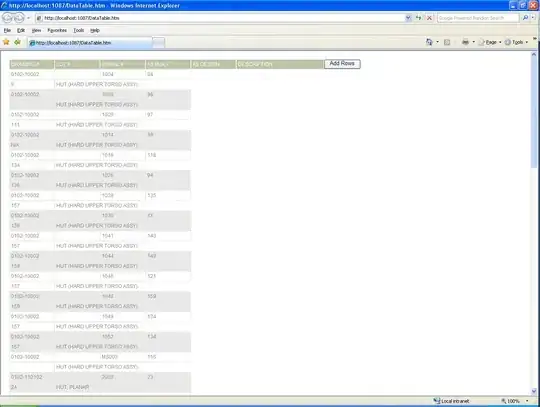
In my computer it looks like this:

If you click the images you'll see that in the mobile view it looks reduced. I'm usign the chrome-dev-tools to simulate mobile view (but in my phone its the same) and inspecting the element I see that the html content has 980 X 1742 px, when it should have 360 X 640 px.

That's from my computer using chrome-dev-tools. Can someone tell my how can I fix this, or at least what am I doing wrong? Or that's how it's suppose to be from a mobile?
