3

Recently I have been playing around with Sciter, and discovered the incredibly useful flow CSS attribute. The docs have little to say about it, asside from listing it as a Sciter feature, and linking to this article.

Obviously, this doesn't work in browsers, and finding more info on the subject is rather difficult.

I find this feature very helpful in creating nice layouts quickly and with a minimum of fuss and bother, and so I am very interested in anything similar that will work in browsers.

Basically I have two questions:

  1. Can I use something similar (eg, using standard CSS) in common browsers? What and how?
  2. (Mostly to satisfy idle curiosity) Is this particular extension used in anything besides Sciter?
Milo Christiansen
  • 3,204
  • 2
  • 23
  • 36
  • Your request was for "something similar" in a way that it looked like you were asking for something similar to Sciter in a quick read. I removed my vote to close. Sorry. – Rob Oct 09 '17 at 02:31
  • 1
    Ahh, I can see how it could be read that way. Edited the question slightly toclear that up. – Milo Christiansen Oct 09 '17 at 02:33

1 Answers1

2

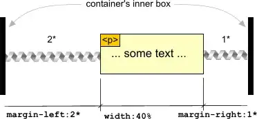
Using the example from the site:

You could do this (background added for viewing purposes:

p {
  margin-left: calc((100% - 40%) / (2 + 1) * 2);
  margin-right: calc((100% - 40%) / (2 + 1) * 1);
  background-color: #fdfcc1;
}
<p>... some text ...</p>

You would implement it like this with any values:

p {
  margin-left: calc((100% - ELEMENT_WIDTH) / (FLEX_VALUE_LEFT + FLEX_VALUE_RIGHT) * FLEX_VALUE_LEFT);
  margin-right: calc((100% - ELEMENT_WIDTH) / (FLEX_VALUE_LEFT + FLEX_VALUE_RIGHT) * FLEX_VALUE_RIGHT);
}

Or if you're using SCSS, you could do something like this:

$elem-width: 40%;
$flex-left: 2;
$flex-right: 1;

p {
  margin-left: calc((100% - $elem-width) / ($flex-left + $flex-right) * $flex-left);
  margin-right: calc((100% - $elem-width) / ($flex-left + $flex-right) * $flex-right);
}
Ethan
  • 3,410
  • 1
  • 28
  • 49
  • 2
    I'm pretty sure that that does not have the same effect. At all. All this does is position an item, it does not position an item's children the way `flow` does. Also, it doesn't seem to properly position children based on each other's position. – Milo Christiansen Oct 09 '17 at 04:16
  • 1
    AFAIK It would be possible to use those formulas to do something with JavaScript, but that isn't really what I am looking for. Still interesting though... – Milo Christiansen Oct 09 '17 at 04:29
  • 1
    @MiloChristiansen this https://sciter.com/docs/flex-flow/flex-layout.htm was my proposal to W3C CSS WG to add to CSS. Tried hard to convince people but gave up as Google were pushing their own flexbox at that time. So flexbox http://www.w3.org/TR/css-flexbox-1/ is the only thing we deserve. – c-smile Nov 13 '17 at 22:27
  • 3
    Both of those links are very interesting, thank you. – Milo Christiansen Nov 14 '17 at 00:11