0

I have Matrix of shape (100,100) which I'm visualising as an image but I'd like the values closest to zero to display increasingly transparent (alpha = 255). How can I acheieve this?

Current code:

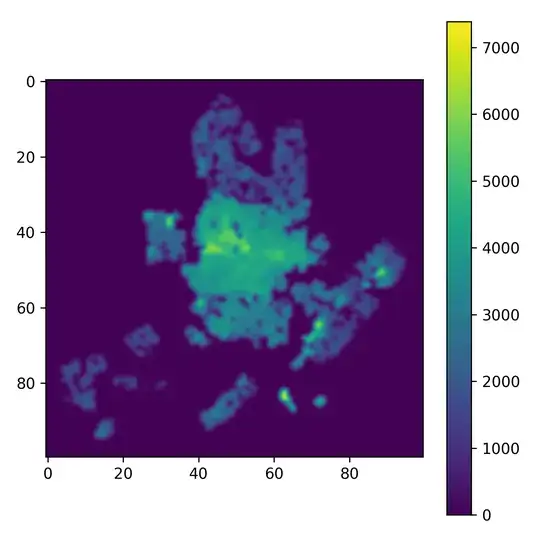
plt.figure(figsize=(12, 12))
plt.imshow(pricesM15, interpolation='bicubic')
plt.colorbar()

Amsterdam house prices

Edit: I have tried one of the solutions listed below. The alpha gets applied to the low range and not around zero.

import numpy as np
import matplotlib.pylab as pl
from matplotlib.colors import ListedColormap

# Random data
data1 = difference

# Choose colormap
cmap = pl.cm.RdBu

# Get the colormap colors
my_cmap = cmap(np.arange(cmap.N))

# Set alpha
my_cmap[:,-1] = np.linspace(0, 1, cmap.N)

# Create new colormap
my_cmap = ListedColormap(my_cmap)

pl.figure(figsize=(16, 7))
pl.subplot(121)
pl.pcolormesh(data1, cmap=pl.cm.RdBu)
pl.colorbar()

pl.subplot(122)
pl.pcolormesh(data1, cmap=my_cmap)
pl.colorbar()

save_fig("two_plots")
Amsterdam house prices difference

Charles Fried
  • 57
  • 2
  • 9
  • Did you try anything yet, e.g. [this one](https://stackoverflow.com/questions/37327308/add-alpha-to-an-existing-matplotlib-colormap). It's really hard to help, if people don't show at which point they get stuck. – ImportanceOfBeingErnest Oct 11 '17 at 08:45
  • I've added one of my attempts, thanks for pointing it out. – Charles Fried Oct 11 '17 at 08:55
  • Ok, so the zero is not necessarily at the bottom of the colormap, is that the problem? Are you looking for a solution for zero being in the middle then? What should the alpha values for the lower end of the colormap be in that case? – ImportanceOfBeingErnest Oct 11 '17 at 09:26
  • If your data range is symmetric about zero, and you want the colours closest to 0 to be more transparent, you could just change the line in your example above to: `my_cmap[:,-1] = np.abs(np.linspace(-1, 1, cmap.N))`, which sets alpha to 1 at each end, and 0 in the middle. – tmdavison Oct 11 '17 at 09:49

0 Answers0