There seems to be a lot of questions regarding the same issue but can't seem to find a satisfactory answer ... I have:
1 container (flex) (green)
   2 columns (block) -> left: red, right: orange
      in the left column, I have two divs (green) who follow each other 'menu1''menu2'
These two menus are themselves wrapped in a div (black) so that when I rotate it, the two menus are vertical rather than horizontal (rotation by 90 deg)
The goal is to have the top wrapper/container (green) to take on the height of the vertical black wrapper, and the left column wrapper to be no larger than the 'width' of the rotated black wrapper.
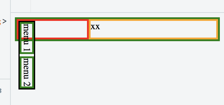
What I get is illustrated in the following example:
https://jsfiddle.net/pg373473/
<div id='container' style='display: flex; border: 3px solid green; flex-direction=row'>
  <div id='leftbox' style='position: relative; display: block; border: 3px solid red'>
    <div id='textwrapper' style='transform-origin: bottom left; transform: translateY(-100%) rotate(90deg); border: 2px solid black;'>
      <div style='border: 3px solid green; display: inline-block'>menu 1</div>
      <div style='border: 3px solid green; display: inline-block'>menu 2</div>
    </div>
  </div>
  <div id='rightbox' style='position: relative; display: flex; flex: 1 1 auto; border: 3px solid orange';>
    xx
  </div>
</div>
Is this possible at all?
By default, the rotation seems to be applied after all the width/height for all divs have been calculated. I personally find this behavior to be against what anybody would expect, but maybe someone who knows the specs very well can explain why this is so? But in the end, I am more interested to know if there is a solution to what I try to achieve (thx).
EDIT
Rotate elements in CSS that affect their parents... is asking something about rotations but the explanation is not satisfactory and the problem slightly different since it's only about being sure that the div of the rotated child take into account the height of the rotated child. The questions asked in this post has 3 constraints:
- you have 2 divs in a row that are rotated by 90 degrees (or more than 2)
- the wrapper container needs to take on:
- the width
- and the height of children rotated elements
The aforementioned question is only asking about the height and does not solve the width problem. Additionally, the jsfiddle doesn't work either.
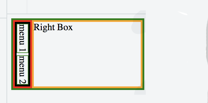
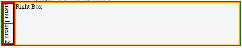
The only good part about this other question is the mentioned in the comments of the writing-mode but I haven't managed to make it work with this either. I tried this option and while I can fix the height issue, I can't make it work to fix the width problem...
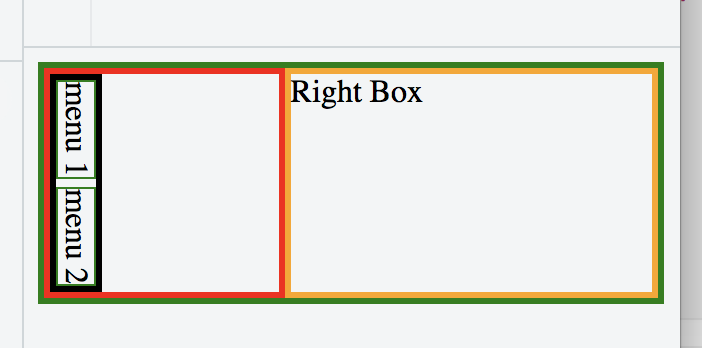
<div id='container' style='display: flex; border: 3px solid green; flex-direction: row'>
  <div style='display: flex; flex-direction: column; border: 3px solid red; flex: 1 1 auto;'>
    <div style='flex: 0 0 auto; display: inline-block; flex-direction: row; writing-mode: vertical-rl; border: 3px solid black;'>
      <div style='flex: 0 0 auto; border: 1px solid green; display: inline-block'>menu 1</div>
      <div style='flex: 0 0 auto; border: 1px solid green; display: inline-block'>menu 2</div>
    </div>
  </div>
  <div id='rightbox' style='display: flex; flex: 1 1 auto; border: 3px solid orange';>
    Right Box
  </div>
</div>
https://jsfiddle.net/dyae4xru/
For clarity here is what I want:
ANSWER / EDIT 2
There is no solution to this problem at this point in time. CSS/HTML/Browsers doesn't support that out of the box. I fixed the problem by writing a small JS function that gives me the exact width and height of the div when horizontal and used the values to set the width of the div once rotated by 90 degrees (using writing-mode: vertical-rl).