I'm trying to reproduce a growth chart in python. The underlying data uses age in days, but I want to display the age (x) axis in 2-month intervals. Can this be done purely with axis/labeling options or do I need to add a calculated column to the data instead?
This is for self-learning, so explanations are even more welcome than code.
This is what I have:
# Import the WHO weight-for-age data from Excel
import pandas
import matplotlib.pyplot as plt
import numpy as np

WHO_WFA = pandas.read_excel("PercentilesData.xlsx", sheetname="WGT_WHO")

# ... slice the dataframe and plot it
# steps omitted for brevity

# Plot with data:
plt.plot(maleAge, maleP01, maleAge, maleP1, maleAge, maleP3, maleAge, maleP5, maleAge, maleP10, maleAge, maleP15, maleAge, maleP25, maleAge, maleP50, maleAge, maleP75, maleAge, maleP85, maleAge, maleP90, maleAge, maleP95, maleAge, maleP97, maleAge, maleP99, maleAge, maleP999)

# Set up the axes/labels
plt.title('Weight-for-Age:  male (WHO)')
plt.xlabel('Age  (days)')
plt.ylabel('Weight  (kg)')
plt.axis([0,1900,0,30])
plt.grid(True)

plt.show()
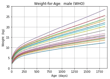
Instead, the x-axis should have ticks in 2-month increments (2,4, 6, 8, 10,12 ... to 60). I still need the data plotted using days though! So the x-axis value of 60 should be displayed as 2, 120 (days) is displayed as 4 (months), etc.
Thank you for any help!
UPDATE 1: Dividing the values by month duration does result in the same curves, as long as the x-axis range is adjusted:
# month duration
mo = 30.4375
# divide age in days by month duration
plt.plot(maleAge/mo, maleP01, maleAge/mo, maleP1, maleAge/mo, maleP3, maleAge/mo, maleP5, maleAge/mo, maleP10, maleAge/mo, maleP15, maleAge/mo, maleP25, maleAge/mo, maleP50, maleAge/mo, maleP75, maleAge/mo, maleP85, maleAge/mo, maleP90, maleAge/mo, maleP95, maleAge/mo, maleP97, maleAge/mo, maleP99, maleAge/mo, maleP999)
# Adjust the maximum x value to 60 ...
plt.axis([0,60,0,30])
This produces:
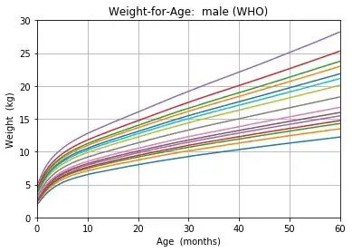
The last step is how to display the axis using major ticks at every 12 months and minor ticks every 2 months.
For the truly curious: Month length in the WHO growth charts is standardized to 30.4375 days. The data goes from 0 to 1856 days (60.98 completed months). For every day (0, 1, ... 1856), there are 15 weight values, each corresponding to a different percentile curve, for a total of 27,840 values.
The original data is publicly available at: WHO data/weight-for-age for boys
